SwiftUI Component Architecture Mastery: Professional Styling, Testing & Performance (2025)
Complete your component mastery with professional design systems, MVVM integration, performance optimization, and comprehensive testing…
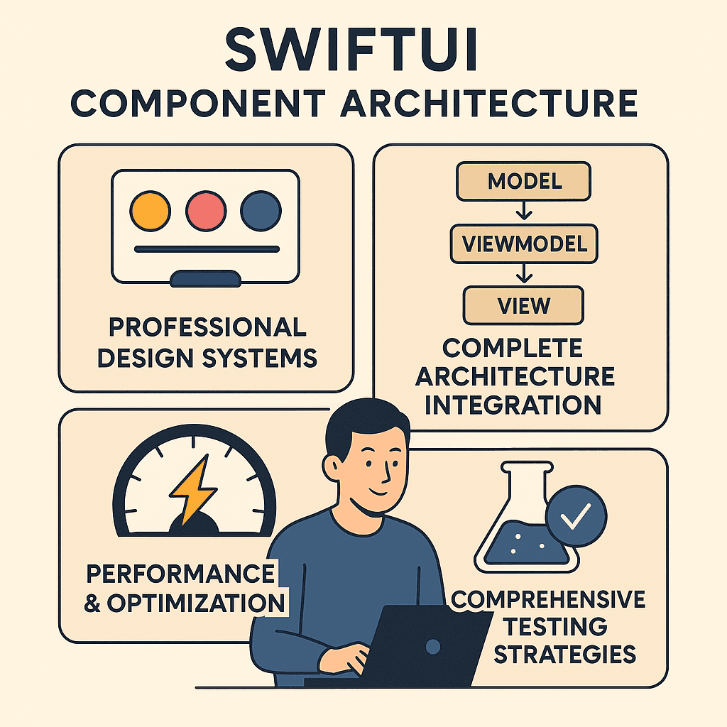

If you’ve already got a handle on generic components and state management (hey, nice work on Article 2 👏), then you’re ready for the final boss: production-ready components.
The production reality check:
- Your components work perfectly in development, but slow down with real data loads
- Each screen has slightly different button styles because there’s no design system
- Your components look great in light mode but break in dark mode
- You want to write tests, but your components are tightly coupled to specific implementations
- Your app needs to support accessibility, but your components weren’t built with it in mind
Sound familiar? You’ve built great component logic, but need the professional polish that separates hobby projects from enterprise applications.
Building on Your Architecture Foundation 🏠
Start with the basics? Check out How to Build Reusable SwiftUI Components: A Complete 2025 Guide for foundational patterns.
**How to Build Reusable SwiftUI Components: A Complete 2025 Guide** _Master the art of DRY code in SwiftUI. Build once, use everywhere — complete with state management, styling best…_medium.comhttps://medium.com/swift-pal/how-to-build-reusable-swiftui-components-a-complete-2025-guide-a792c2d4b9ce
Need advanced patterns first? Read SwiftUI Component Architecture Mastery: Generic Components & Advanced State Management to master the logic layer before diving into production concerns.
**SwiftUI Component Architecture Mastery: Generic Components & Advanced State Management (2025)** _Master generic components and advanced state patterns that work with any data type. From protocol-based design to…_medium.comhttps://medium.com/swift-pal/swiftui-component-architecture-mastery-generic-components-advanced-state-management-2025-a0588940485a
New to SwiftUI? Start with SwiftUI for Beginners in 2025: Build Your First iOS App Step-by-Step.
**SwiftUI for Beginners in 2025: Build Your First iOS App Step-by-Step** _This step-by-step guide will walk you through building your very first iOS app — no prior experience needed! Learn the…_medium.comhttps://medium.com/swift-pal/swiftui-for-beginners-in-2025-build-your-first-ios-app-step-by-step-400c627f19bc
What You’ll Master in This Final Guide 🎯
🎨 Professional Design Systems
- Design tokens and theme management
- Environment-aware styling that adapts automatically
- Consistent visual language across your entire app
🏛️ Complete Architecture Integration
- This architecture isn’t just clean — it’s testable, modular, and built for scaling. Think of it like assembling LEGO sets where the pieces just click into place (and don’t collapse during launch 🚀).
⚡ Performance & Optimization
- Memory management best practices
- Rendering optimization techniques
- Profiling and measuring component performance
🧪 Comprehensive Testing Strategies
- Unit testing for component logic
- UI testing for component behavior
- Snapshot testing for visual consistency
By the end of this guide, you’ll have components that perform well with thousands of users, maintain visual consistency across platforms, and integrate cleanly into any production iOS app architecture.
The Complete Journey: From basic reusable components → advanced architecture patterns → production-ready systems that scale.
So, ready to take your components from ‘it works on my machine’ to ‘this is production-grade’? Let’s build the kind of SwiftUI components that wouldn’t blink in a Fortune 500 codebase. 🚀
Professional Styling Architecture 🎨
Enterprise apps need consistent styling that can adapt to different themes, support accessibility, and scale across teams. Let’s build a professional design system that makes your components truly production-ready.
The Styling Chaos Problem 🎭
Without a proper design system, your app’s styling becomes a maintenance nightmare:
// Scattered throughout your app... 😵💫
Text("Welcome")
.font(.system(size: 18, weight: .semibold))
.foregroundColor(.blue)
.padding(16)
Text("Settings")
.font(.system(size: 17, weight: .medium)) // Slightly different!
.foregroundColor(.blue) // Same color, but hardcoded everywhere
.padding(14) // Different padding!When your designer wants to change the primary color or font sizes, you’re hunting through hundreds of files. Not scalable.
Design Tokens: The Foundation 🏗️
Professional apps use design tokens — centralized values that define your entire design system:
// 1. Define your design system foundation
struct DesignTokens {
    // Colors
    struct Colors {
        static let primary = Color.blue
        static let secondary = Color.gray
        static let success = Color.green
        static let error = Color.red
        static let textPrimary = Color.primary
        static let textSecondary = Color.secondary
        static let background = Color(.systemBackground)
        static let surface = Color(.secondarySystemBackground)
    }

    // Typography
    struct Typography {
        static let largeTitle = Font.largeTitle.weight(.bold)
        static let title = Font.title2.weight(.semibold)
        static let headline = Font.headline.weight(.medium)
        static let body = Font.body
        static let caption = Font.caption
    }

    // Spacing
    struct Spacing {
        static let xs: CGFloat = 4
        static let sm: CGFloat = 8
        static let md: CGFloat = 16
        static let lg: CGFloat = 24
        static let xl: CGFloat = 32
    }

    // Corner Radius
    struct Radius {
        static let small: CGFloat = 4
        static let medium: CGFloat = 8
        static let large: CGFloat = 12
    }
}
Why this works:
- Single source of truth: Change
Colors.primaryonce, updates everywhere - Consistent naming: Everyone on your team uses the same values
- Easy to modify: Designer wants bigger spacing? Update
Spacing.mdand done!
Theme-Aware ViewModifiers 🎨
Now let’s create ViewModifiers that use these tokens and respond to environment changes:
// 2. Create semantic styling modifiers
struct PrimaryButtonStyle: ViewModifier {
    @Environment(\.isEnabled) private var isEnabled
    @Environment(\.colorScheme) private var colorScheme

    func body(content: Content) -> some View {
        content
            .font(DesignTokens.Typography.headline)
            .foregroundColor(.white)
            .padding(.vertical, DesignTokens.Spacing.sm)
            .padding(.horizontal, DesignTokens.Spacing.md)
            .background(
                RoundedRectangle(cornerRadius: DesignTokens.Radius.medium)
                    .fill(isEnabled ? DesignTokens.Colors.primary : DesignTokens.Colors.secondary)
            )
            .opacity(isEnabled ? 1.0 : 0.6)
    }
}

struct CardContainerStyle: ViewModifier {
    @Environment(\.colorScheme) private var colorScheme

    func body(content: Content) -> some View {
        content
            .padding(DesignTokens.Spacing.md)
            .background(DesignTokens.Colors.surface)
            .cornerRadius(DesignTokens.Radius.large)
            .shadow(
                color: colorScheme == .dark ? .clear : .black.opacity(0.1),
                radius: 4,
                y: 2
            )
    }
}
Key insights:
- Environment-aware: Automatically adapts to light/dark mode and button enabled state
- Semantic naming:
PrimaryButtonStyletells you what it is, not how it looks - Consistent spacing: Uses design tokens instead of magic numbers
Easy-to-Use Extensions ✨
Make your design system effortless to apply:
// 3. Create convenient extensions
extension View {
    func primaryButton() -> some View {
        modifier(PrimaryButtonStyle())
    }

    func cardContainer() -> some View {
        modifier(CardContainerStyle())
    }

    func titleText() -> some View {
        font(DesignTokens.Typography.title)
            .foregroundColor(DesignTokens.Colors.textPrimary)
    }

    func bodyText() -> some View {
        font(DesignTokens.Typography.body)
            .foregroundColor(DesignTokens.Colors.textPrimary)
    }

    func captionText() -> some View {
        font(DesignTokens.Typography.caption)
            .foregroundColor(DesignTokens.Colors.textSecondary)
    }
}
Now your components become beautifully consistent:
// Clean, readable, and consistent! ✨
struct ProfileCard: View {
    let user: User

    var body: some View {
        VStack(alignment: .leading, spacing: DesignTokens.Spacing.sm) {
            Text(user.name)
                .titleText()  // 👈 Semantic, consistent styling

            Text(user.email)
                .bodyText()

            Text("Member since 2023")
                .captionText()

            Button("View Profile") {
                // action
            }
            .primaryButton()  // 👈 Consistent button styling
        }
        .cardContainer()  // 👈 Consistent card styling
    }
}
Advanced: Dynamic Theme System 🌗
For apps that need multiple themes or user customization:
// 4. Dynamic theme management
class ThemeManager: ObservableObject {
    @Published var currentTheme: AppTheme = .default

    enum AppTheme {
        case `default`
        case dark
        case accessibility

        var primaryColor: Color {
            switch self {
            case .default: return .blue
            case .dark: return .cyan
            case .accessibility: return .orange
            }
        }

        var fontSize: CGFloat {
            switch self {
            case .default, .dark: return 16
            case .accessibility: return 20  // Larger for accessibility
            }
        }
    }
}

// Theme-aware modifier
struct ThemedPrimaryButton: ViewModifier {
    @EnvironmentObject private var themeManager: ThemeManager
    @Environment(\.isEnabled) private var isEnabled

    func body(content: Content) -> some View {
        content
            .font(.system(size: themeManager.currentTheme.fontSize, weight: .medium))
            .foregroundColor(.white)
            .padding(.vertical, DesignTokens.Spacing.sm)
            .padding(.horizontal, DesignTokens.Spacing.md)
            .background(
                RoundedRectangle(cornerRadius: DesignTokens.Radius.medium)
                    .fill(isEnabled ? themeManager.currentTheme.primaryColor : DesignTokens.Colors.secondary)
            )
    }
}
Usage with dynamic theming:
What makes this powerful:
- Real-time updates: Change theme, entire app updates instantly
- Accessibility support: Easy to implement high-contrast or large text themes
- User preferences: Let users choose their preferred theme
The Design System Advantage 🚀
Professional styling architecture gives you:
- ✅ Consistency: Every component looks and feels cohesive
- ✅ Maintainability: Change design tokens, update entire app
- ✅ Team efficiency: Designers and developers speak the same language
- ✅ Accessibility: Built-in support for different user needs
- ✅ Brand compliance: Easy to implement and maintain brand guidelines
Advanced Styling: Want to dive deeper into SwiftUI styling, animations, and advanced design patterns? My comprehensive SwiftUI Styling Guide: Fonts, Themes, and Dark Mode — Why Order Matters covers everything from basic styling to complex theme systems.
**SwiftUI Styling Guide: Fonts, Themes, Dark Mode & Why Order Matters** _🎨 Give your SwiftUI app a complete style upgrade! Learn how to add custom fonts, build adaptive themes, support dark…_medium.comhttps://medium.com/swift-pal/swiftui-styling-guide-fonts-themes-dark-mode-why-order-matters-7fbf5389d384
Component Architecture Integration 🏛️
Professional SwiftUI components don’t exist in isolation — they need to integrate cleanly with your app’s architecture. Let’s explore how to build components that work seamlessly with MVVM, dependency injection, and testing patterns.
The Architecture Mismatch Problem 🤔
Many developers build components that tightly couple UI with business logic:
// ❌ Component doing too much - violates MVVM
struct UserProfileCard: View {
    let userId: String
    @State private var user: User?
    @State private var isLoading = false

    var body: some View {
        VStack {
            if isLoading {
                ProgressView()
            } else if let user = user {
                Text(user.name)
                Text(user.email)
            }
        }
        .task {
            // ❌ Business logic in the View!
            isLoading = true
            let url = URL(string: "https://api.example.com/users/\(userId)")!
            let (data, _) = try! await URLSession.shared.data(from: url)
            user = try! JSONDecoder().decode(User.self, from: data)
            isLoading = false
        }
    }
}
Problems with this approach:
- Business logic mixed with UI code
- Hard to test the networking logic
- Violates single responsibility principle
- Can’t reuse the data fetching logic
MVVM-Compliant Component Design ⚙️
Here’s how to build components that respect clean architecture:
// 1. ViewModel handles business logic
class UserProfileViewModel: ObservableObject {
    @Published var user: User?
    @Published var isLoading = false
    @Published var errorMessage: String?

    private let userService: UserServiceProtocol

    init(userService: UserServiceProtocol = UserService()) {
        self.userService = userService
    }

    func loadUser(id: String) async {
        await MainActor.run { isLoading = true }

        do {
            let fetchedUser = try await userService.fetchUser(id: id)
            await MainActor.run {
                self.user = fetchedUser
                self.isLoading = false
            }
        } catch {
            await MainActor.run {
                self.errorMessage = error.localizedDescription
                self.isLoading = false
            }
        }
    }
}
Why this ViewModel pattern works:
- Single responsibility: Only handles user profile data and states
- Testable: You can inject mock services for testing
- Reusable: Multiple views can use the same ViewModel
- Clean separation: Business logic separate from UI code
// 2. Component becomes a pure UI layer
struct UserProfileCard: View {
    let userId: String
    @StateObject private var viewModel = UserProfileViewModel()

    var body: some View {
        VStack(spacing: DesignTokens.Spacing.sm) {
            if viewModel.isLoading {
                ProgressView("Loading user...")
            } else if let user = viewModel.user {
                UserInfoDisplay(user: user)
            } else if let error = viewModel.errorMessage {
                ErrorDisplay(message: error) {
                    Task { await viewModel.loadUser(id: userId) }
                }
            }
        }
        .cardContainer()
        .task {
            await viewModel.loadUser(id: userId)
        }
    }
}

// 3. Break down into smaller, focused components
struct UserInfoDisplay: View {
    let user: User

    var body: some View {
        VStack(alignment: .leading, spacing: DesignTokens.Spacing.xs) {
            Text(user.name)
                .titleText()

            Text(user.email)
                .bodyText()

            if let joinDate = user.joinDate {
                Text("Member since \(joinDate, style: .date)")
                    .captionText()
            }
        }
    }
}
struct ErrorDisplay: View {
    let message: String
    let onRetry: () -> Void

    var body: some View {
        VStack(spacing: DesignTokens.Spacing.sm) {
            Text("Error: \(message)")
                .foregroundColor(DesignTokens.Colors.error)
                .bodyText()

            Button("Retry", action: onRetry)
                .primaryButton()
        }
    }
}
Benefits of this approach:
- Easy to test: Mock the ViewModel and test UI states independently
- Reusable components:
ErrorDisplaycan be used throughout your app - Clear responsibilities: Each component has one job
- Maintainable: Changes to business logic don’t affect UI code
Dependency Injection for Components 💉
Make your components flexible by accepting their dependencies:
// 1. Define service protocols for testability
protocol UserServiceProtocol {
    func fetchUser(id: String) async throws -> User
    func updateUser(_ user: User) async throws -> User
}

protocol ImageCacheProtocol {
    func cachedImage(for url: URL) -> UIImage?
    func cacheImage(_ image: UIImage, for url: URL)
}

// 2. Component accepts its dependencies
struct EditableUserProfile: View {
    let userId: String
    let userService: UserServiceProtocol
    let imageCache: ImageCacheProtocol
    let onSave: (User) -> Void

    @StateObject private var viewModel: EditableUserProfileViewModel

    init(
        userId: String,
        userService: UserServiceProtocol,
        imageCache: ImageCacheProtocol,
        onSave: @escaping (User) -> Void
    ) {
        self.userId = userId
        self.userService = userService
        self.imageCache = imageCache
        self.onSave = onSave

        // Inject dependencies into ViewModel
        self._viewModel = StateObject(wrappedValue: EditableUserProfileViewModel(
            userService: userService,
            imageCache: imageCache
        ))
    }

    var body: some View {
        VStack {
            if viewModel.isLoading {
                ProgressView("Loading...")
            } else {
                UserEditForm(
                    user: viewModel.user,
                    onSave: { updatedUser in
                        Task {
                            await viewModel.saveUser(updatedUser)
                            onSave(updatedUser)
                        }
                    }
                )
            }
        }
        .task {
            await viewModel.loadUser(id: userId)
        }
    }
}
Why dependency injection matters:
- Testing: Inject mock services that return predictable data
- Flexibility: Same component works with different implementations
- Decoupling: Component doesn’t need to know about specific service implementations
Usage in Production Architecture 🏢
Here’s how these components integrate with a real app architecture:
// Production app using dependency injection
struct ProfileView: View {
    let userId: String

    // Dependencies provided by app's dependency container
    @EnvironmentObject private var serviceContainer: ServiceContainer

    var body: some View {
        NavigationView {
            EditableUserProfile(
                userId: userId,
                userService: serviceContainer.userService,    // Real API service
                imageCache: serviceContainer.imageCache,      // Real cache implementation
                onSave: { updatedUser in
                    // Handle successful save (analytics, navigation, etc.)
                    serviceContainer.analyticsService.track(.userProfileUpdated)
                }
            )
            .navigationTitle("Profile")
        }
    }
}

// For testing
#Preview {
    ProfileView(userId: "test-user")
        .environmentObject(MockServiceContainer())  // Mock dependencies
}
Service container pattern:
class ServiceContainer: ObservableObject {
    lazy var userService: UserServiceProtocol = APIUserService()
    lazy var imageCache: ImageCacheProtocol = ImageCacheService()
    lazy var analyticsService = AnalyticsService()
}

class MockServiceContainer: ServiceContainer {
    override init() {
        super.init()
        // Override with mock implementations for testing
        userService = MockUserService()
        imageCache = MockImageCache()
    }
}
Testing-Friendly Component Design 🧪
With proper architecture, testing becomes straightforward:
// Easy to test because dependencies are injected
class UserProfileViewModelTests: XCTestCase {

    func testLoadUserSuccess() async {
        // Arrange
        let mockService = MockUserService()
        mockService.mockUser = User(name: "Test User", email: "test@example.com")
        let viewModel = UserProfileViewModel(userService: mockService)

        // Act
        await viewModel.loadUser(id: "test-id")

        // Assert
        XCTAssertEqual(viewModel.user?.name, "Test User")
        XCTAssertFalse(viewModel.isLoading)
        XCTAssertNil(viewModel.errorMessage)
    }

    func testLoadUserError() async {
        // Arrange
        let mockService = MockUserService()
        mockService.shouldThrowError = true
        let viewModel = UserProfileViewModel(userService: mockService)

        // Act
        await viewModel.loadUser(id: "test-id")

        // Assert
        XCTAssertNil(viewModel.user)
        XCTAssertFalse(viewModel.isLoading)
        XCTAssertNotNil(viewModel.errorMessage)
    }
}
The Architecture Integration Advantage 🚀
Properly integrated components give you:
- ✅ Clean separation: UI, business logic, and data layers are distinct
- ✅ Testability: Each layer can be tested independently
- ✅ Reusability: Components work in different contexts and apps
- ✅ Maintainability: Changes in one layer don’t break others
- ✅ Team scalability: Different developers can work on different layers
Architecture Deep Dive: Want to master MVVM patterns and clean architecture in SwiftUI? My comprehensive guide MVVM in SwiftUI Explained: Build Scalable, Testable Apps with Clean Architecture covers everything from basic patterns to advanced dependency injection techniques.
**MVVM in SwiftUI Explained: Build Scalable & Testable Apps with Clean Architecture** _Let’s unravel the mystery of MVVM and learn how to structure your SwiftUI apps with clean, testable architecture…_medium.comhttps://medium.com/swift-pal/mvvm-in-swiftui-explained-build-scalable-testable-apps-with-clean-architecture-2b36443ebfca
Performance & Testing Best Practices ⚡
Professional SwiftUI components need to perform well under real-world conditions and be thoroughly tested. Let’s explore the optimization techniques and testing strategies that ensure your components are truly production-ready.
The Performance Reality Check 📊
Your components work great in development, but real-world usage reveals performance issues:
// ❌ Component that kills performance
struct HeavyListItem: View {
    let item: ListItem

    var body: some View {
        VStack {
            // Problem 1: Heavy computation in body
            Text(processComplexData(item.data))  // Runs on every re-render!

            // Problem 2: Expensive view creation
            ForEach(generateDynamicContent(item)) { content in  // Creates arrays constantly
                ComplexSubview(content)
            }

            // Problem 3: No view recycling
            ScrollView {
                ForEach(item.children, id: \.id) { child in
                    HeavyChildView(child)  // All children rendered even if not visible
                }
            }
        }
    }

    // Heavy computation that shouldn't be in the View
    private func processComplexData(_ data: String) -> String {
        // Expensive operation that runs on every body evaluation
        return data.uppercased().replacingOccurrences(of: " ", with: "_")
    }
}
Performance problems:
- Heavy computation runs on every SwiftUI update
- Dynamic content generation happens repeatedly
- No optimization for off-screen content
Performance Optimization Patterns ⚙️
Here’s how to build components that stay fast with real data loads:
// ✅ Performance-optimized component
struct OptimizedListItem: View {
    let item: ListItem

    // 1. Compute expensive data once and cache it
    @State private var processedData: String = ""
    @State private var dynamicContent: [ContentItem] = []

    var body: some View {
        VStack {
            // Fast display of pre-computed data
            Text(processedData)

            // Lazy loading for better performance
            LazyVStack {
                ForEach(dynamicContent, id: \.id) { content in
                    OptimizedSubview(content)
                }
            }
        }
        .onAppear {
            // Compute heavy operations only when needed
            if processedData.isEmpty {
                processedData = processComplexData(item.data)
                dynamicContent = generateDynamicContent(item)
            }
        }
    }

    // Heavy computation moved out of body
    private func processComplexData(_ data: String) -> String {
        // Same expensive operation, but only runs once
        return data.uppercased().replacingOccurrences(of: " ", with: "_")
    }

    private func generateDynamicContent(_ item: ListItem) -> [ContentItem] {
        // Dynamic content generation, but cached
        return item.children.map { ContentItem(child: $0) }
    }
}
Key performance principles:
- Compute once, display many: Cache expensive calculations
- Lazy loading: Use
LazyVStack/LazyHStackfor large lists - State management: Only trigger updates when data actually changes
Memory Management Best Practices 🧠
Prevent memory leaks and optimize memory usage:
// ✅ Memory-efficient component patterns
struct MemoryOptimizedComponent: View {
    let imageURL: URL?

    // 1. Use @StateObject for owned objects, @ObservedObject for injected ones
    @StateObject private var imageLoader = ImageLoader()  // Component owns this
    @ObservedObject var themeManager: ThemeManager        // Injected dependency

    // 2. Proper cleanup in onDisappear
    var body: some View {
        AsyncImage(url: imageURL) { image in
            image
                .resizable()
                .aspectRatio(contentMode: .fit)
        } placeholder: {
            ProgressView()
        }
        .onAppear {
            imageLoader.loadImage(from: imageURL)
        }
        .onDisappear {
            // Clean up resources when view disappears
            imageLoader.cancelLoading()
        }
    }
}

// Memory-efficient image loader
class ImageLoader: ObservableObject {
    @Published var image: UIImage?
    private var cancellable: AnyCancellable?

    func loadImage(from url: URL?) {
        guard let url = url else { return }

        cancellable = URLSession.shared.dataTaskPublisher(for: url)
            .map(\.data)
            .compactMap(UIImage.init)
            .receive(on: DispatchQueue.main)
            .sink(
                receiveCompletion: { _ in },
                receiveValue: { [weak self] image in
                    self?.image = image
                }
            )
    }

    func cancelLoading() {
        cancellable?.cancel()
        cancellable = nil
    }

    deinit {
        cancelLoading()  // Ensure cleanup on deallocation
    }
}
Memory management rules:
- Use
@StateObjectfor objects the component creates and owns - Use
@ObservedObjectfor objects injected from parent views - Cancel network requests and timers in
onDisappearordeinit - Use
weak selfin closures to prevent retain cycles
**Mastering SwiftUI State Management in 2025: @State, @Binding, @ObservedObject, @StateObject — Plus…** _Confused between @State, @Binding, @ObservedObject, @StateObject, @Observable and @Bindable in SwiftUI? You’re not…_medium.comhttps://medium.com/swift-pal/mastering-swiftui-state-management-state-vs-binding-vs-observedobject-vs-stateobject-2025-e1f751aa038d
Comprehensive Testing Strategies 🧪
Professional components need multiple layers of testing:
// 1. Unit Testing for Component Logic
import XCTest
@testable import YourApp

class ComponentLogicTests: XCTestCase {

    func testValidationRules() {
        // Test your validation logic separately from UI
        let emailRule = ValidationRule.email

        XCTAssertNil(emailRule.validate("test@example.com"))
        XCTAssertNotNil(emailRule.validate("invalid-email"))
    }

    func testViewModelStateManagement() async {
        // Test ViewModel state changes
        let mockService = MockUserService()
        let viewModel = UserProfileViewModel(userService: mockService)

        await viewModel.loadUser(id: "test-id")

        XCTAssertEqual(viewModel.user?.name, "Mock User")
        XCTAssertFalse(viewModel.isLoading)
    }
}

// 2. Mock services for predictable testing
class MockUserService: UserServiceProtocol {
    var mockUser: User?
    var shouldThrowError = false

    func fetchUser(id: String) async throws -> User {
        if shouldThrowError {
            throw TestError.mockError
        }
        return mockUser ?? User(name: "Mock User", email: "mock@test.com")
    }
}
**Unit Testing in Swift Made Easy: A Beginner’s Guide With Real Examples** _A beginner’s guide to Swift unit testing — learn the basics, write your first tests, and improve your code quality._medium.comhttps://medium.com/swift-pal/unit-testing-in-swift-made-easy-a-beginners-guide-with-real-examples-0409f65e84f6
UI Testing for Component Behavior 📱
Test how your components behave in real user scenarios:
// UI Testing for component interactions
import XCTest

class ComponentUITests: XCTestCase {

    func testUserProfileCardInteraction() throws {
        let app = XCUIApplication()
        app.launch()

        // Find your component
        let profileCard = app.otherElements["UserProfileCard"]
        XCTAssertTrue(profileCard.exists)

        // Test user interactions
        let editButton = profileCard.buttons["Edit Profile"]
        editButton.tap()

        // Verify state changes
        let editForm = app.otherElements["EditProfileForm"]
        XCTAssertTrue(editForm.waitForExistence(timeout: 2))

        // Test form validation
        let emailField = editForm.textFields["Email"]
        emailField.tap()
        emailField.typeText("invalid-email")

        let saveButton = editForm.buttons["Save"]
        XCTAssertFalse(saveButton.isEnabled)  // Should be disabled for invalid input
    }
}
**UI Testing in SwiftUI (2025 Guide): Write End-to-End Tests for Reliable iOS Apps** _UI testing got you sweating bullets? 🫠 In this 2025 guide, you’ll learn how to write reliable end-to-end tests for…_medium.comhttps://medium.com/swift-pal/ui-testing-in-swiftui-2025-guide-write-end-to-end-tests-for-reliable-ios-apps-164e4458ffdf
Snapshot Testing for Visual Consistency 📸
Ensure your components look consistent across updates:
// Snapshot testing (using SnapshotTesting library)
import XCTest
import SnapshotTesting
import SwiftUI

class ComponentSnapshotTests: XCTestCase {

    func testUserProfileCardAppearance() {
        let user = User(name: "John Doe", email: "john@example.com")
        let view = UserProfileCard(user: user)
            .frame(width: 300, height: 200)

        // Test light mode
        assertSnapshot(matching: view, as: .image)

        // Test dark mode
        let darkModeView = view.preferredColorScheme(.dark)
        assertSnapshot(matching: darkModeView, as: .image)
    }

    func testButtonStatesVisually() {
        let buttons = VStack {
            CustomButton("Normal", style: .primary) { }
            CustomButton("Disabled", style: .primary, isEnabled: false) { }
            CustomButton("Secondary", style: .secondary) { }
        }
        .padding()

        assertSnapshot(matching: buttons, as: .image)
    }
}
**iOS Snapshot Testing: Complete Guide for UIKit and SwiftUI Apps** _Master visual regression testing, prevent UI bugs, and ship pixel-perfect apps across all iOS frameworks_medium.comhttps://medium.com/swift-pal/ios-snapshot-testing-complete-guide-for-uikit-and-swiftui-apps-817af4136896
Performance Profiling in Practice 📈
Use Xcode’s tools to measure and optimize:
// Add performance measurements to your tests
class PerformanceTests: XCTestCase {

    func testListComponentPerformance() {
        let items = (0..<1000).map {
            ListItem(id: $0, title: "Item \($0)", data: "Sample data")
        }

        measure {
            // Test how long it takes to create 1000 list items
            let listView = LazyVStack {
                ForEach(items, id: \.id) { item in
                    OptimizedListItem(item: item)
                }
            }
            _ = listView.body  // Force evaluation
        }
    }
}
Testing Best Practices Checklist ✅
For each component, ensure you have:
- ✅ Unit tests for business logic and validation rules
- ✅ ViewModel tests for state management behavior
- ✅ UI tests for critical user interactions
- ✅ Snapshot tests for visual consistency across modes
- ✅ Performance tests for components that handle large data sets
- ✅ Memory leak tests using Xcode’s Memory Graph Debugger
- ✅ Accessibility tests for VoiceOver and other assistive technologies
The Production-Ready Advantage 🚀
With proper performance optimization and testing:
- ✅ Reliable performance: Components stay fast with real-world data loads
- ✅ Visual consistency: Snapshot tests catch unintended design changes
- ✅ Behavior reliability: UI tests ensure components work as expected
- ✅ Memory efficiency: No memory leaks or excessive resource usage
- ✅ Team confidence: Comprehensive tests enable safe refactoring
- ✅ User satisfaction: Smooth, responsive UI that works consistently
SwiftUI Component Architecture Mastery — Complete! 🎯
Congratulations! You’ve just completed a comprehensive journey from basic reusable components to enterprise-grade SwiftUI architecture. Let’s celebrate what you’ve accomplished and map out your path forward as a SwiftUI component architecture expert.
Your Complete Mastery Journey 🚀
🏗️ From Article 1: Foundation Mastery
- ✅ Built your first reusable CustomButton, CustomCard, and CustomTextField
- ✅ Mastered basic state management with @State and @Binding
- ✅ Created consistent styling with ViewModifiers
- ✅ Organized components for maintainability
🔧 From Article 2: **Advanced Architecture Patterns**
- ✅ Built generic components that work with any data type using protocols
- ✅ Mastered advanced state management with custom bindings and environment objects
- ✅ Implemented dependency injection for testable, flexible components
- ✅ Created type-safe, reusable component architecture
🏛️ From Article 3: Production-Ready Excellence
- ✅ Built professional design systems with design tokens and theme management
- ✅ Integrated components seamlessly with MVVM architecture patterns
- ✅ Optimized performance for real-world data loads and memory efficiency
- ✅ Implemented comprehensive testing strategies (unit, UI, snapshot, performance)
What Makes You Different Now 💡
You’re no longer just building components — you’re architecting systems. You can now:
🎯 Think at Scale
- Build components that work across multiple apps and teams
- Design architecture that grows with your organization
- Create systems that maintain consistency across large codebases
⚡ Solve Complex Problems
- Handle intricate state flows between multiple components
- Build components that adapt to any data model or business requirement
- Optimize performance for apps with millions of users
🧪 Build with Confidence
- Write comprehensive tests that catch issues before users do
- Refactor fearlessly knowing your tests protect against regressions
- Ship components that meet enterprise reliability standards
Your Professional Component Architect Toolkit 🛠️
You now have mastery over:
Design Patterns:
- Protocol-oriented component design
- Generic type-safe architecture
- Dependency injection patterns
- MVVM integration strategies
State Management:
- Custom binding creation
- Environment-based communication
- Complex parent-child data flows
- Observable object patterns
Performance & Quality:
- Memory management best practices
- Rendering optimization techniques
- Comprehensive testing strategies
- Visual consistency maintenance
Professional Systems:
- Design token systems
- Theme management
- Accessibility integration
- Cross-platform considerations
Real-World Impact: What You Can Build Now 🌟
With your new skills, you can confidently tackle:
🏢 Enterprise Applications
- Banking apps with complex form validation and state management
- E-commerce platforms with dynamic product displays
- Social media apps with infinite scroll and real-time updates
🎨 Design System Libraries
- Component libraries used across multiple apps in your organization
- Open-source component packages for the SwiftUI community
- Custom design systems that reflect your brand perfectly
⚡ High-Performance Apps
- Apps that handle thousands of list items smoothly
- Real-time data visualization components
- Memory-efficient image galleries and media players
The Component Architecture Community 🤝
You’re now part of an elite group of iOS developers who understand professional component architecture. Here’s how to stay connected and keep growing:
Share Your Knowledge:
- Write about your component architecture experiences
- Open source your reusable component libraries
- Speak at conferences about SwiftUI architecture patterns
- Mentor junior developers in your organization
Keep Learning:
- Follow SwiftUI evolution and new architecture patterns
- Experiment with performance optimization techniques
- Explore accessibility and internationalization in components
- Study architecture patterns from other platforms and frameworks
Series Wrap-Up: From Beginner to Expert 🎓
The Complete Journey:
- Article 1: 🌱 Seedling → Built your first reusable components
- Article 2: 🌿 Growing → Mastered advanced architecture patterns
- Article 3: 🌳 Expert → Achieved production-ready component mastery
You’ve gone from duct-taping UI views to engineering real-deal components — battle-tested, reusable, and flexible enough for any app team worth its salt.
Thank You for This Journey! 🙏
Creating this comprehensive guide has been incredibly rewarding. Seeing developers level up their SwiftUI skills and build better apps is what drives me to create detailed, practical content.
Your success stories matter: Build something cool with these patterns? Drop me a note — I love seeing how folks push SwiftUI in the wild.
🎉 Enjoyed this article? Your support means the world to me!
💬 Drop a comment below! I love hearing about your experiences and answering questions
🎬 Subscribe on Youtube and become early subscribers of my channel: https://www.youtube.com/@swift-pal
💼 Let’s connect on LinkedIn for more professional insights: https://www.linkedin.com/in/karan-pal
Happy coding! 🚀
New articles, straight to your inbox.
No spam, no filler — just new writing on iOS, the web, and AI when it ships. Unsubscribe anytime.
Keep reading
Your CPU Has More Cores Than Your Job Can Use
Some work splits cleanly across hundreds of cores. Other work is a chain of steps where every new step has to wait for the last one to finish.
ReadYour Password Isn’t as Random as You Think
Crack-time calculators measure the size of a theoretical password space—not how people actually choose passwords or how attackers search them.
Read