How to Build Reusable SwiftUI Components: A Complete 2025 Guide
Master the art of DRY code in SwiftUI. Build once, use everywhere — complete with state management, styling best practices, and real-world…
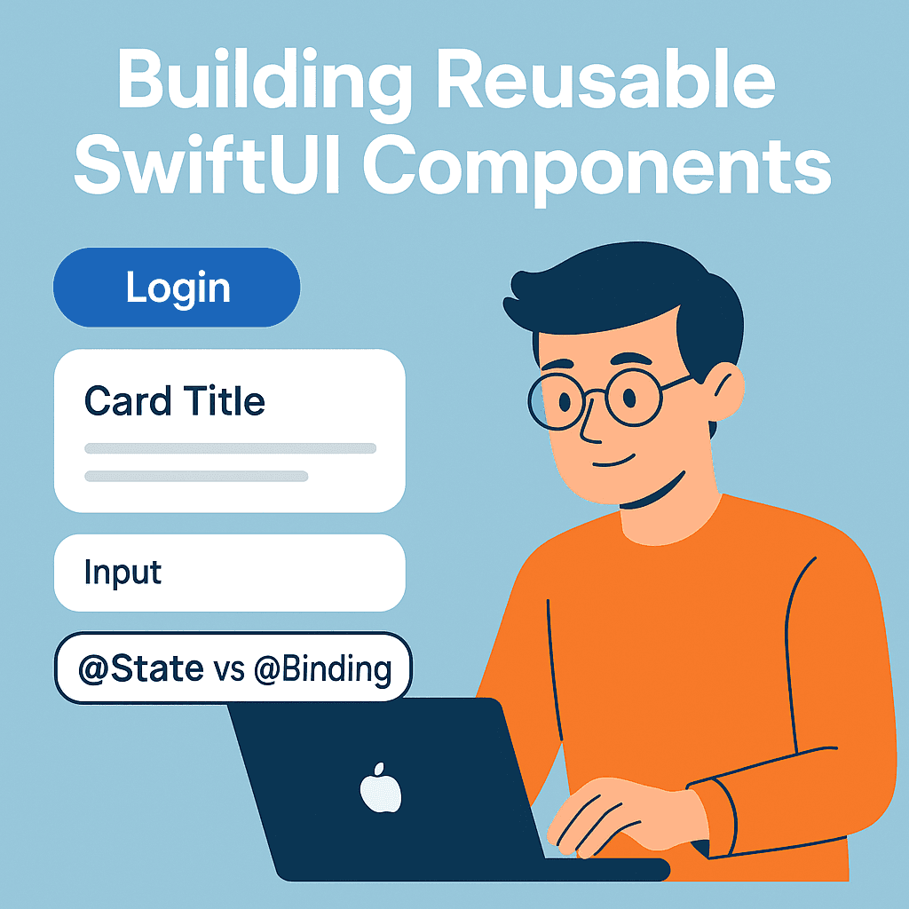

Your designer just updated the primary button color. Now you need to hunt down every single button in your app and update them one by one. There’s got to be a better way, right?
If you’ve ever found yourself scrolling through dozens of SwiftUI files, manually changing colors, fonts, or styling properties across similar UI elements, you’re not alone. This is the classic sign that your app needs reusable components.
The upside? SwiftUI actually makes this way easier than you’d expect — once you’ve seen the pattern, it clicks fast. By the end of this guide, you’ll never have to manually hunt down scattered UI code again.
New to SwiftUI? If you’re just getting started, I recommend checking out my SwiftUI for Beginners in 2025: Build Your First iOS App Step-by-Step guide first — it covers all the fundamentals you’ll need.
**SwiftUI for Beginners in 2025: Build Your First iOS App Step-by-Step** _This step-by-step guide will walk you through building your very first iOS app — no prior experience needed! Learn the…_medium.comhttps://medium.com/swift-pal/swiftui-for-beginners-in-2025-build-your-first-ios-app-step-by-step-400c627f19bc
What you’ll learn:
- Building reusable buttons, cards, and input fields
- Making sense of
@Statevs@Bindingwithout your head spinning - Styling that doesn’t break across views
- How to structure your components without making a mess
Ready to solve that designer color change problem once and for all? Let’s dive in! 💪
Building Your First Reusable Component — The Custom Button 🔘
Let’s start by solving our opening problem with a proper reusable button. Instead of scattered button code throughout your app, we’ll create one component that handles all the variations.
The Problem We’re Solving
Here’s what most developers start with — and why it becomes a nightmare:
// Scattered across different files... 😬
Button("Login") {
    // action
}
.font(.headline)
.foregroundColor(.white)
.padding()
.background(Color.blue)
.cornerRadius(8)

Button("Sign Up") {
    // action
}
.font(.headline)
.foregroundColor(.white)
.padding()
.background(Color.blue)  // Oops, designer changed this to green!
.cornerRadius(8)
When your designer updates the color, you’re hunting through files. Not fun.
Building the CustomButton Component ⚙️
Before we dive into the code, make sure you’re comfortable with basic SwiftUI views and modifiers. If you need a refresher, check out my SwiftUI for Beginners in 2025: Build Your First iOS App Step-by-Step guide first.
**SwiftUI for Beginners in 2025: Build Your First iOS App Step-by-Step** _This step-by-step guide will walk you through building your very first iOS app — no prior experience needed! Learn the…_medium.comhttps://medium.com/swift-pal/swiftui-for-beginners-in-2025-build-your-first-ios-app-step-by-step-400c627f19bc
Let’s create a button that handles different styles and states:
struct CustomButton: View {
    let title: String
    let action: () -> Void
    let style: ButtonStyle
    let isEnabled: Bool

    enum ButtonStyle {
        case primary
        case secondary
        case destructive

        var backgroundColor: Color {
            switch self {
            case .primary: return .blue
            case .secondary: return .gray
            case .destructive: return .red
            }
        }

        var textColor: Color {
            switch self {
            case .primary: return .white
            case .secondary: return .primary
            case .destructive: return .white
            }
        }
    }

    init(
        _ title: String,
        style: ButtonStyle = .primary,
        isEnabled: Bool = true,
        action: @escaping () -> Void
    ) {
        self.title = title
        self.style = style
        self.isEnabled = isEnabled
        self.action = action
    }

    var body: some View {
        Button(action: action) {
            Text(title)
                .font(.headline)
                .foregroundColor(isEnabled ? style.textColor : .gray)
                .padding()
                .frame(maxWidth: .infinity)
                .background(
                    RoundedRectangle(cornerRadius: 8)
                        .fill(isEnabled ? style.backgroundColor : Color.gray.opacity(0.3))
                )
        }
        .disabled(!isEnabled)
    }
}
Using Your CustomButton ✨
Now instead of scattered button code, you have this clean, consistent approach:
// Anywhere in your app
VStack(spacing: 16) {
    CustomButton("Login", style: .primary) {
        // login action
    }

    CustomButton("Cancel", style: .secondary) {
        // cancel action
    }

    CustomButton("Delete Account", style: .destructive) {
        // delete action
    }

    CustomButton("Loading...", isEnabled: false) {
        // disabled state
    }
}
.padding()
The magic? When your designer changes the primary color, you update it in ONE place — the ButtonStyle enum. Every button in your app automatically updates. 🎉
Quick Layout Tip: If you’re not comfortable with maxWidth: .infinity or VStack spacing, my SwiftUI Layout Guide: VStack, HStack, ZStack covers all the positioning fundamentals you'll need.
**SwiftUI Layout Guide: VStack, HStack, ZStack & Grids Explained (2025 Edition)** _Confused about SwiftUI layouts? 🤔 This complete 2025 guide breaks down VStack, HStack, ZStack, and Apple’s official…_medium.comhttps://medium.com/swift-pal/swiftui-layout-guide-vstack-hstack-zstack-grids-explained-2025-edition-285fb89b5de5
Creating a Versatile Card Component 🃏
Cards are everywhere in modern apps — from user profiles to product listings to notification panels. Let’s build a flexible card component that you can reuse across your entire app.
The Card Chaos Problem 📱
Without reusable cards, you end up with inconsistent spacing, shadows, and corner radius throughout your app:
// Profile screen - one style
VStack {
Text("John Doe")
Text("iOS Developer")
}
.padding()
.background(Color.white)
.cornerRadius(12)
.shadow(radius: 2)
// Settings screen - slightly different style 😵💫
VStack {
Text("Notifications")
Toggle("Enable", isOn: .constant(true))
}
.padding(16) // Different padding!
.background(Color.gray.opacity(0.1)) // Different background!
.cornerRadius(8) // Different radius!
.shadow(color: .black.opacity(0.1), radius: 4) // Different shadow!See the problem? Similar cards, but inconsistent styling everywhere.
Building the CustomCard Component ⚙️
Here’s a flexible card that maintains consistency while allowing customization:
struct CustomCard<Content: View>: View {
    let content: Content
    let style: CardStyle

    enum CardStyle {
        case elevated    // With shadow
        case flat        // No shadow
        case bordered    // With border

        var backgroundColor: Color {
            switch self {
            case .elevated, .flat: return Color(.systemBackground)
            case .bordered: return Color(.systemBackground)
            }
        }

        var hasShadow: Bool {
            switch self {
            case .elevated: return true
            case .flat, .bordered: return false
            }
        }

        var hasBorder: Bool {
            switch self {
            case .bordered: return true
            case .elevated, .flat: return false
            }
        }
    }

    init(style: CardStyle = .elevated, @ViewBuilder content: () -> Content) {
        self.style = style
        self.content = content()
    }

    var body: some View {
        content
            .padding(16)
            .background(style.backgroundColor)
            .cornerRadius(12)
            .overlay(
                RoundedRectangle(cornerRadius: 12)
                    .stroke(Color.gray.opacity(0.2), lineWidth: style.hasBorder ? 1 : 0)
            )
            .shadow(
                color: style.hasShadow ? Color.black.opacity(0.1) : Color.clear,
                radius: style.hasShadow ? 4 : 0,
                x: 0,
                y: style.hasShadow ? 2 : 0
            )
    }
}
Using Your CustomCard ✨
Now you can create consistent cards with different content while maintaining the same styling:
// Profile Card
CustomCard(style: .elevated) {
    VStack(alignment: .leading, spacing: 8) {
        Text("John Doe")
            .font(.headline)
        Text("iOS Developer")
            .font(.subheadline)
            .foregroundColor(.secondary)
    }
}

// Settings Card
CustomCard(style: .flat) {
    HStack {
        Text("Notifications")
        Spacer()
        Toggle("Enable", isOn: $notificationsEnabled)
    }
}

// Action Card with Border
CustomCard(style: .bordered) {
    VStack(spacing: 12) {
        Image(systemName: "plus.circle.fill")
            .font(.largeTitle)
            .foregroundColor(.blue)
        Text("Add New Item")
            .font(.headline)
    }
}
Flexible Cards Done Right 🚀
Notice that <Content: View> in our card definition? This is what makes our card super flexible — it can hold ANY SwiftUI content while maintaining consistent styling.
The @ViewBuilder closure lets you pass multiple views naturally, just like you would with a VStack or HStack.
Layout Foundation: The card uses alignment and spacing techniques. If these feel unfamiliar, my SwiftUI Layout Guide: VStack, HStack, ZStack explains all the positioning fundamentals in detail.
Smart Input Fields with State Management 📝
Input fields are tricky in reusable components because they need to communicate data back to their parent views. This is where understanding @State vs @Binding becomes crucial for building truly reusable components.
The Input Field Inconsistency Problem 🤔
Without reusable input components, you end up with scattered validation logic and inconsistent styling:
// Login screen
@State private var email = ""
@State private var emailError = ""
TextField("Email", text: $email)
.textFieldStyle(RoundedBorderTextFieldStyle())
.onChange(of: email) { _, newValue in
if !newValue.contains("@") {
emailError = "Invalid email"
} else {
emailError = ""
}
}
if !emailError.isEmpty {
Text(emailError)
.foregroundColor(.red)
.font(.caption)
}
// Registration screen - different validation logic! 😵💫
@State private var username = ""
@State private var usernameError = ""
TextField("Username", text: $username)
.padding()
.background(Color.gray.opacity(0.1))
.cornerRadius(8)
.onChange(of: username) { _, newValue in
if newValue.count < 3 {
usernameError = "Username too short"
} else {
usernameError = ""
}
}Different styles, scattered validation, repeated error handling code everywhere!
Building the CustomTextField Component ⚙️
Here’s a smart input field that handles validation and consistent styling:
struct CustomTextField: View {
    let title: String
    @Binding var text: String
    let placeholder: String
    let validation: ValidationRule?

    @State private var errorMessage = ""
    @State private var isValid = true

    enum ValidationRule {
        case email
        case minLength(Int)
        case required
        case custom((String) -> String?)

        func validate(_ input: String) -> String? {
            switch self {
            case .email:
                return input.contains("@") && input.contains(".") ? nil : "Please enter a valid email"
            case .minLength(let min):
                return input.count >= min ? nil : "Must be at least \(min) characters"
            case .required:
                return input.isEmpty ? "This field is required" : nil
            case .custom(let validator):
                return validator(input)
            }
        }
    }

    init(
        _ title: String,
        text: Binding<String>,
        placeholder: String = "",
        validation: ValidationRule? = nil
    ) {
        self.title = title
        self._text = text
        self.placeholder = placeholder
        self.validation = validation
    }

    var body: some View {
        VStack(alignment: .leading, spacing: 8) {
            Text(title)
                .font(.headline)
                .foregroundColor(.primary)

            TextField(placeholder, text: $text)
                .padding(12)
                .background(Color(.systemGray6))
                .cornerRadius(8)
                .overlay(
                    RoundedRectangle(cornerRadius: 8)
                        .stroke(isValid ? Color.clear : Color.red, lineWidth: 1)
                )
                .onChange(of: text) { _, newValue in
                    validateInput(newValue)
                }

            if !errorMessage.isEmpty {
                Text(errorMessage)
                    .font(.caption)
                    .foregroundColor(.red)
            }
        }
    }

    private func validateInput(_ input: String) {
        guard let validation = validation else {
            isValid = true
            errorMessage = ""
            return
        }

        if let error = validation.validate(input) {
            isValid = false
            errorMessage = error
        } else {
            isValid = true
            errorMessage = ""
        }
    }
}
Using Your CustomTextField ✨
Now you can create consistent input fields with built-in validation:
struct LoginView: View {
    @State private var email = ""
    @State private var password = ""
    @State private var username = ""

    var body: some View {
        VStack(spacing: 20) {
            CustomTextField(
                "Email",
                text: $email,
                placeholder: "Enter your email",
                validation: .email
            )

            CustomTextField(
                "Password",
                text: $password,
                placeholder: "Enter password",
                validation: .minLength(8)
            )

            CustomTextField(
                "Username",
                text: $username,
                placeholder: "Choose username",
                validation: .custom { input in
                    if input.contains(" ") {
                        return "Username cannot contain spaces"
                    }
                    return input.count < 3 ? "Username too short" : nil
                }
            )
        }
        .padding()
    }
}
Understanding @State vs @Binding 🔗
Here’s the key insight for reusable components:
- @State: The component owns and manages the data internally
- @Binding: The component receives data from its parent and can modify it
In our CustomTextField, we use:
@Binding var text: So the parent view controls the actual text value@State private var errorMessage: Internal state that only the component needs to know about
This pattern allows the parent to access the input text while letting the component handle its own validation state.
Deep Dive: Want to master all the property wrappers and state management patterns? Check out my comprehensive guide: Mastering SwiftUI State Management: @State, @Binding, @ObservedObject, and More (2025 Edition).
**Mastering SwiftUI State Management in 2025: @State, @Binding, @ObservedObject, @StateObject — Plus…** _Confused between @State, @Binding, @ObservedObject, @StateObject, @Observable and @Bindable in SwiftUI? You’re not…_medium.comhttps://medium.com/swift-pal/mastering-swiftui-state-management-state-vs-binding-vs-observedobject-vs-stateobject-2025-e1f751aa038d
Styling and Consistency 🎨
Now that we have our core components, let’s solve the styling consistency problem. Instead of applying the same modifiers everywhere, we’ll create reusable styling patterns that keep your entire app looking cohesive.
The Styling Mess Problem 🎭
Without consistent styling patterns, your app ends up looking like this:
// Screen 1 - some shadow style
Text("Welcome")
.font(.title)
.foregroundColor(.blue)
.padding()
.background(Color.white)
.cornerRadius(8)
.shadow(radius: 2)
// Screen 2 - different shadow, different padding 😵💫
Text("Settings")
.font(.title)
.foregroundColor(.blue)
.padding(16) // Different padding!
.background(Color.white)
.cornerRadius(12) // Different corner radius!
.shadow(color: .gray, radius: 4, x: 0, y: 2) // Different shadow!Every screen has slightly different styling, making your app feel inconsistent and unprofessional.
Creating Custom ViewModifiers ⚙️
ViewModifiers are SwiftUI’s secret weapon for consistent styling. Here’s how to create reusable style patterns:
struct CardStyle: ViewModifier {
    let backgroundColor: Color
    let cornerRadius: CGFloat
    let shadowRadius: CGFloat

    init(
        backgroundColor: Color = Color(.systemBackground),
        cornerRadius: CGFloat = 12,
        shadowRadius: CGFloat = 4
    ) {
        self.backgroundColor = backgroundColor
        self.cornerRadius = cornerRadius
        self.shadowRadius = shadowRadius
    }

    func body(content: Content) -> some View {
        content
            .padding(16)
            .background(backgroundColor)
            .cornerRadius(cornerRadius)
            .shadow(
                color: Color.black.opacity(0.1),
                radius: shadowRadius,
                x: 0,
                y: 2
            )
    }
}

struct HeaderTextStyle: ViewModifier {
    func body(content: Content) -> some View {
        content
            .font(.title2)
            .fontWeight(.semibold)
            .foregroundColor(.primary)
            .multilineTextAlignment(.leading)
    }
}

struct PrimaryButtonStyle: ViewModifier {
    let isEnabled: Bool

    init(isEnabled: Bool = true) {
        self.isEnabled = isEnabled
    }

    func body(content: Content) -> some View {
        content
            .font(.headline)
            .foregroundColor(.white)
            .padding()
            .frame(maxWidth: .infinity)
            .background(isEnabled ? Color.blue : Color.gray)
            .cornerRadius(8)
            .opacity(isEnabled ? 1.0 : 0.6)
    }
}

// Extension to make them easy to use
extension View {
    func cardStyle(
        backgroundColor: Color = Color(.systemBackground),
        cornerRadius: CGFloat = 12,
        shadowRadius: CGFloat = 4
    ) -> some View {
        modifier(CardStyle(
            backgroundColor: backgroundColor,
            cornerRadius: cornerRadius,
            shadowRadius: shadowRadius
        ))
    }

    func headerText() -> some View {
        modifier(HeaderTextStyle())
    }

    func primaryButton(isEnabled: Bool = true) -> some View {
        modifier(PrimaryButtonStyle(isEnabled: isEnabled))
    }
}
Using Your Custom ViewModifiers ✨
Now you can apply consistent styling across your entire app with simple, readable modifiers:
struct ProfileView: View {
    var body: some View {
        VStack(spacing: 20) {
            // Consistent card styling
            VStack(alignment: .leading, spacing: 12) {
                Text("Profile Information")
                    .headerText()  // 👈 Consistent header style

                Text("John Doe")
                    .font(.headline)
                Text("iOS Developer")
                    .font(.subheadline)
                    .foregroundColor(.secondary)
            }
            .cardStyle()  // 👈 Consistent card style

            // Another card with the same styling
            VStack(alignment: .leading, spacing: 12) {
                Text("Account Settings")
                    .headerText()  // 👈 Same header style everywhere

                Toggle("Dark Mode", isOn: .constant(true))
                Toggle("Notifications", isOn: .constant(false))
            }
            .cardStyle()  // 👈 Same card style everywhere

            // Consistent button styling
            Button("Save Changes") {
                // action
            }
            .primaryButton()  // 👈 Consistent button style
        }
        .padding()
    }
}
The Power of Consistent Design Systems 🚀
With ViewModifiers, you get:
- Single source of truth: Change the card style once, update everywhere
- Readable code:
.cardStyle()is much cleaner than 5 lines of modifiers - Design system ready: Easy to implement your designer’s style guide
- Theme support: Pass different colors for light/dark mode
When your designer says “make all cards have 16pt corner radius instead of 12pt,” you change it in ONE place and every card in your app updates automatically. 🎉
Pro Tip: Environment-Based Styling 💡
You can even make your modifiers respond to the environment:
struct AdaptiveCardStyle: ViewModifier {
    @Environment(\.colorScheme) var colorScheme

    func body(content: Content) -> some View {
        content
            .padding(16)
            .background(colorScheme == .dark ? Color(.systemGray6) : Color.white)
            .cornerRadius(12)
            .shadow(
                color: colorScheme == .dark ? Color.clear : Color.black.opacity(0.1),
                radius: 4,
                x: 0,
                y: 2
            )
    }
}
Advanced Styling: Want to dive deeper into SwiftUI styling, theming, and design systems? My comprehensive SwiftUI Styling Guide: Colors, Fonts, and Why Order Matters (2025 Edition) covers everything from basic styling to advanced theme management.
**SwiftUI Styling Guide: Fonts, Themes, Dark Mode & Why Order Matters** _🎨 Give your SwiftUI app a complete style upgrade! Learn how to add custom fonts, build adaptive themes, support dark…_medium.comhttps://medium.com/swift-pal/swiftui-styling-guide-fonts-themes-dark-mode-why-order-matters-7fbf5389d384
Best Practices & Wrap-up 🚀
You’ve built three solid reusable components, but let’s make sure you’re following the patterns that will keep your code maintainable as your app grows.
Code Organization That Scales 📁
Don’t dump all your components in one file! Here’s a clean organization structure:
Components/
├── Buttons/
│   ├── CustomButton.swift
│   └── ButtonStyles.swift
├── Cards/
│   ├── CustomCard.swift
│   └── CardModifiers.swift
├── Forms/
│   ├── CustomTextField.swift
│   └── ValidationRules.swift
└── Modifiers/
    ├── ViewModifiers.swift
    └── StyleExtensions.swift
Performance Considerations ⚡
Keep Components Lightweight:
- Avoid heavy computations in your component’s
body - Use
@Stateonly when the component needs to own the data - Prefer
@Bindingwhen the parent should control the state
// ❌ Heavy computation in body
var body: some View {
    Text(processComplexData())  // This runs on every re-render!
}

// ✅ Compute once, store result
@State private var processedData = ""

var body: some View {
    Text(processedData)
        .onAppear {
            processedData = processComplexData()
        }
}
Component Testing Strategy 🧪
Make your components testable by keeping logic separate:
// ✅ Testable validation logic
extension CustomTextField.ValidationRule {
    static func validateEmail(_ email: String) -> String? {
        return email.contains("@") && email.contains(".") ? nil : "Invalid email"
    }
}

// Now you can unit test this separately from the UI
class ValidationTests: XCTestCase {
    func testEmailValidation() {
        XCTAssertNil(CustomTextField.ValidationRule.validateEmail("test@example.com"))
        XCTAssertNotNil(CustomTextField.ValidationRule.validateEmail("invalid"))
    }
}
Common Pitfalls to Avoid 🚫
- Over-customization: Don’t add every possible parameter “just in case”
- Tight coupling: Components shouldn’t know about specific view controllers or models
- Inconsistent naming: Use clear, consistent naming conventions
- Missing defaults: Always provide sensible default values
Your Component Library Checklist ✅
Before you ship any reusable component, make sure it has:
- ✅ Clear purpose: One component, one responsibility
- ✅ Consistent API: Parameters follow the same naming patterns
- ✅ Default values: Works with minimal configuration
- ✅ Documentation: Clear examples of how to use it
- ✅ Error handling: Graceful handling of edge cases
- ✅ Accessibility: VoiceOver and accessibility support
Where to Go Next? 👇
SwiftUI Component Architecture Mastery: Generic Components & Advanced State Management
Master generic components and advanced state patterns that work with any data type. From protocol-based design to complex state flows — build components that scale with enterprise-level apps
**SwiftUI Component Architecture Mastery: Generic Components & Advanced State Management (2025)** _Master generic components and advanced state patterns that work with any data type. From protocol-based design to…_medium.comhttps://medium.com/swift-pal/swiftui-component-architecture-mastery-generic-components-advanced-state-management-2025-a0588940485a
What’s Next? 🎯
You now have the foundation for building consistent, reusable SwiftUI components! Here are your next steps:
- Practice: Build components for your current project
- Expand: Try creating components for navigation, loading states, or data visualization
- Level up: Ready for enterprise-scale component patterns? Check out my follow-up guide: “Advanced SwiftUI Component Architecture: Scalable Patterns for Professional Apps”
Quick Recap 📝
Today you learned how to:
- ✅ Build a flexible CustomButton with multiple states
- ✅ Create a versatile CustomCard that works with any content
- ✅ Design smart CustomTextField with built-in validation
- ✅ Apply consistent styling with custom ViewModifiers
- ✅ Organize and optimize your components for production
The next time your designer changes that primary button color, you’ll just smile and update it in one place. Your future self will thank you! 😊
🎉 Enjoyed this article? Your support means the world to me!
💬 Drop a comment below! I love hearing about your experiences and answering questions
🎬 Subscribe on Youtube and become early subscribers of my channel: https://www.youtube.com/@swift-pal
💼 Let’s connect on LinkedIn for more professional insights: https://www.linkedin.com/in/karan-pal
Happy coding! 🚀
New articles, straight to your inbox.
No spam, no filler — just new writing on iOS, the web, and AI when it ships. Unsubscribe anytime.
Keep reading
Your CPU Has More Cores Than Your Job Can Use
Some work splits cleanly across hundreds of cores. Other work is a chain of steps where every new step has to wait for the last one to finish.
ReadYour Password Isn’t as Random as You Think
Crack-time calculators measure the size of a theoretical password space—not how people actually choose passwords or how attackers search them.
Read