SwiftUI Layout Guide: VStack, HStack, ZStack & Grids Explained (2025 Edition)
Confused about SwiftUI layouts? 🤔 This complete 2025 guide breaks down VStack, HStack, ZStack, and Apple’s official Grid & LazyGrid views…
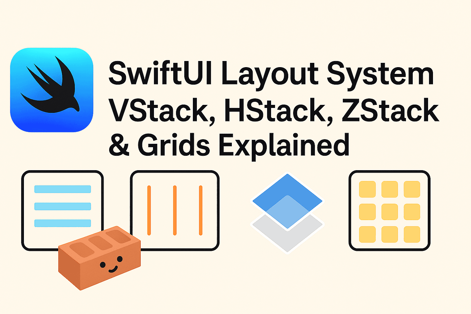

🖐️ Introduction: Stack Attack! 🧱
So you just started with SwiftUI and now you’re stuck wondering:
Why is my button floating in space? Why is my text overlapping my image? Why is everything so… vertically confused?! 😅
Welcome to the wonderful world of SwiftUI layouts — where VStack, HStack, and ZStack are your new besties, and Grid is the cool new kid Apple introduced in iOS 16 to clean things up.
In this 2025 guide, we’ll walk you through the SwiftUI layout system, covering:
- Directional stacks:
VStack,HStack, andZStack - Static Grid for clean 2D layouts
- Scrollable, responsive layouts with
LazyVGridandLazyHGrid - And a few layout gotchas that’ll save your sanity 🧘
By the end, you’ll have a layout toolkit so sharp, your UI will practically align itself. Let’s get stacking!
🧱 VStack & HStack: The Bread and Butter of SwiftUI
Before we get all fancy with grids and overlays, let’s talk about the OG layout duo in SwiftUI:
VStack— stacks views verticallyHStack— stacks views horizontally
Together, they’re the foundation of almost every SwiftUI layout you’ll build. Think of them as Lego bricks for your interface 🧱
🧭 Basic Usage
VStack {
    Text("Username")
    TextField("Enter your username", text: $username)
    Button("Submit") {
        print("Submitted!")
    }
}
That’s a neat vertical stack — no AutoLayout trauma required.
Want a row of items instead?
HStack {
    Image(systemName: "star.fill")
    Text("Featured")
}
🎛️ Alignment & Spacing
By default:
VStackcenters items horizontallyHStackcenters items vertically- Spacing is… nice, but sometimes not your kind of nice
You can customize both:
VStack(alignment: .leading, spacing: 12) {
    Text("Email")
    TextField("you@example.com", text: $email)
}
Want to make it stretch?
HStack {
    Text("Cancel")
    Spacer()
    Text("Save")
}
Ah yes, the mighty Spacer() — SwiftUI’s invisible boundary ninja 🥷
🚧 Common Gotchas
- Forgetting alignment makes stuff look… weirdly centered.
- Nested stacks can get messy fast. Tip: use groups or custom views if it’s getting hard to follow.
- Want multiple lines in an
HStack? Wrap your text in aVStackor uselineLimit(nil)and a frame.
✅ When to Use
- Layouts with a few related items stacked in one direction.
- Most UI sections: forms, headers, toolbars, input fields.
✨ Real-Life Example: A Quick Login Form
VStack(spacing: 16) {
    Text("Welcome Back! 👋")
        .font(.title)

    TextField("Email", text: $email)
        .textFieldStyle(.roundedBorder)

    SecureField("Password", text: $password)
        .textFieldStyle(.roundedBorder)

    Button("Login") {
        // Handle login
    }
    .buttonStyle(.borderedProminent)
}
.padding()
Simple. Clean. No storyboard heartbreaks. 💔
🎥 Video Tutorial: Complete Visual Guide
If you prefer learning through visual examples, I’ve created a comprehensive 4-minute video tutorial that walks through all these layout concepts with live code demonstrations:
The video covers:
- Real-time demonstrations of alignment and spacing
- Grid layout implementations with immediate visual feedback
- Performance comparisons between Grid and LazyGrid
Watch the tutorial to see these layouts in action and follow along with the complete code examples.
🧲 ZStack: SwiftUI’s Overlap Trick
Where VStack and HStack put things side-by-side or top-to-bottom, **ZStack** lets you stack views on top of each other — like digital pancakes 🥞.
Great for:
- Backgrounds
- Overlays
- Badges
- Modals
- That one element that just needs to float above everything else
🧭 Basic Usage
ZStack {
    Color.blue
    Text("Hello, ZStack!")
        .foregroundColor(.white)
        .font(.title)
}
👉 This paints a blue background with white text over it. Easy peasy.
🪄 View Order Matters
Views are drawn from back to front, top to bottom.
ZStack {
    Image("profile")// you'll need image added to Assets
    Circle().stroke(Color.blue, lineWidth: 4)
    Text("👑")
}
The image sits at the back, the circle outlines it, and the emoji is the cherry on top 👑.
🎯 Alignment in ZStack
By default, everything in a ZStack is centered. You can tweak that:
ZStack(alignment: .topLeading) {
    Color.gray.opacity(0.2)
    Text("Top Left")
}
.frame(width: 200, height: 100)
Want a floating badge on an avatar? ZStack + alignment = perfection.
✨ Real-Life Example: Avatar with Online Badge
ZStack(alignment: .bottomTrailing) {
    Image("avatar") // you'll need image added to Assets
        .resizable()
        .background(Color.blue)
        .frame(width: 100, height: 100)
        .clipShape(Circle())

    Circle()
        .fill(Color.green)
        .frame(width: 20, height: 20)
        .overlay(Circle().stroke(Color.white, lineWidth: 2))
}
Now your app looks like it has friends. 🙌
✅ When to Use
- You need overlapping layers
- You’re building cards, badges, image overlays, or background effects
🧮 Grid & GridRow: For When VStack Isn’t Enough
So you’ve nested a VStack inside an HStack, inside another VStack, inside a prayer — and it’s still not aligning right? 😩
Enter Grid, Apple’s solution for building clean, structured 2D layouts without relying on scrollable views. Think Excel, but less trauma.
🧭 Basic Usage
Grid {
    GridRow {
        Text("🗓️").bold()
        Text("Event")
        Text("Date")
    }
    GridRow {
        Text("🎉")
        Text("Launch Party")
        Text("June 30")
    }
}
Each GridRow is a row, and its children fill columns in order.
✨ Layout Control & Spacing
Need to control alignment or spacing?
Grid(alignment: .leading, horizontalSpacing: 20, verticalSpacing: 12) {
    GridRow {
        Text("Name").bold()
        Text("Score").bold()
    }
    GridRow {
        Text("Karan")
        Text("99")
    }
}
Super readable. Super flexible. Super underused (for now).
📐 Spanning Columns
Need a view to take up more space? Use .gridCellColumns().
Grid {
    GridRow {
        Text("User Profile").gridCellColumns(2)
    }
    GridRow {
        Text("Name")
        Text("Karan")
    }
}
Now you’re thinking in Grid. Welcome to layout enlightenment 🧘
🔁 No Scroll? No Problem.
This grid is static, so it doesn’t scroll. It’s perfect for:
- Dashboards
- Forms
- Summary cards
- Fixed-size components
✅ When to Use
- You want clean, aligned layouts with rows and columns
- You’re tired of Stack-ception (
VStackinHStackinZStackin 😵💫) - You don’t need scrolling
🧪 Real-Life Example: A Dashboard Summary
Grid {
    GridRow {
        Text("💵 Income").bold()
        Text("$12,340")
    }
    GridRow {
        Text("📉 Expenses").bold()
        Text("$5,200")
    }
    GridRow {
        Text("💰 Savings").bold()
        Text("$7,140")
    }
}
.font(.headline)
.padding()
Minimal effort. Maximum clarity. And your finance UI just got ✨ bougie.
Up next: **Lazy Grids** — for when your content scrolls longer than your screen (and your attention span). Ready to go? 📜
🧘 LazyVGrid & LazyHGrid: When Your Content Refuses to Sit Still
Need to build a gallery? A product catalog? A giant list of emoji-themed cards?
You’re not doing that with Grid unless you want your app to explode in RAM.
Enter the Lazy Grids:
LazyVGrid— scrolls vertically, items arranged in a gridLazyHGrid— scrolls horizontally, rows in a scrollable line
They’re like LazyVStack/LazyHStack — but with columns and rows. And less memory crying. 😅
🧭 Basic Usage: LazyVGrid
let columns = [
    GridItem(.flexible()),
    GridItem(.flexible()),
    GridItem(.flexible())
]

ScrollView {
    LazyVGrid(columns: columns, spacing: 30) {
        ForEach(1..<25) { index in
            Text("Item \(index)")
                .frame(height: 100)
                .frame(maxWidth: .infinity)
                .background(.blue.opacity(0.2))
                .cornerRadius(8)
        }
    }
    .padding()
}
🧠 SwiftUI only renders views as they appear on screen — which means fast scrolling, no lag, and your battery thanks you.

🔄 GridItem Configs
GridItem supports:
.fixed(100)— same width always.flexible()— shares space wit
let columns = [
    GridItem(.adaptive(minimum: 100))
]
Useful for screens of varying sizes (especially on iPad or landscape mode).
🔁 LazyHGrid
Same vibe. Just horizontal.
let rows = [
    GridItem(.fixed(100)),
    GridItem(.fixed(100))
]

ScrollView(.horizontal) {
    LazyHGrid(rows: rows, spacing: 12) {
        ForEach(0..<20) { i in
            RoundedRectangle(cornerRadius: 8)
                .fill(Color.pink)
                .frame(width: 100)
        }
    }
    .padding()
}
Great for:
- Story carousels
- Horizontal image scrollers
- And that row of icons no one asked for but you just had to add 😅
✅ When to Use
- You have a dynamic list of items
- You want scrollable content in a grid format
- You care about performance and adaptive layout
✨ Real-Life Example: Image Grid
let columns = [
    GridItem(.adaptive(minimum: 80))
]

ScrollView {
    LazyVGrid(columns: columns, spacing: 10) {
        ForEach(images, id: \.self) { name in
            Image(name)
                .resizable()
                .scaledToFit()
                .frame(height: 100)
                .cornerRadius(6)
        }
    }
    .padding()
}
Just like that — a responsive photo grid with zero stress and 100% SwiftUI goodness 📸
🧠 When to Use What (A Stack Showdown)
Think of this as your SwiftUI layout cheat sheet — minus the table, because Medium and tables are not besties 😬
🥪 VStack
- Use when you want to stack things vertically
- Great for: forms, buttons, login screens, settings
- Analogy: Making a sandwich — one layer at a time
🍱 HStack
- Use when you want to line things up horizontally
- Great for: toolbars, icons with text, side-by-side buttons
- Analogy: Bento box — neat horizontal compartments
🍰 ZStack
- Use when you need layers on top of each other
- Great for: overlays, badges, backgrounds, complex cards
- Analogy: Cake layers — with frosting and sprinkles on top 🎂
🧮 Grid + GridRow (iOS 16+)
- Use when you want a clean, static 2D layout
- Great for: dashboards, schedules, form previews
- Analogy: Excel sheet — structured but not scrollable
📸 LazyVGrid/LazyHGrid
- Use when your data scrolls and there’s a lot of it
- Great for: image galleries, product grids, tag clouds
- Analogy: Instagram feed — performance-optimized, flexible layout
🤔 Not Sure Which to Use?
If your layout _is simple and static_ → Stack it.
If you need _rows & columns_ → Grid it.
If you need _scrolling_ → LazyGrid it.
If it’s _on top of something else_ → ZStack to the rescue!
🔚 Conclusion: Stack Smarter, Not Harder
Congratulations! You now speak fluent SwiftUI layout 😎
You know when to use a humble VStack, when to bust out LazyVGrid, and when to sprinkle in some ZStack magic.
Whether you’re building a login screen, an Instagram clone, or the next great budgeting app — your layout choices just got a whole lot smarter.
No more nested HStack inside VStack inside ZStack inside panic. You got this.
📣 What’s Next: Mastering SwiftUI State
Now that your layouts are cleaner than your camera roll after a spring-clean, it’s time to learn how to actually make your UI respond to user actions.
Up next in the SwiftUI Mastery Series:
👉 Mastering State in SwiftUI: @State, @Binding, @ObservedObject, and @StateObject Made Simple
Because beautifully stacked views mean nothing if they don’t do anything 😅
**Mastering SwiftUI State Management: @State vs @Binding vs @ObservedObject vs @StateObject (2025…** _Confused between @State, @Binding, @ObservedObject, and @StateObject in SwiftUI? You’re not alone. This 2025 guide…_medium.comhttps://medium.com/swift-pal/mastering-swiftui-state-management-state-vs-binding-vs-observedobject-vs-stateobject-2025-e1f751aa038d
🎉 Enjoyed this article? Your support means the world to me!
💬 Drop a comment below! I love hearing about your experiences and answering questions
🎬 Subscribe on Youtube and become early subscribers of my channel: https://www.youtube.com/@swift-pal
💼 Let’s connect on LinkedIn for more professional insights: https://www.linkedin.com/in/karan-pal
Happy coding! 🚀
New articles, straight to your inbox.
No spam, no filler — just new writing on iOS, the web, and AI when it ships. Unsubscribe anytime.
Keep reading
Your CPU Has More Cores Than Your Job Can Use
Some work splits cleanly across hundreds of cores. Other work is a chain of steps where every new step has to wait for the last one to finish.
ReadYour Password Isn’t as Random as You Think
Crack-time calculators measure the size of a theoretical password space—not how people actually choose passwords or how attackers search them.
Read