SwiftUI Design System: A Complete Guide to Building Consistent UI Components (2025)
From scattered colors and inconsistent spacing to a unified, scalable component library
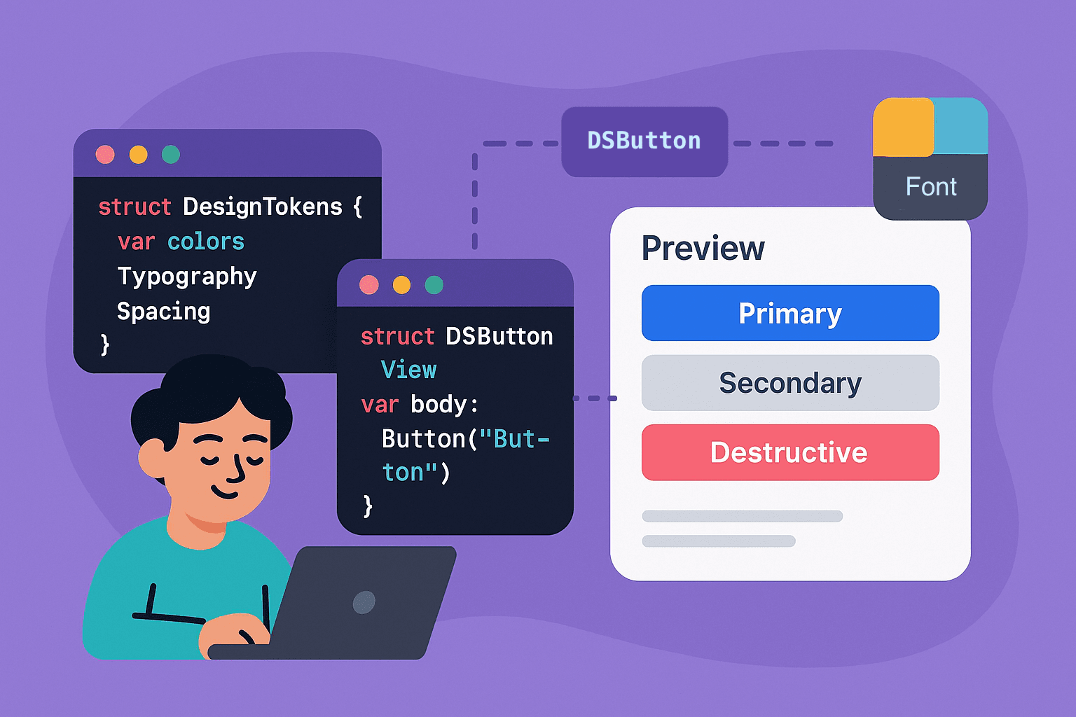

You know what’s frustrating? Opening up a SwiftUI project and seeing Color.blue in one view, Color(hex: "#007AFF") in another, and some random Color.accentColor sprinkled throughout. It's like each view is speaking its own language.
I’ve been there. We’ve all been there.
Building apps without a proper design system feels productive at first — you’re moving fast, shipping features, getting stuff done. But then you need to update that shade of blue across your entire app, and suddenly you’re playing hide-and-seek with hardcoded values scattered across 47 different files.
Here’s the thing though — design systems in SwiftUI aren’t just about avoiding color chaos. They’re about creating this shared vocabulary between you, your teammates, and even future-you who won’t remember why that padding is 18 points instead of 16.
Look, I get it. Design systems can feel like overkill when you’re building your first app or working on a quick prototype. But trust me on this one — the time you invest upfront pays dividends later. We’re talking about writing less code, fixing bugs in one place instead of hunting them down, and actually enjoying the process of building interfaces.
So here’s what we’re gonna do. We’ll build a complete design system from scratch — design tokens, reusable components, theming patterns, the whole nine yards. By the end, you’ll have something that actually scales with your app instead of fighting against it.
🏗️ Foundation First: Design Tokens
Alright, let’s start with the boring stuff that’s actually the most important — design tokens. Think of these as the DNA of your design system. Colors, typography, spacing, corner radii — all the basic building blocks that every component will inherit from.
Now, here’s where most people mess up. They create a massive Constants.swift file with hundreds of static values, and then wonder why their design system feels rigid and impossible to maintain. Don't do that.
Instead, we’re gonna be smart about this. We’ll use SwiftUI’s environment system to make our tokens dynamic and context-aware.
But first — let’s talk about organization. You’ve got two main options here:
Option 1: Swift Package (recommended for reusability) Create a separate Swift package for your design system. This makes it easy to share across multiple projects and keeps your design system isolated from your app logic.
Option 2: In-App Organization (simpler for single projects) Keep everything within your main app bundle using folders to organize your design system components.
For this guide, I’ll show the Swift package approach, but if you’re keeping everything in your main app, just replace bundle: .module with bundle: .main or remove , bundle: .module in the examples below.
Colors That Actually Make Sense
First up — colors. And no, I don’t mean creating 50 different shades of blue with names like primaryBlueLight and primaryBlueDarker. That's a recipe for madness.
Colors That Actually Make Sense
First up — colors. And no, I don’t mean creating 50 different shades of blue with names like primaryBlueLight and primaryBlueDarker. That's a recipe for madness.
import SwiftUI

public struct DSColors {
    // Semantic colors - what they mean, not what they look like
    public static let primary = Color("Primary", bundle: .module)
    public static let secondary = Color("Secondary", bundle: .module)
    public static let accent = Color("Accent", bundle: .module)

    // System colors - for different states and contexts
    public static let success = Color("Success", bundle: .module)
    public static let warning = Color("Warning", bundle: .module)
    public static let error = Color("Error", bundle: .module)

    // Surface colors - for backgrounds and containers
    public static let background = Color("Background", bundle: .module)
    public static let surface = Color("Surface", bundle: .module)
    public static let surfaceVariant = Color("SurfaceVariant", bundle: .module)

    // Text colors - readable on different backgrounds
    public static let onPrimary = Color("OnPrimary", bundle: .module)
    public static let onSurface = Color("OnSurface", bundle: .module)
    public static let onSurfaceSecondary = Color("OnSurfaceSecondary", bundle: .module)
}
Extra: Supporting Themes and Dark Mode
The easiest way to support themes in your design system is to use Xcode’s Color Sets in your asset catalog. This gives you automatic light/dark mode support without any extra code.
Here’s how to set it up:
Create Color Sets in Assets.xcassets
- Right-click in your asset catalog → New Color Set
- Name it something semantic like “Primary” or “Surface”
- In the Attributes Inspector, set Appearances to “Any, Dark”
- Set your light mode color in the “Any Appearance” slot
- Set your dark mode color in the “Dark Appearance” slot
Reference them in your code
public struct DSColors {
    public static let primary = Color("Primary")
    public static let secondary = Color("Secondary")
    public static let surface = Color("Surface")
    // etc.
}
That’s it! SwiftUI automatically picks the right color based on the current appearance. No environment values, no theme protocols, no complex switching logic.
Typography That Scales
Typography is where things get interesting. SwiftUI’s dynamic type is powerful, but you need to set it up right from the beginning.
import SwiftUI

public struct DSTypography {
    // Display styles - for heroes and big statements
    public static let displayLarge = Font.largeTitle.weight(.bold)
    public static let displayMedium = Font.title.weight(.bold)
    public static let displaySmall = Font.title2.weight(.bold)

    // Headline styles - for section headers
    public static let headlineLarge = Font.title2.weight(.semibold)
    public static let headlineMedium = Font.title3.weight(.semibold)
    public static let headlineSmall = Font.headline.weight(.semibold)

    // Body styles - for main content
    public static let bodyLarge = Font.body
    public static let bodyMedium = Font.callout
    public static let bodySmall = Font.caption

    // Label styles - for UI elements
    public static let labelLarge = Font.callout.weight(.medium)
    public static let labelMedium = Font.caption.weight(.medium)
    public static let labelSmall = Font.caption2.weight(.medium)
}
This approach:
- Uses built-in text styles that automatically support dynamic type
- Works immediately without any setup
- Follows Apple’s typography guidelines
Spacing That Breathes
Now for spacing — probably the most underrated part of any design system. Consistent spacing is what makes your app feel polished instead of thrown together.
import SwiftUI

public struct DSSpacing {
    // Base unit - everything derives from this
    private static let baseUnit: CGFloat = 4

    // Spacing scale - powers of our base unit
    public static let xs = baseUnit * 1      // 4pt
    public static let sm = baseUnit * 2      // 8pt
    public static let md = baseUnit * 4      // 16pt
    public static let lg = baseUnit * 6      // 24pt
    public static let xl = baseUnit * 8      // 32pt
    public static let xxl = baseUnit * 12    // 48pt
    public static let xxxl = baseUnit * 16   // 64pt

    // Semantic spacing - for specific use cases
    public static let buttonPadding = md
    public static let cardPadding = lg
    public static let sectionSpacing = xl
    public static let screenPadding = md
}
This mathematical approach isn’t just for show — it creates visual rhythm. Everything aligns nicely because all your spacing values are multiples of the same base unit. It’s like having a grid system for your entire app.
Actually, let me show you how this all comes together in practice…
Making It All Work Together
Here’s where the rubber meets the road. Having these tokens is great, but they’re useless if they’re not easy to use. Let’s create an environment-based system that makes these values accessible throughout your app.
import SwiftUI

public struct DesignTokens {
    public let colors: DSColors.Type = DSColors.self
    public let typography: DSTypography.Type = DSTypography.self
    public let spacing: DSSpacing.Type = DSSpacing.self
}

// Environment key for accessing design tokens
private struct DesignTokensKey: EnvironmentKey {
    static let defaultValue = DesignTokens()
}

public extension EnvironmentValues {
    var designTokens: DesignTokens {
        get { self[DesignTokensKey.self] }
        set { self[DesignTokensKey.self] = newValue }
    }
}
Now here’s the cool part — you can access all your design tokens from any view using the environment:
struct SomeView: View {
    @Environment(\.designTokens) private var tokens

    var body: some View {
        Text("Hello, Design System!")
            .font(tokens.typography.headlineMedium)
            .foregroundColor(tokens.colors.onSurface)
            .padding(tokens.spacing.md)
    }
}
Tokens don’t need to be passed, easy to use and easy to modify.
🧱 Building Your First Component
Now, let’s build something real. We’re gonna start with buttons because, let’s be honest, buttons are everywhere and they’re usually the first thing that gets inconsistent in a project.
But here’s the thing about buttons in SwiftUI — the built-in Button view is pretty basic. It gives you text, maybe an icon, and that's about it. For a proper design system, we need something more flexible.
The Button Foundation
First, let’s think about what makes a good button component. We need different styles (primary, secondary, destructive), different sizes (small, medium, large), and the ability to handle loading states. Oh, and it needs to work with dynamic type and accessibility.
import SwiftUI

public struct DSButton: View {
    public enum Style {
        case primary
        case secondary
        case destructive
        case ghost
    }

    public enum Size {
        case small
        case medium
        case large
    }

    private let title: String
    private let style: Style
    private let size: Size
    private let isLoading: Bool
    private let action: () -> Void

    public init(
        _ title: String,
        style: Style = .primary,
        size: Size = .medium,
        isLoading: Bool = false,
        action: @escaping () -> Void
    ) {
        self.title = title
        self.style = style
        self.size = size
        self.isLoading = isLoading
        self.action = action
    }

    public var body: some View {
        Button(action: action) {
            HStack {
                if isLoading {
                    ProgressView()
                        .progressViewStyle(CircularProgressViewStyle())
                        .scaleEffect(0.8)
                }

                Text(title)
                    .font(fontForSize)
                    .fontWeight(fontWeightForStyle)
            }
            .foregroundColor(foregroundColor)
            .padding(paddingForSize)
            .background(backgroundColor)
            .cornerRadius(cornerRadiusForSize)
        }
        .disabled(isLoading)
        .opacity(isLoading ? 0.6 : 1.0)
    }
}
Now, I could put all the styling logic inline, but that’s gonna make this view massive and hard to maintain. Instead, let’s use computed properties to keep things organized:
// ...existing code...

private extension DSButton {
    var fontForSize: Font {
        switch size {
        case .small: return DSTypography.labelMedium
        case .medium: return DSTypography.labelLarge
        case .large: return DSTypography.bodyLarge
        }
    }

    var fontWeightForStyle: Font.Weight {
        switch style {
        case .primary, .destructive: return .semibold
        case .secondary, .ghost: return .medium
        }
    }

    var foregroundColor: Color {
        switch style {
        case .primary: return DSColors.onPrimary
        case .secondary: return DSColors.primary
        case .destructive: return DSColors.onPrimary
        case .ghost: return DSColors.primary
        }
    }

    var backgroundColor: Color {
        switch style {
        case .primary: return DSColors.primary
        case .secondary: return DSColors.surface
        case .destructive: return DSColors.error
        case .ghost: return Color.clear
        }
    }

    var paddingForSize: EdgeInsets {
        switch size {
        case .small:
            return EdgeInsets(top: DSSpacing.sm, leading: DSSpacing.md, bottom: DSSpacing.sm, trailing: DSSpacing.md)
        case .medium:
            return EdgeInsets(top: DSSpacing.md, leading: DSSpacing.lg, bottom: DSSpacing.md, trailing: DSSpacing.lg)
        case .large:
            return EdgeInsets(top: DSSpacing.lg, leading: DSSpacing.xl, bottom: DSSpacing.lg, trailing: DSSpacing.xl)
        }
    }

    var cornerRadiusForSize: CGFloat {
        switch size {
        case .small: return 6
        case .medium: return 8
        case .large: return 12
        }
    }
}
#Preview {
DSButton("DSButton", style: .destructive, size: .medium, isLoading: false) {
// Do something
}
}
This is looking pretty good, but we’re missing something important — accessibility. SwiftUI makes this easy, but you have to remember to add it.
Button(action: action) {
  // Button UI code
}
.disabled(isLoading)
.opacity(isLoading ? 0.6 : 1.0)
.accessibilityLabel(title)
.accessibilityHint(isLoading ? "Loading" : "")
.accessibilityAddTraits(isLoading ? .notEnabled : .isButton)
The accessibility additions are small but important. Screen readers will announce the button title, indicate when it’s loading, and properly identify it as a button or disabled element.
Now let’s see different styles of this button in action:
struct ContentView: View {
    @State private var isLoading = false

    var body: some View {
        VStack(spacing: DSSpacing.lg) {
            DSButton("Primary Button", style: .primary) {
                print("Primary tapped")
            }

            DSButton("Secondary Button", style: .secondary) {
                print("Secondary tapped")
            }

            DSButton("Loading Button", style: .primary, isLoading: isLoading) {
                isLoading = true
                DispatchQueue.main.asyncAfter(deadline: .now() + 2) {
                    isLoading = false
                }
            }

            DSButton("Small Destructive", style: .destructive, size: .small) {
                print("Delete tapped")
            }
        }
        .padding()
    }
}
Pretty clean, right? One component, multiple styles, consistent behavior across your entire app.
🎯 The Design System Architecture
Now that we have our foundation tokens set up, let’s talk about the bigger picture. A design system isn’t just a collection of colors and fonts — it’s a systematic approach to building consistent interfaces.
The key insight here is that design systems work best when they follow clear architectural patterns. This is where understanding reusable component architecture becomes crucial — but we’re not just building components, we’re building a system that generates components.
**How to Build Reusable SwiftUI Components: A Complete 2025 Guide** _Master the art of DRY code in SwiftUI. Build once, use everywhere — complete with state management, styling best…_medium.comhttps://medium.com/swift-pal/how-to-build-reusable-swiftui-components-a-complete-2025-guide-a792c2d4b9ce
Think of it like this: instead of creating 50 different button styles, you create one flexible button system that can express 50 different styles through configuration. That’s the difference between reusable components and a design system.
🏗️ Component Architecture Patterns
Here’s where most design systems fall apart — they focus on individual components instead of the relationships between components. Your design system needs to establish clear patterns for:
Composition over Configuration Instead of creating specialized components for every use case, build base components that compose well together. A card component shouldn’t have built-in button styles — it should work seamlessly with your button system.
Consistent APIs All your components should follow similar patterns for props, styling, and behavior. If your button uses a size prop, your text input should too. This reduces cognitive load and makes the system easier to adopt.
Contextual Adaptation Components should adapt to their context automatically. A button inside a card should know to use appropriate contrast ratios without you having to specify it manually.
This is where professional component architecture principles really shine — you’re not just building components, you’re building a system that ensures consistency across your entire application.
**SwiftUI Component Architecture Mastery: Generic Components & Advanced State Management (2025)** _Master generic components and advanced state patterns that work with any data type. From protocol-based design to…_medium.comhttps://medium.com/swift-pal/swiftui-component-architecture-mastery-generic-components-advanced-state-management-2025-a0588940485a
🚀 Implementation Strategy
Alright, you’ve got your design tokens, you understand the patterns, and you’re ready to actually use this thing. But here’s where most design systems fail — not in the building, but in the rolling out.
The biggest mistake I see teams make is trying to convert their entire app to use the design system overnight. That’s a recipe for frustration, bugs, and ultimately abandoning the whole project.
Start Small, Think Big
Pick one feature or screen to convert first. Something visible but not mission-critical. Maybe your settings screen or a secondary flow. This gives you a chance to work out the kinks without breaking your main user journey.
Here’s what that looks like in practice:
// Before: Inconsistent styling scattered everywhere
struct SettingsView: View {
    var body: some View {
        VStack {
            Text("Settings")
                .font(.title)
                .foregroundColor(.black)
                .padding(.top, 20)

            Button("Save Changes") {
                // action
            }
            .foregroundColor(.white)
            .background(Color.blue)
            .cornerRadius(8)
            .padding(.horizontal, 24)
            .padding(.vertical, 12)
        }
    }
}

// After: Using your design system
struct SettingsView: View {
    var body: some View {
        VStack(spacing: DSSpacing.lg) {
            Text("Settings")
                .font(DSTypography.headlineLarge)
                .foregroundColor(DSColors.onSurface)

            DSButton("Save Changes", style: .primary) {
                // action
            }
        }
        .padding(DSSpacing.md)
    }
}
See the difference? The second version is not only cleaner, but it automatically adapts to dark mode, scales with dynamic type, and follows your established visual hierarchy.
Migration Pattern
For existing apps, you don’t need to rewrite everything. Create a migration strategy that lets old and new coexist:
import SwiftUI

public struct Constants {
    // Map your old color names to new semantic ones
    static let oldBlue = DSColors.primary
    static let oldGray = DSColors.secondary
    static let oldRed = DSColors.error

    // Map old font usage to new typography scale
    static let oldTitle = DSTypography.headlineLarge
    static let oldSubtitle = DSTypography.bodyLarge
    static let oldCaption = DSTypography.bodySmall
}
This lets you gradually replace old styling without breaking existing screens.
Team Adoption Strategy
Here’s the reality — even the best design system is useless if your team doesn’t use it. Make adoption as easy as possible:
Create Code Snippets Add Xcode code snippets for common patterns:
DSButton("<#title#>", style: .<#style#>) {
    <#action#>
}
Document with Examples For complex components, include usage examples right in the code:
/// A flexible button component that adapts to different contexts
///
/// Usage:
/// ```swift
/// DSButton("Save", style: .primary) {
///     saveData()
/// }
/// ```
///
/// Available styles: .primary, .secondary, .destructive, .ghost
public struct DSButton: View {
    // ... implementation
}
Measuring Success
Finally, track whether your design system is actually working:
- Consistency: Are new screens using the design system components?
- Speed: Are developers shipping features faster?
- Maintenance: Are visual bugs decreasing?
- Adoption: What percentage of your UI uses design system components?
The goal isn’t perfection on day one. It’s steady progress toward a more consistent, maintainable codebase.
For teams looking to package their design system for reuse across multiple projects, the principles are the same — start small, make adoption easy, and measure what matters.
**How to Build and Publish Swift Packages: Turn Your Code into Reusable Libraries (2025 Edition)** _Transform your copy-paste code into professional Swift libraries. Complete guide to package creation, testing…_medium.comhttps://medium.com/swift-pal/how-to-build-and-publish-swift-packages-turn-your-code-into-reusable-libraries-2025-edition-cb8f752e16b1
That’s it. You now have a complete design system that scales with your app and makes your team more productive. The hard part isn’t building it — it’s sticking with it. But trust me, once you experience the joy of fixing a visual bug in one place and seeing it update everywhere, you’ll never go back to the old way.
🎬 From Theory to Practice: Complete Visual Guide
Building a design system can feel overwhelming when you’re staring at a blank Xcode project. Where do you actually start? How do you structure the files? What does the final architecture really look like?
I’ve created a comprehensive video tutorial that breaks down every concept we’ve covered here into clear, visual presentations. Using carefully crafted slides and code examples, the tutorial walks you through the complete implementation — from setting up your first design tokens to organizing a professional component library that scales.
What you’ll see: Clean, focused presentations of each concept with complete code examples you can copy directly into your projects. No distractions, no live coding fumbles — just clear explanations of how to implement semantic color systems, mathematical spacing scales, and flexible component APIs.
The video covers additional implementation strategies we couldn’t fit here: alternative approaches to token organization, different ways to structure your Swift packages, and practical migration paths from existing codebases. You’ll see the complete architecture laid out visually, making it easier to understand how all the pieces fit together.
Perfect for visual learners who want to see the big picture before diving into implementation. The slide-based format lets you pause at any point to implement concepts at your own pace, with clear code examples that show exactly what goes where.
Sometimes the best way to understand a complex system is to see it presented clearly, one piece at a time.
🎉 Enjoyed this article? Your support means the world to me!
💬 Drop a comment below! I love hearing about your experiences and answering questions
🎬 Subscribe on Youtube and become early subscribers of my channel: https://www.youtube.com/@swift-pal
💼 Let’s connect on LinkedIn for more professional insights: https://www.linkedin.com/in/karan-pal
Happy coding! 🚀
New articles, straight to your inbox.
No spam, no filler — just new writing on iOS, the web, and AI when it ships. Unsubscribe anytime.
Keep reading
Your CPU Has More Cores Than Your Job Can Use
Some work splits cleanly across hundreds of cores. Other work is a chain of steps where every new step has to wait for the last one to finish.
ReadYour Password Isn’t as Random as You Think
Crack-time calculators measure the size of a theoretical password space—not how people actually choose passwords or how attackers search them.
Read