Make Your SwiftUI Buttons Interactive: Animation Guide for iOS Developers
Create Smooth, Responsive Button Effects That Users Love to Tap
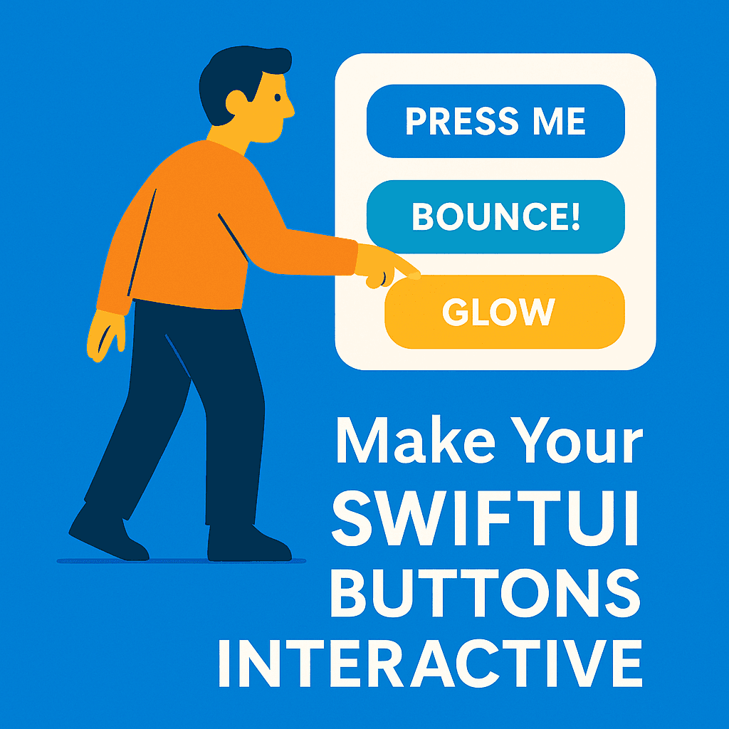

You know what’s interesting? I was using a banking app last week, and every time I tapped a button, it felt… dead. No feedback, no acknowledgment that I’d actually pressed anything. It made me second-guess whether my taps were registering, especially when transferring money. That’s when it hit me — button animations aren’t just pretty decorations, they’re essential communication tools.
Look, I get it. When you’re building an iOS app, animations can feel like the cherry on top — nice to have, but not essential. But here’s the thing I’ve learned after shipping several SwiftUI apps: users don’t just want your buttons to work, they want to feel like they’re working.
SwiftUI makes this surprisingly straightforward. Gone are the days of wrestling with UIView.animate and completion blocks. Now you can create button animations that feel smooth and responsive with just a few lines of code. And honestly? Once you start adding these micro-interactions, going back to static buttons feels wrong.
In this guide, I’ll walk you through everything from basic scale effects to complex multi-state animations. We’ll start simple and build up to the kind of button interactions you see in polished, professional apps. By the end, you’ll have a toolkit of animation patterns that’ll make your users actually enjoy tapping your buttons.
Ready? Let’s make some buttons that people love to press.
🎯 SwiftUI Animation Fundamentals
Alright, let’s get our hands dirty. If you’ve been working with SwiftUI for a while, you’ve probably stumbled across animation modifiers and thought “I’ll figure this out later.” Well, later is now, and I promise it’s simpler than you think.
The beautiful thing about SwiftUI animations is that they’re declarative, just like everything else in SwiftUI. You don’t tell the system how to animate — you tell it what the end state should look like, and SwiftUI figures out the motion.
Here’s the most basic button animation you can create:
struct AnimatedButton: View {
    @State private var isPressed = false

    var body: some View {
        Button("Tap Me") {
            // Button action here
        }
        .scaleEffect(isPressed ? 0.95 : 1.0)
        .onLongPressGesture(minimumDuration: 0, maximumDistance: .infinity, pressing: { pressing in
            withAnimation(.easeInOut(duration: 0.1)) {
                isPressed = pressing
            }
        }, perform: {})
    }
}
Now, I know what you’re thinking — “Why the long press gesture instead of just using the button action?” Great question. The button action only fires when the tap completes, but we want visual feedback the moment the user touches down. This gesture approach gives us that immediate response.
The magic happens in that withAnimation block. We're telling SwiftUI: "Hey, whenever isPressed changes, animate the transition over 0.1 seconds with an ease-in-out curve." The .scaleEffect modifier responds to this state change by smoothly scaling between 95% and 100% size.
Here’s what’s happening step by step: when the user touches the button, pressing becomes true, triggering the animation to scale down to 95%. When they lift their finger, pressing becomes false, and we animate back to 100% scale. The whole thing feels natural and responsive.
The timing is crucial here. 0.1 seconds is fast enough to feel immediate but slow enough for users to actually see the feedback. Any longer and it feels sluggish; any shorter and it might be too subtle to notice.
🚀 Essential Button Animation Patterns
Okay, so we’ve got the basics down, but let’s be honest — a simple scale effect is just the beginning. I’ve been experimenting with different button animations for months now, and there are a few patterns that keep showing up in well-designed apps. Let me show you the ones that actually make a difference.
The Classic Press Effect
This is your bread and butter. Most users expect some kind of “press down” feedback
struct PressButton: View {
    @State private var isPressed = false

    var body: some View {
        Button("Press Me") {
            // Your action here
        }
        .padding()
        .background(Color.blue)
        .foregroundColor(.white)
        .cornerRadius(10)
        .scaleEffect(isPressed ? 0.95 : 1.0)
        .onLongPressGesture(minimumDuration: 0, maximumDistance: .infinity, pressing: { pressing in
            withAnimation(.easeInOut(duration: 0.1)) {
                isPressed = pressing
            }
        }, perform: {})
    }
}
The Bounce Effect
Want something with more personality? Add a little spring to your step:
struct BounceButton: View {
    @State private var isPressed = false

    var body: some View {
        Button("Bounce!") {
            // Your action here
        }
        .padding()
        .background(Color.green)
        .foregroundColor(.white)
        .cornerRadius(10)
        .scaleEffect(isPressed ? 1.2 : 1.0)
        .onLongPressGesture(minimumDuration: 0, maximumDistance: .infinity, pressing: { pressing in
            withAnimation(.spring(response: 0.3, dampingFraction: 0.6)) {
                isPressed = pressing
            }
        }, perform: {})
    }
}
Notice how I switched to .spring() animation? That gives us that satisfying bounce feeling. The response controls how long the spring takes, and dampingFraction controls how much it oscillates.
The Glow Effect
Sometimes you want the button to feel more… magical. Here’s a glow effect that works great for primary actions:
struct GlowButton: View {
    @State private var isPressed = false

    var body: some View {
        Button("Glow") {
            // Your action here
        }
        .padding()
        .background(Color.purple)
        .foregroundColor(.white)
        .cornerRadius(10)
        .shadow(color: isPressed ? .purple.opacity(0.6) : .clear, radius: isPressed ? 10 : 0)
        .scaleEffect(isPressed ? 0.98 : 1.0)
        .onLongPressGesture(minimumDuration: 0, maximumDistance: .infinity, pressing: { pressing in
            withAnimation(.easeInOut(duration: 0.15)) {
                isPressed = pressing
            }
        }, perform: {})
    }
}
The shadow creates that glow effect, and combining it with a subtle scale change makes the whole button feel alive.
⚡ Intermediate Techniques
Alright, now we’re getting into the fun stuff. The patterns I just showed you will cover 80% of your button animation needs, but sometimes you want something more sophisticated. Here’s where SwiftUI really starts to shine.
Custom Timing Curves
You know how some animations just feel better than others? A lot of that comes down to timing curves. SwiftUI gives you several built-in options, but you can also create custom ones:
struct CustomTimingButton: View {
    @State private var isPressed = false

    var body: some View {
        Button("Custom Curve") {
            // Your action here
        }
        .padding()
        .background(Color.orange)
        .foregroundColor(.white)
        .cornerRadius(10)
        .scaleEffect(isPressed ? 0.92 : 1.0)
        .onLongPressGesture(minimumDuration: 0, maximumDistance: .infinity, pressing: { pressing in
            withAnimation(.timingCurve(0.2, 0.8, 0.2, 1.0, duration: 0.15)) {
                isPressed = pressing
            }
        }, perform: {})
    }
}
Those numbers in timingCurve are Bezier control points. This particular curve starts slow, speeds up, then eases out smoothly. It's subtle, but it makes the animation feel more natural.
Chained Animations
Sometimes you want multiple effects to happen in sequence. Here’s a much cleaner approach — a button that pulses when tapped:
struct PulseButton: View {
    @State private var scale: CGFloat = 1.0
    @State private var opacity: Double = 1.0

    var body: some View {
        Button("Pulse") {
            triggerPulse()
        }
        .padding()
        .background(Color.red)
        .foregroundColor(.white)
        .cornerRadius(10)
        .scaleEffect(scale)
        .opacity(opacity)
    }

    private func triggerPulse() {
        // First animation: scale down quickly
        withAnimation(.easeIn(duration: 0.1)) {
            scale = 0.9
            opacity = 0.7
        }

        // Second animation: bounce back bigger
        DispatchQueue.main.asyncAfter(deadline: .now() + 0.1) {
            withAnimation(.spring(response: 0.3, dampingFraction: 0.4)) {
                scale = 1.05
                opacity = 1.0
            }
        }

        // Final animation: settle to normal
        DispatchQueue.main.asyncAfter(deadline: .now() + 0.5) {
            withAnimation(.easeOut(duration: 0.2)) {
                scale = 1.0
            }
        }
    }
}
This creates a satisfying three-part animation: compress → expand → settle. Each phase has its own timing and feel, creating a much more engaging interaction than a simple press effect.
State-Driven Animations
Here’s something really powerful — buttons that animate based on app state, not just user interaction:
struct StateButton: View {
    @State private var isLoading = false
    @State private var isSuccess = false

    var body: some View {
        Button(buttonText) {
            performAction()
        }
        .padding()
        .background(buttonColor)
        .foregroundColor(.white)
        .cornerRadius(10)
        .scaleEffect(isSuccess ? 1.1 : 1.0)
        .animation(.spring(response: 0.3, dampingFraction: 0.6), value: isSuccess)
        .animation(.easeInOut(duration: 0.2), value: isLoading)
    }

    private var buttonText: String {
        if isLoading { return "Loading..." }
        if isSuccess { return "Success!" }
        return "Submit"
    }

    private var buttonColor: Color {
        if isLoading { return .gray }
        if isSuccess { return .green }
        return .blue
    }

    private func performAction() {
        isLoading = true

        // Simulate network request
        DispatchQueue.main.asyncAfter(deadline: .now() + 2) {
            isLoading = false
            isSuccess = true

            DispatchQueue.main.asyncAfter(deadline: .now() + 1) {
                isSuccess = false
            }
        }
    }
}
This button morphs through different states — normal, loading, success — with appropriate animations for each transition. Users get clear feedback about what’s happening without any additional UI elements.
🔥 Advanced Interactive Patterns
Now we’re getting into the territory where your buttons start feeling like they belong in a $10 million app. These patterns take a bit more work, but the payoff in user experience is huge.
Long Press with Progress Indication
You know those “hold to confirm” buttons you see in banking apps? Here’s how to build one:
struct LongPressButton: View {
    @State private var isPressed = false
    @State private var progress: Double = 0.0
    @State private var isComplete = false

    var body: some View {
        ZStack {
            // Background
            RoundedRectangle(cornerRadius: 12)
                .fill(Color.red)
                .frame(width: 200, height: 50)

            // Progress fill
            RoundedRectangle(cornerRadius: 12)
                .fill(Color.green)
                .frame(width: 200 * progress, height: 50)
                .animation(.linear(duration: 0.1), value: progress)
                .clipShape(RoundedRectangle(cornerRadius: 12))

            // Text
            Text(isComplete ? "Done!" : "Hold to Delete")
                .foregroundColor(.white)
                .font(.headline)
        }
        .scaleEffect(isPressed ? 0.98 : 1.0)
        .onLongPressGesture(minimumDuration: 2.0, maximumDistance: 50) {
            // Action completed
            withAnimation(.spring()) {
                isComplete = true
            }
            resetAfterDelay()
        } onPressingChanged: { pressing in
            withAnimation(.easeInOut(duration: 0.1)) {
                isPressed = pressing
            }

            if pressing {
                startProgress()
            } else {
                resetProgress()
            }
        }
    }

    private func startProgress() {
        withAnimation(.linear(duration: 2.0)) {
            progress = 1.0
        }
    }

    private func resetProgress() {
        withAnimation(.easeOut(duration: 0.2)) {
            progress = 0.0
        }
    }

    private func resetAfterDelay() {
        DispatchQueue.main.asyncAfter(deadline: .now() + 1.0) {
            withAnimation(.easeInOut(duration: 0.3)) {
                isComplete = false
                progress = 0.0
            }
        }
    }
}
This button fills up as you hold it, giving clear feedback about progress. If you let go early, it resets. Perfect for destructive actions.
Multi-State Button Behavior
Here’s a more sophisticated example — a button that cycles through different states with unique animations for each:
struct MultiStateButton: View {
    enum ButtonState {
        case idle, loading, success, error
    }

    @State private var currentState: ButtonState = .idle
    @State private var rotationAngle: Double = 0

    var body: some View {
        Button(action: performAction) {
            HStack {
                if currentState == .loading {
                    Image(systemName: "arrow.2.circlepath")
                        .rotationEffect(.degrees(rotationAngle))
                } else if currentState == .success {
                    Image(systemName: "checkmark")
                } else if currentState == .error {
                    Image(systemName: "xmark")
                }

                Text(buttonText)
            }
            .padding()
            .frame(minWidth: 120)
            .background(buttonColor)
            .foregroundColor(.white)
            .cornerRadius(10)
        }
        .disabled(currentState == .loading)
        .scaleEffect(currentState == .success ? 1.05 : 1.0)
        .animation(.spring(response: 0.3, dampingFraction: 0.6), value: currentState)
        .onChange(of: currentState) { _, state in
            if state == .loading {
                startRotation()
            } else {
                stopRotation()
            }
        }
    }

    private var buttonText: String {
        switch currentState {
        case .idle: return "Submit"
        case .loading: return "Processing..."
        case .success: return "Success!"
        case .error: return "Try Again"
        }
    }

    private var buttonColor: Color {
        switch currentState {
        case .idle: return .blue
        case .loading: return .gray
        case .success: return .green
        case .error: return .red
        }
    }

    private func performAction() {
        currentState = .loading

        // Simulate API call
        DispatchQueue.main.asyncAfter(deadline: .now() + 2) {
            // Randomly succeed or fail for demo
            currentState = Bool.random() ? .success : .error

            // Reset after showing result
            DispatchQueue.main.asyncAfter(deadline: .now() + 2) {
                currentState = .idle
            }
        }
    }

    private func startRotation() {
        withAnimation(.linear(duration: 1.0).repeatForever(autoreverses: false)) {
            rotationAngle = 360
        }
    }

    private func stopRotation() {
        withAnimation(.easeOut(duration: 0.3)) {
            rotationAngle = 0
        }
    }
}
This button provides rich feedback throughout the entire user journey. The loading state has a spinning icon, success gets a satisfying scale bump, and errors are clearly communicated.
Actually, speaking of animations, if you want to dive deeper into SwiftUI’s animation system beyond just buttons, I wrote a comprehensive guide on SwiftUI Animations for Beginners: Learn with Simple Examples (2025 Edition) that covers all the fundamentals.
**SwiftUI Animations for Beginners: Learn with Simple Examples (2025 Edition)** _Animations in SwiftUI feel like magic 🪄 — until your view just snaps instead of fades. In this beginner-friendly…_medium.comhttps://medium.com/swift-pal/swiftui-animations-for-beginners-learn-with-simple-examples-2025-edition-76eb224eb633
💡 Real-World Implementation
Alright, let’s talk about the stuff they don’t teach you in tutorials — the real-world considerations that separate amateur button animations from professional ones.
When NOT to Animate (The Honest Take)
Look, I love animations as much as the next developer, but sometimes they’re just wrong. Here’s when to skip them:
- Accessibility concerns: Some users have motion sensitivity. Always respect
UIAccessibility.isReduceMotionEnabled - Frequent actions: If users are tapping the same button repeatedly (like increment/decrement), constant animations become annoying
- Critical actions: Emergency buttons, panic buttons, anything safety-related should prioritize immediate response over visual flair
- Performance-critical screens: If your screen is already pushing the limits, animations might be the first thing to cut
Here’s how to respect accessibility preferences:
struct AccessibleButton: View {
    @State private var isPressed = false
    @Environment(\.accessibilityReduceMotion) var reduceMotion

    var body: some View {
        Button("Accessible") {
            // Your action
        }
        .padding()
        .background(Color.purple)
        .foregroundColor(.white)
        .cornerRadius(10)
        .scaleEffect(isPressed ? 0.95 : 1.0)
        .onLongPressGesture(minimumDuration: 0, maximumDistance: .infinity, pressing: { pressing in
            if !reduceMotion {
                withAnimation(.easeInOut(duration: 0.1)) {
                    isPressed = pressing
                }
            } else {
                isPressed = pressing
            }
        }, perform: {})
    }
}
Debugging Animation Issues
Animation problems can be frustrating because they’re often timing-related. Here are the most common issues I’ve encountered:
- Animations not triggering: Usually means your state isn’t actually changing. Add some print statements to verify.
- Choppy animations: Often caused by heavy view updates during animation. Try moving expensive operations outside the animation block.
- Unexpected animation behavior: SwiftUI sometimes animates properties you didn’t expect. Use
.animation(.none, value: someProperty)to disable specific animations. - Memory leaks with timers: If you’re using
DispatchQueue.main.asyncAfterin animations, make sure to clean up properly when views disappear.
Building Reusable Animation Components
After building dozens of animated buttons, you’ll want to create reusable components. Here’s a pattern I use:
struct AnimatedButtonStyle: ButtonStyle {
    let animationType: AnimationType

    enum AnimationType {
        case scale, bounce
    }

    func makeBody(configuration: Configuration) -> some View {
        configuration.label
            .scaleEffect(configuration.isPressed ? pressedScale : 1.0)
            .animation(animationStyle, value: configuration.isPressed)
    }

    private var pressedScale: Double {
        switch animationType {
        case .scale: return 0.95
        case .bounce: return 1.1
        }
    }

    private var animationStyle: Animation {
        switch animationType {
        case .scale: return .easeInOut(duration: 0.1)
        case .bounce: return .spring(response: 0.3, dampingFraction: 0.6)
        }
    }
}
Now you can apply consistent animations across your app:
Button("Scale Button") { }
    .buttonStyle(AnimatedButtonStyle(animationType: .scale))
If you’re interested in building more reusable SwiftUI components like this, check out my guide on How to Build Reusable SwiftUI Components: A Complete 2025 Guide.
**How to Build Reusable SwiftUI Components: A Complete 2025 Guide** _Master the art of DRY code in SwiftUI. Build once, use everywhere — complete with state management, styling best…_medium.comhttps://medium.com/swift-pal/how-to-build-reusable-swiftui-components-a-complete-2025-guide-a792c2d4b9ce
🎯 Wrapping Up: Making Buttons That Users Love
So here we are — we’ve gone from basic scale effects to sophisticated multi-state animations. But let me leave you with the most important lesson I’ve learned after shipping multiple SwiftUI apps: the best button animations are the ones users don’t consciously notice.
Think about it. When you use your favorite apps, you’re not thinking “wow, great button animation!” You’re just enjoying a smooth, responsive experience. That’s the goal we’re aiming for.
Quick Recap of What Actually Matters:
- Immediate feedback — Users need to know their tap registered instantly
- Appropriate timing — 0.1–0.2 seconds for most interactions
- Consistent feel — Don’t mix wildly different animation styles in the same app
- Respect accessibility — Always check for reduce motion preferences
- Performance awareness — Too many simultaneous animations kill frame rates
My Personal Recommendations:
Start with simple scale effects. Get those feeling right before you move to complex chained animations. I’ve seen too many developers jump straight to fancy bounces and glows without nailing the basics first.
Use springs sparingly. They’re fun, but they can make your app feel toy-like if overused. Save them for moments of delight, not every button press.
Test on real devices. Animations that feel smooth in the simulator can feel different on actual hardware, especially older devices.
Where to Go Next:
If you want to dive deeper into SwiftUI’s animation capabilities, I highly recommend exploring Advanced Animations in SwiftUI: matchedGeometryEffect, TimelineView, PhaseAnimator & Beyond (2025 Guide). It covers some really powerful techniques that go way beyond button animations.
**Advanced Animations in SwiftUI: matchedGeometryEffect, TimelineView, PhaseAnimator & Beyond (2025…** _In this deep dive, we’re exploring SwiftUI’s most advanced animation tools — from layout-matching transitions and…_medium.comhttps://medium.com/swift-pal/advanced-animations-in-swiftui-matchedgeometryeffect-timelineview-phaseanimator-beyond-2025-da8876b7b0b9
The patterns we’ve covered today will handle 90% of your button animation needs. Master these, and your users will definitely notice the difference — even if they can’t quite put their finger on why your app feels so much more polished.
Now go forth and make some buttons that people actually enjoy tapping!
🎉 Enjoyed this article? Your support means the world to me!
💬 Drop a comment below! I love hearing about your experiences and answering questions
🎬 Subscribe on Youtube and become early subscribers of my channel: https://www.youtube.com/@swift-pal
💼 Let’s connect on LinkedIn for more professional insights: https://www.linkedin.com/in/karan-pal
Happy coding! 🚀
New articles, straight to your inbox.
No spam, no filler — just new writing on iOS, the web, and AI when it ships. Unsubscribe anytime.
Keep reading
Your CPU Has More Cores Than Your Job Can Use
Some work splits cleanly across hundreds of cores. Other work is a chain of steps where every new step has to wait for the last one to finish.
ReadYour Password Isn’t as Random as You Think
Crack-time calculators measure the size of a theoretical password space—not how people actually choose passwords or how attackers search them.
Read