How to Create and Customize Modal Sheets in SwiftUI
A Complete 2025 Guide to Building and Styling Modal Presentations
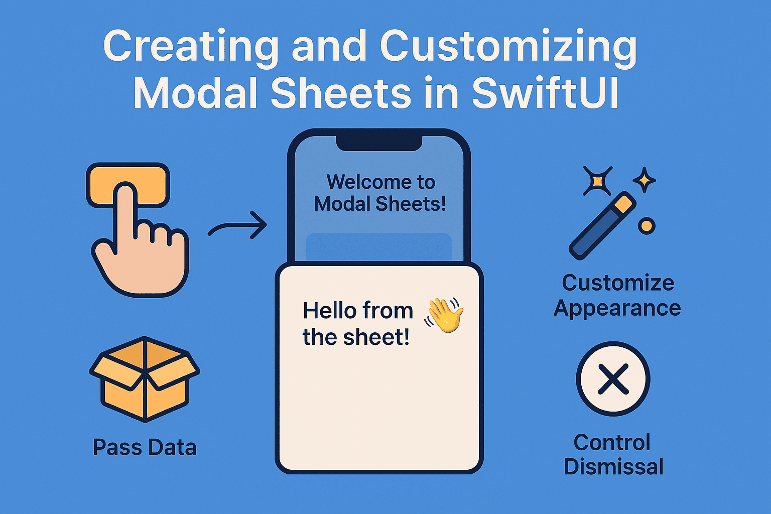

📱 Introduction
You’re using your favorite iOS app, and you tap a button to add something new, edit your profile, or peek at some extra details. What shows up? A sleek little sheet sliding up from the bottom — giving you what you need without taking you away from where you were. That’s modal magic ✨
Modal sheets are everywhere in modern iOS apps — from composing tweets to filling out forms and tweaking settings. They’re so natural, users barely notice them. But as a SwiftUI dev? You should notice, because these sheets are a powerhouse for building clean, intuitive user flows.
In this guide, we’re diving deep into everything SwiftUI offers for modal sheets. Whether you’re just getting started or leveling up with custom detents and dismissal control, you’ll learn how to:
- 🎯 Create basic modal sheets with simple triggers
- 📦 Pass data between the main view and sheet content
- ✨ Customize appearance with detents, corner radius & more
- 🎮 Control user interaction & dismissal behavior
- 🚀 Handle advanced flows like multiple sheets & in-sheet navigation
- 🕳️ Avoid common pitfalls that trip up even experienced devs
From the trusty .sheet() in iOS 14 to the shiny new presentation APIs in iOS 18 — we’re covering it all. By the end, you’ll be building modal sheets that feel modern, polished, and just right for your app.
Let’s start simple and work our way up to the cool stuff 🏗️
🧱 Getting Started: Basic Modal Sheet in SwiftUI
The beauty of SwiftUI modal sheets? Pure simplicity. With just a couple lines of code, you can get a clean, professional-looking sheet that glides up from the bottom like it’s been there all along.
At its core, a SwiftUI modal sheet needs just two things:
- A trigger (usually a button) to open the sheet
- A Boolean state to control whether the sheet is visible
Let’s kick things off with the most basic implementation — clean, minimal, and easy to build on:
struct ContentView: View {
    @State private var showingSheet = false

    var body: some View {
        VStack {
            Text("Welcome to Modal Sheets!")
                .font(.title)
                .padding()

            Button("Show Sheet") {
                showingSheet = true
            }
            .buttonStyle(.borderedProminent)
        }
        .sheet(isPresented: $showingSheet) {
            Text("Hello from the sheet! 👋")
                .font(.title2)
                .padding()
        }
    }
}
🧠 What’s Happening Behind the Scenes?
Let’s break it down step by step:
- State Variable: We declare
@State private var showingSheet = falseto track whether the sheet should be visible. - Trigger: When the button is tapped, it sets
showingSheet = true. - Sheet Modifier: The
.sheet(isPresented: $showingSheet)watches that Boolean. When it flips totrue, the sheet shows up. - Content: Whatever you put inside the closure becomes the content of your modal.
🔁 The magic here is the $showingSheet binding — it’s a two-way street. Set it to true and SwiftUI shows the sheet. Dismiss the sheet (via swipe or tap outside), and SwiftUI flips it right back to false for you. Clean and automatic.
💡 Pro Tip: Understanding how state flows in SwiftUI is key to building smooth, bug-free UIs. Want to dive deeper into @State, @Binding, and other property wrappers? Check out our full guide on mastering SwiftUI state management — it covers everything you need to know about managing data flow in your apps.
**Mastering SwiftUI State Management in 2025: @State, @Binding, @ObservedObject, @StateObject — Plus…** _Confused between @State, @Binding, @ObservedObject, @StateObject, @Observable and @Bindable in SwiftUI? You’re not…_medium.comhttps://medium.com/swift-pal/mastering-swiftui-state-management-state-vs-binding-vs-observedobject-vs-stateobject-2025-e1f751aa038d
That’s it — your first modal sheet is up and running! 🎉
Clean, simple, and incredibly useful. But we’re just getting started.
In the next section, we’ll make things more dynamic by passing data between views — because a sheet that knows why it’s being shown is way more powerful than one that just shows up. Let’s level it up!
📦 How to Present Sheets with Data
Boolean-triggered sheets are perfect for simple cases — but real-world apps? They usually need more context. Maybe you’re editing a profile, viewing product details, or opening a form with pre-filled info. That’s where item-based sheet presentation shines 💡
Instead of toggling with a Boolean, you can present a sheet using optional data. When the optional has a value, SwiftUI shows the sheet. When it’s nil, the sheet goes away. Simple as that.
Here’s how it works:
struct User: Identifiable {
var id = UUID().hashValue
let name: String
let email: String
let avatar: String
}
struct ContentView: View {
@State private var selectedUser: User? = nil
let users = [
User(name: "Alice Johnson", email: "alice@example.com", avatar: "👩💻"),
User(name: "Bob Smith", email: "bob@example.com", avatar: "👨🎨"),
User(name: "Carol Davis", email: "carol@example.com", avatar: "👩🔬")
]
var body: some View {
NavigationView {
List(users, id: \.email) { user in
HStack {
Text(user.avatar)
.font(.title)
VStack(alignment: .leading) {
Text(user.name)
.font(.headline)
Text(user.email)
.font(.caption)
.foregroundColor(.secondary)
}
}
.onTapGesture {
selectedUser = user
}
}
.navigationTitle("Team Members")
}
.sheet(item: $selectedUser) { user in
UserDetailSheet(user: user)
}
}
}
struct UserDetailSheet: View {
let user: User
@Environment(\.dismiss) private var dismiss
var body: some View {
NavigationView {
VStack(spacing: 20) {
Text(user.avatar)
.font(.system(size: 100))
Text(user.name)
.font(.largeTitle)
.bold()
Text(user.email)
.font(.title3)
.foregroundColor(.secondary)
Spacer()
}
.padding()
.navigationTitle("Profile")
.navigationBarTitleDisplayMode(.inline)
.toolbar {
ToolbarItem(placement: .navigationBarTrailing) {
Button("Done") {
dismiss()
}
}
}
}
}
}
🧠 Here’s What’s Happening
- Optional State:
@State private var selectedUser: User? = nilstores either aUserobject ornil. - Item-Based Sheet:
.sheet(item: $selectedUser)presents the sheet only whenselectedUserhas a value. - Data Access: The sheet closure automatically unwraps the
User, so you can access their properties directly — no optional chaining required. - Automatic Dismissal: When the user dismisses the sheet (via swipe or programmatically), SwiftUI resets
selectedUsertonil. No manual cleanup needed!
🧭 The Environment Dismiss Pattern
Notice how we dismiss the sheet from inside the modal? That’s done using @Environment(\.dismiss) — the modern, SwiftUI-native way to handle programmatic dismissal.
It’s cleaner than passing callbacks around, and it works across presentation styles — full screens, popovers, sheets — all of it.
🤔 When Should You Use Each Approach?
- Boolean sheets (
**isPresented**): Perfect for simple content that doesn’t need outside data. - Item-based sheets (
**item**): Ideal when you're passing data to the sheet or customizing content dynamically.
🔄 Passing Multiple Data Types
Need to present the same sheet with different kinds of data? Instead of duplicating logic or stacking conditionals, you can model it all with an enum. It’s clean, flexible, and scales like a champ:
enum SheetContent: Identifiable {
    case newUser
    case editUser(User)
    case settings

    var id: String {
        switch self {
        case .newUser: return "newUser"
        case .editUser(let user): return "editUser-\(user.email)"
        case .settings: return "settings"
        }
    }
}
This pattern keeps your sheet logic tidy and type-safe — and it makes handling different presentation scenarios feel way less messy.
✨ How to Customize Sheet Appearance
Now that you’ve got your sheets showing up and passing data like a pro, let’s make them look the part too. SwiftUI gives you a ton of control over how modal sheets appear — and we’re long past the days of full-screen-or-bust.
Modern iOS apps use smart, adaptive sheet sizing that feels responsive and intentional. That’s where presentation detents come in.
🎛️ Presentation Detents: The Game Changer
Since iOS 16, SwiftUI introduced presentationDetents — and they’re a total game changer. With detents, you control exactly how tall your sheet should be. Instead of always covering the entire screen, you can show just enough to be helpful — and still let users stay grounded in the parent view.
struct ContentView: View {
    @State private var showingSheet = false

    var body: some View {
        VStack {
            Button("Show Customized Sheet") {
                showingSheet = true
            }
            .buttonStyle(.borderedProminent)
        }
        .sheet(isPresented: $showingSheet) {
            SheetWithDetents()
                .presentationDetents([.medium, .large])
                .presentationDragIndicator(.visible)
        }
    }
}

struct SheetWithDetents: View {
    var body: some View {
        VStack(alignment: .leading, spacing: 16) {
            Text("Quick Settings")
                .font(.title2)
                .bold()

            SettingRow(icon: "🌙", title: "Dark Mode", isOn: .constant(false))
            SettingRow(icon: "🔔", title: "Notifications", isOn: .constant(true))
            SettingRow(icon: "📍", title: "Location", isOn: .constant(false))

            Text("Drag up for more options...")
                .font(.caption)
                .foregroundColor(.secondary)

            Spacer()
        }
        .padding()
    }
}

struct SettingRow: View {
    let icon: String
    let title: String
    @Binding var isOn: Bool

    var body: some View {
        HStack {
            Text(icon)
            Text(title)
            Spacer()
            Toggle("", isOn: $isOn)
        }
    }
}
📏 Available Detent Options
.medium: About half the screen — great for quick actions or previews.large: Full height (minus safe areas) — ideal for detailed or scrollable content.fraction(0.3): A custom percentage of the screen — super flexible.height(200): Exact height in points — when you need precise control
🕹️ Multiple Detents = User Control
Want that smooth, draggable sheet behavior like in Apple Maps or Shortcuts? Just provide multiple detents like [.medium, .large].
SwiftUI will let the user drag between those options, and the sheet will snap into place with that oh-so-satisfying sticky motion. Feels great, works even better.
Fine-Tuning the Experience
.sheet(isPresented: $showingSheet) {
    SheetContent()
        .presentationDetents([.medium, .large])
        .presentationDragIndicator(.visible)
        .presentationBackgroundInteraction(.enabled(upThrough: .medium))
        .presentationCornerRadius(20)
}
Here’s what each modifier does (and why you’ll want them):
.presentationDragIndicator(.visible): Shows the little grabber at the top so users know the sheet can be dragged.presentationBackgroundInteraction(.enabled): Allows interaction with the background when the sheet is partially visible (great for medium detents).presentationCornerRadius(20): Adds a custom corner radius — because sharp corners are so iOS 12 😅
📐 iOS 18 Advanced Sizing
If you’re targeting iOS 18+, SwiftUI gives you even more fine-grained control with .presentationSizing(). It lets you define exactly how your sheet should size and behave — perfect for tailoring the experience across device types or accessibility settings.
.sheet(isPresented: $showingSheet) {
    DynamicContent()
        .presentationDetents([.medium, .large])
        .presentationSizing(.fitted) // iOS 18+
}
The .fitted option in iOS 18+ automatically sizes the sheet to fit its content — perfect for dynamic forms or anything that changes height as the user interacts. No guesswork, just a sheet that adjusts itself like a pro.
🧠 Creating Contextual Sheets
Not all content is created equal — and neither are sheets. Here’s a quick vibe check for choosing the right presentation style:
- Settings / Preferences:
.medium— quick access, minimal space - Forms:
.largeor.fitted— give those text fields room to breathe - Details / Galleries: Use multiple detents for a smooth, scrollable reveal
- Quick Actions:
.fraction(0.25)— small, punchy, and out of the way
The key is matching the sheet’s size to the user’s intent. Quick actions should feel lightweight. Deep tasks should feel spacious. When the presentation feels right, the interaction just flows.
🎮 How to Control Sheet Behavior
Sometimes, you need to tighten the reins on your sheet’s behavior. Maybe you’re showing a form that shouldn’t vanish with a casual swipe, or you want to run some cleanup code when the sheet closes. Good news — SwiftUI gives you the tools to handle it all.
🛑 Preventing Accidental Dismissals
Few things are more frustrating than filling out a form… and accidentally swiping it away. Thankfully, SwiftUI lets you disable that behavior:
struct FormSheet: View {
    @State private var name = ""
    @State private var email = ""
    @State private var hasUnsavedChanges = false
    @Environment(\.dismiss) private var dismiss

    var body: some View {
        NavigationView {
            Form {
                Section("Personal Information") {
                    TextField("Name", text: $name)
                        .onChange(of: name) { hasUnsavedChanges = true }

                    TextField("Email", text: $email)
                        .onChange(of: email) { hasUnsavedChanges = true }
                }
            }
            .navigationTitle("Edit Profile")
            .navigationBarTitleDisplayMode(.inline)
            .toolbar {
                ToolbarItem(placement: .navigationBarLeading) {
                    Button("Cancel") {
                        dismiss()
                    }
                }

                ToolbarItem(placement: .navigationBarTrailing) {
                    Button("Save") {
                        // Save logic here
                        dismiss()
                    }
                    .disabled(name.isEmpty || email.isEmpty)
                }
            }
        }
        .interactiveDismissDisabled(hasUnsavedChanges)
    }
}
The .interactiveDismissDisabled(hasUnsavedChanges) modifier is your guardrail. When it’s set to true, users can’t dismiss the sheet by swiping or tapping outside — they must use your buttons. Perfect for saving them (and you) from accidental data loss.
🧹 Custom Dismissal Actions
Need to run cleanup, save a draft, or log an analytics event when a sheet goes away? SwiftUI’s got your back — just use the onDismiss parameter:
struct ContentView: View {
    @State private var showingSheet = false
    @State private var lastDismissalTime: Date?

    var body: some View {
        VStack {
            Button("Show Sheet") {
                showingSheet = true
            }

            if let time = lastDismissalTime {
                Text("Last dismissed: \(time.formatted())")
                    .font(.caption)
                    .foregroundColor(.secondary)
            }
        }
        .sheet(isPresented: $showingSheet, onDismiss: {
            lastDismissalTime = Date()
            print("Sheet was dismissed - performing cleanup")
            // Perfect place for analytics, data saving, etc.
        }) {
            SheetContent()
        }
    }
}
This onDismiss closure runs every time the sheet closes — whether the user swipes it down or you dismiss it programmatically. It’s perfect for things like:
- Saving draft data
- Sending analytics events
- Refreshing parent view content
- Running cleanup operations
🧩 Advanced Background Interactions
With presentation detents, you can even create sheets that don’t block the whole interface. That means users can still interact with the content behind the sheet — super handy for tool panels, filters, or quick-reference views.
.sheet(isPresented: $showingSheet) {
    QuickActionsSheet()
        .presentationDetents([.height(200), .medium])
        .presentationBackgroundInteraction(.enabled(upThrough: .height(200)))
}
When the sheet is at .height(200), users can tap and interact with the content behind it. But as soon as they drag it up to .medium, the background becomes non-interactive. It’s a subtle, smart way to guide user focus — and it feels super intuitive.
🧠 Smart Dismissal Patterns
Here’s a pattern I like to use for sheets that might contain unsaved changes or incomplete forms:
struct SmartFormSheet: View {
    @State private var text = ""
    @State private var showingDiscardAlert = false
    @Environment(\.dismiss) private var dismiss

    private var hasChanges: Bool {
        !text.trimmingCharacters(in: .whitespacesAndNewlines).isEmpty
    }

    var body: some View {
        NavigationView {
            VStack {
                TextEditor(text: $text)
                    .padding()

                Spacer()
            }
            .navigationTitle("New Note")
            .navigationBarTitleDisplayMode(.inline)
            .toolbar {
                ToolbarItem(placement: .navigationBarLeading) {
                    Button("Cancel") {
                        if hasChanges {
                            showingDiscardAlert = true
                        } else {
                            dismiss()
                        }
                    }
                }

                ToolbarItem(placement: .navigationBarTrailing) {
                    Button("Save") {
                        // Save logic
                        dismiss()
                    }
                    .disabled(!hasChanges)
                }
            }
        }
        .interactiveDismissDisabled(hasChanges)
        .alert("Discard Changes?", isPresented: $showingDiscardAlert) {
            Button("Discard", role: .destructive) {
                dismiss()
            }
            Button("Cancel", role: .cancel) { }
        } message: {
            Text("Your changes will be lost if you don't save them.")
        }
    }
}
This pattern creates a smooth, user-friendly experience by:
- Preventing accidental data loss
- Offering clear choices when unsaved changes exist
- Disabling “Save” when there’s nothing to save
- Using familiar iOS alert behavior to reduce friction
💡 Pro Tip: Building great forms is a huge part of crafting good modal sheet experiences. Want to level up your form game? Check out our complete guide to forms and inputs in SwiftUI — from basic text fields to advanced validation tricks.
**Building Forms and Inputs in SwiftUI: TextFields, Pickers, Toggles & More** _Learn how to build beautiful and functional forms in SwiftUI using TextFields, Pickers, Toggles, and more. From simple…_medium.comhttps://medium.com/swift-pal/building-forms-and-inputs-in-swiftui-textfields-pickers-toggles-more-14d1aafcffe9
🚀 How to Handle Advanced Scenarios
As your app grows, so do your sheet needs. You’ll run into situations that go way beyond the basics — like juggling multiple sheets, navigating inside a sheet, or handling dynamic content.
Let’s walk through a few battle-tested patterns that’ll keep your code clean and your users happy.
🧩 Managing Multiple Sheets
One of the trickiest parts of working with sheets? Handling more than one in the same view. The cleanest solution? Use an enum to create a single source of truth — so you know exactly which sheet should be active.
enum SheetType: Identifiable {
    case profile
    case settings
    case newPost
    case editPost(Post)

    var id: String {
        switch self {
        case .profile: return "profile"
        case .settings: return "settings"
        case .newPost: return "newPost"
        case .editPost(let post): return "editPost-\(post.id)"
        }
    }
}

struct ContentView: View {
    @State private var activeSheet: SheetType?

    var body: some View {
        VStack(spacing: 20) {
            Button("Show Profile") {
                activeSheet = .profile
            }

            Button("Show Settings") {
                activeSheet = .settings
            }

            Button("New Post") {
                activeSheet = .newPost
            }
        }
        .buttonStyle(.borderedProminent)
        .sheet(item: $activeSheet) { sheetType in
            switch sheetType {
            case .profile:
                ProfileSheet()
            case .settings:
                SettingsSheet()
            case .newPost:
                NewPostSheet()
            case .editPost(let post):
                EditPostSheet(post: post)
            }
        }
    }
}
This approach gives you a bunch of nice perks:
- ✅ A single
.sheet()modifier — no more stacking conditionals everywhere - 🛡️ Type safety with compiler checks
- 🧼 Clean, centralized state management using just one optional
- 🧪 Easier testing — you can mock sheet states without juggling multiple flags
🧭 Navigation Within Sheets
Sometimes your sheet needs its own navigation — like a multi-step form, a nested settings menu, or even a mini feature flow. In those cases, wrapping the sheet’s content in a NavigationStack is your best friend:
struct SettingsSheet: View {
    @Environment(\.dismiss) private var dismiss

    var body: some View {
        NavigationStack {
            List {
                Section("Account") {
                    NavigationLink("Profile", destination: ProfileSettingsView())
                    NavigationLink("Privacy", destination: PrivacySettingsView())
                    NavigationLink("Notifications", destination: NotificationSettingsView())
                }

                Section("App") {
                    NavigationLink("Appearance", destination: AppearanceSettingsView())
                    NavigationLink("Storage", destination: StorageSettingsView())
                }
            }
            .navigationTitle("Settings")
            .navigationBarTitleDisplayMode(.large)
            .toolbar {
                ToolbarItem(placement: .navigationBarTrailing) {
                    Button("Done") {
                        dismiss()
                    }
                }
            }
        }
        .presentationDetents([.large])
    }
}

struct ProfileSettingsView: View {
    var body: some View {
        Form {
            Section("Personal Information") {
                TextField("Name", text: .constant(""))
                TextField("Email", text: .constant(""))
            }

            Section("Preferences") {
                Toggle("Email Notifications", isOn: .constant(true))
                Toggle("Push Notifications", isOn: .constant(false))
            }
        }
        .navigationTitle("Profile")
        .navigationBarTitleDisplayMode(.inline)
    }
}
🧭 Key Points for Navigation in Sheets
- Use
NavigationStack(iOS 16+) or fall back toNavigationViewfor earlier versions - The
@Environment(\.dismiss)value works from any view in the sheet’s navigation stack - Consider
.largedetents for flows with multiple screens — it gives your content room to breathe
📏 Dynamic Content Sizing
Sometimes your sheet content isn’t static — maybe it grows, shrinks, or depends on what the user selects. Here’s a go-to pattern for making your sheet adapt its size based on dynamic content:
struct DynamicContentSheet: View {
    @State private var items: [String] = ["Item 1", "Item 2"]

    var body: some View {
        VStack(alignment: .leading, spacing: 16) {
            Text("Dynamic List")
                .font(.title2)
                .bold()

            ForEach(items, id: \.self) { item in
                HStack {
                    Text(item)
                    Spacer()
                    Button("Remove") {
                        items.removeAll { $0 == item }
                    }
                    .foregroundColor(.red)
                }
                .padding(.vertical, 4)
            }

            Button("Add Item") {
                items.append("Item \(items.count + 1)")
            }
            .buttonStyle(.borderedProminent)

            Spacer(minLength: 0)
        }
        .padding()
        .presentationDetents([.height(CGFloat(120 + items.count * 44)), .large])
    }
}
This pattern automatically adjusts the sheet’s minimum height based on how much content there is — like the number of items in a list. And if users want more room? They can still drag it up to full size. Flexible and intuitive.
🧵 Sheet Chaining & Nested Presentations
Occasionally, you’ll need to present a sheet from another sheet — think adding a tag while editing a note, or showing a sub-form during a workflow. Use this pattern sparingly (stacked modals can get messy fast), but when you need it, here’s how to do it safely:
struct ParentSheet: View {
    @State private var showingChildSheet = false

    var body: some View {
        NavigationView {
            VStack {
                Text("Parent Sheet Content")

                Button("Show Child Sheet") {
                    showingChildSheet = true
                }
                .buttonStyle(.borderedProminent)
            }
            .navigationTitle("Parent")
            .navigationBarTitleDisplayMode(.inline)
        }
        .sheet(isPresented: $showingChildSheet) {
            ChildSheet()
        }
    }
}

struct ChildSheet: View {
    @Environment(\.dismiss) private var dismiss

    var body: some View {
        VStack {
            Text("Child Sheet")
                .font(.title)

            Button("Dismiss") {
                dismiss()
            }
        }
        .presentationDetents([.medium])
    }
}
✅ Best Practices for Complex Scenarios
- 🔁 Limit nesting depth — try to keep things no deeper than 2 levels
- 🚪 Use consistent dismiss patterns — users should always know how to exit
- 🧭 Think through navigation flow — would a sheet make sense here, or is a push nav clearer?
- 📱 Test on different devices — what looks great on an iPhone Pro Max might feel squished on an SE
💡 Pro Tip: As your sheets grow in complexity, reusable components become your best friend. Want to avoid repeating yourself (and future headaches)? Check out our guide on building reusable SwiftUI components covers patterns that will help you create clean, maintainable sheet components that work across your entire app.
**How to Build Reusable SwiftUI Components: A Complete 2025 Guide** _Master the art of DRY code in SwiftUI. Build once, use everywhere — complete with state management, styling best…_medium.comhttps://medium.com/swift-pal/how-to-build-reusable-swiftui-components-a-complete-2025-guide-a792c2d4b9ce
🕳️ How to Avoid Common Mistakes
Let’s be real — modal sheets are awesome, but they’re also full of gotchas. I’ve run into these myself (more than once 😅), and I’ve seen plenty in the wild.
Here are some of the most common mistakes — and how to dodge them like a pro.
❌ Mistake #1: Multiple Sheet Modifiers
This one pops up all the time: You’ve got multiple .sheet() modifiers scattered across your view. Maybe one for editing, one for creating, one for showing details...
The result? Weird behavior. Sheets not showing. Some dismissing others. Pure chaos.
// ❌ DON'T DO THIS
struct BadExample: View {
    @State private var showingProfile = false
    @State private var showingSettings = false

    var body: some View {
        VStack {
            Button("Profile") { showingProfile = true }
            Button("Settings") { showingSettings = true }
        }
        .sheet(isPresented: $showingProfile) {
            ProfileView()
        }
        .sheet(isPresented: $showingSettings) {
            SettingsView()
        }
    }
}
Why it’s a problem: SwiftUI only allows one sheet per view at a time. If you stack multiple .sheet() modifiers, things get unpredictable fast — some sheets might not appear, others might dismiss unexpectedly, and you’ll be left wondering what went wrong 😵💫
✅ The Fix: Use a single .sheet() tied to an enum-based state (just like we covered earlier). It keeps your logic clean and avoids the chaos.
// ✅ DO THIS INSTEAD
enum SheetContent: Identifiable {
    case profile, settings
    var id: String { String(describing: self) }
}

struct GoodExample: View {
    @State private var activeSheet: SheetContent?

    var body: some View {
        VStack {
            Button("Profile") { activeSheet = .profile }
            Button("Settings") { activeSheet = .settings }
        }
        .sheet(item: $activeSheet) { content in
            switch content {
            case .profile: ProfileView()
            case .settings: SettingsView()
            }
        }
    }
}
❌ Mistake #2: Forgetting Accessibility
Just because your sheet looks great doesn’t mean it works for everyone. It’s easy to forget, but for users relying on VoiceOver or Dynamic Type, a poorly structured sheet can be completely unusable.
And if key controls aren’t reachable or properly labeled? That’s a broken experience — even if the visuals are spot-on.
// ❌ POOR ACCESSIBILITY
Button("Show Details") {
    showingSheet = true
}
.sheet(isPresented: $showingSheet) {
    VStack {
        Image(systemName: "star.fill")
        Text("Great job!")
        Button("OK") { showingSheet = false }
    }
}
✅ The Fix: Add clear accessibility labels and hints to important elements in your sheet.
Use .accessibilityLabel(), .accessibilityHint(), and make sure controls are reachable in the expected order. Test with VoiceOver enabled — it’ll quickly show you what’s missing.
// ✅ ACCESSIBLE
Button("Show Details") {
    showingSheet = true
}
.accessibilityLabel("Show details sheet")
.sheet(isPresented: $showingSheet) {
    VStack {
        Image(systemName: "star.fill")
            .accessibilityLabel("Success")
        Text("Great job!")
        Button("OK") { showingSheet = false }
            .accessibilityLabel("Dismiss details")
    }
    .accessibilityElement(children: .contain)
}
Mistake #3: Inconsistent Dismissal Patterns
Different sheets using different dismissal methods confuses users:
// ❌ INCONSISTENT
// Some sheets use environment dismiss
@Environment(\.dismiss) private var dismiss

// Others use binding manipulation
@Binding var isPresented: Bool

// Others use custom closures
let onDismiss: () -> Void
✅ The Fix: Establish a consistent dismissal experience across your app. Stick with @Environment(\.dismiss) as your go-to — it’s clean, modern, and works from anywhere inside the sheet.
// ✅ CONSISTENT
struct StandardSheet: View {
    @Environment(\.dismiss) private var dismiss

    var body: some View {
        NavigationView {
            // Your content here
            .toolbar {
                ToolbarItem(placement: .navigationBarTrailing) {
                    Button("Done") {
                        dismiss()
                    }
                }
            }
        }
    }
}
⚙️ Performance Best Practices
- 💤 Lazy load content — wait until the sheet appears before fetching data
- 🧹 Dispose of resources — clean up with
onDisappear(timers, network calls, etc.) - 🧱 Keep it modular — break complex sheets into smaller, reusable views
- 📱 Test on older devices — the iPhone 15 Pro might breeze through it, but the iPhone SE will let you know if something’s too heavy
🧪 Quick Debugging Checklist
If your sheet’s acting weird, here’s a fast sanity check:
✅ Only one .sheet() modifier per view ✅ All state variables are properly marked with @State ✅ Bindings are passed using the $ prefix ✅ Your Identifiable types have stable, unique IDs ✅ No strong reference cycles in your closures ✅ Network content has solid error handling
🎯 Wrapping Up
Congrats — you’ve made it through a full tour of SwiftUI modal sheets! From simple .sheet() usage to deeply customized, multi-layered presentations, you now have the tools to craft modal experiences that feel polished, modern, and actually enjoyable to use.
✅ Essential Techniques You’ve Learned
- Creating basic sheets using Boolean state
- Presenting data-driven sheets with optional
Identifiableitems - Customizing sheet appearance using detents, corner radius, and drag behavior
- Controlling dismissal with
@Environment(\.dismiss)andonDismiss - Managing advanced flows like nested sheets and sheet navigation
- Avoiding common gotchas that can break your UX (or your brain)
🚀 Your Next Steps
Now that you’ve got the fundamentals and beyond, here’s how to level up:
- Start Small: Replace old alerts or popovers with proper sheets
- Play with Detents: Try different sizes for different flows
- Build a Sheet Library: Create reusable sheet views to save time across projects
- Test on Real Devices: Especially smaller ones and with accessibility settings on — you’ll catch things the simulator won’t
🔗 Continue Your SwiftUI Journey
Modal sheets are just the beginning. Want to keep leveling up? Here are some next steps worth exploring:
- Navigation Patterns: Understanding when to use sheets vs navigation is crucial. Our guide on SwiftUI navigation, NavigationStack, and TabView will help you choose the right pattern for every scenario.
**SwiftUI Navigation: NavigationStack, Deep Linking, and TabView Explained** _🧭 This guide demystifies SwiftUI’s navigation system — from TabView setups to deep linking and advanced…_medium.comhttps://medium.com/swift-pal/swiftui-navigation-navigationstack-deep-linking-and-tabview-explained-0f905bbb20d4
- Advanced State Management: As your apps grow more complex, proper state management becomes essential. Dive deeper with our comprehensive guide on mastering SwiftUI state management.
**Mastering SwiftUI State Management in 2025: @State, @Binding, @ObservedObject, @StateObject — Plus…** _Confused between @State, @Binding, @ObservedObject, @StateObject, @Observable and @Bindable in SwiftUI? You’re not…_medium.comhttps://medium.com/swift-pal/mastering-swiftui-state-management-state-vs-binding-vs-observedobject-vs-stateobject-2025-e1f751aa038d
- Beautiful Animations: Want to add custom transitions to your sheets? Our SwiftUI animations guide covers everything from basic transitions to advanced effects.
**SwiftUI Animations for Beginners: Learn with Simple Examples (2025 Edition)** _Animations in SwiftUI feel like magic 🪄 — until your view just snaps instead of fades. In this beginner-friendly…_medium.comhttps://medium.com/swift-pal/swiftui-animations-for-beginners-learn-with-simple-examples-2025-edition-76eb224eb633
💡 Pro Tips for Success
Keep these principles in mind as you build — they’ll save you time, frustration, and support a great user experience:
- Consistency is key — pick interaction patterns and stick with them
- User intent matters — let the goal guide your sheet’s size and behavior
- Accessibility first — always test with VoiceOver, Dynamic Type, and reduced motion
- Performance counts — lazy load your data and clean up with
onDisappear
🎉 You’re Ready to Build Amazing Sheets!
Modal sheets might look simple, but now you’ve seen just how deep and flexible they really are. With the techniques you’ve learned today, you’re ready to create experiences that feel native, thoughtful, and straight-up delightful.
The best way to master it? Get your hands dirty. Build something. Try weird detents. Nest a few views. Break it — then fix it better. SwiftUI gives you the power — now you know how to wield it ✨
Happy coding, and may your sheets always present smoothly 🙌
🎉 Enjoyed this article? Your support means the world to me!
💬 Drop a comment below! I love hearing about your experiences and answering questions
🎬 Subscribe on Youtube and become early subscribers of my channel: https://www.youtube.com/@swift-pal
💼 Let’s connect on LinkedIn for more professional insights: https://www.linkedin.com/in/karan-pal
Happy coding! 🚀
New articles, straight to your inbox.
No spam, no filler — just new writing on iOS, the web, and AI when it ships. Unsubscribe anytime.
Keep reading
Your CPU Has More Cores Than Your Job Can Use
Some work splits cleanly across hundreds of cores. Other work is a chain of steps where every new step has to wait for the last one to finish.
ReadYour Password Isn’t as Random as You Think
Crack-time calculators measure the size of a theoretical password space—not how people actually choose passwords or how attackers search them.
Read