SwiftUI Shimmer Loading Animation: Complete Implementation Guide
Master SwiftUI animations by creating Instagram and LinkedIn-style loading placeholders that improve user experience
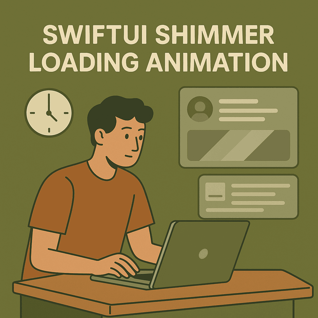

🎯 Why Shimmer Beats Traditional Loading Every Time
Look, I used to be that developer who thought loading states were just functional requirements. Show a spinner, hide the spinner when data loads. Done. But here’s what changed my mind — and it wasn’t some fancy research study I conducted.
I was sitting in a coffee shop, mindlessly scrolling through Instagram while waiting for my latte, when I noticed something weird. Even when my connection was slow, Instagram never felt frustrating. But when I switched to check something in my own app, that spinning wheel immediately made me impatient.
That’s when it hit me — the difference wasn’t the actual loading time. It was the way the loading felt.
Here’s the thing about human psychology that I’ve observed (and yeah, this is just my theory, not some peer-reviewed study): we hate uncertainty more than we hate waiting. When you show a static loading spinner, I have no idea what’s happening or how long it’ll take. My mind starts wandering: “Is the app frozen? Should I tap again? Is my internet connection broken?”
But shimmer animations? They feel alive. There’s constant movement that reassures me something is actively happening. It’s like the difference between waiting in a line that’s clearly moving versus standing in a crowd where you can’t tell if anything’s happening.
I started paying attention to this in other apps too. LinkedIn’s feed shimmer makes waiting feel almost… pleasant? Facebook’s story loading placeholders set up my expectations perfectly. Even when the content takes a few seconds to load, I’m not annoyed because I can see exactly what shape that content will take.
Now, here’s where it gets interesting… The most successful apps don’t just use shimmer — they use contextual shimmer. Instagram doesn’t show you a generic loading animation; it shows you story-shaped placeholders that look exactly like what’s coming. LinkedIn shows feed card shapes that match their actual post layout.
This isn’t rocket science, but it is smart UX. When I see a shimmer placeholder that looks like a profile card, my brain is already prepared to process profile information. It’s like giving me a sneak peek of the layout before the real content arrives.
💡 The Core Shimmer Concept
A shimmer effect is just three things working together:
- A gradient — typically gray → white → gray
- Movement — the gradient slides horizontally across your view
- Repetition — it loops continuously while loading
That’s it. No complex math, no fancy bezier curves. Just a moving gradient that creates the illusion of light sweeping across your placeholder content.
The gradient acts like a highlight moving across static shapes. Think of it like running a flashlight beam across frosted glass — you get that bright spot that travels from left to right, then starts over.
🛠️ Building Your First Shimmer Effect
Let’s start with the absolute basics. Here’s a simple shimmer view that you can drop into any SwiftUI project:
struct ShimmerView: View {
    @State private var startPoint = UnitPoint(x: -1.8, y: -1.2)
    @State private var endPoint = UnitPoint(x: 0, y: -0.2)

    var body: some View {
        LinearGradient(
            colors: [
                Color.gray.opacity(0.25),
                Color.white.opacity(0.8),
                Color.gray.opacity(0.25)
            ],
            startPoint: startPoint,
            endPoint: endPoint
        )
        .onAppear {
            withAnimation(
                .easeInOut(duration: 1.5)
                .repeatForever(autoreverses: false)
            ) {
                startPoint = UnitPoint(x: 1, y: 1.2)
                endPoint = UnitPoint(x: 2.2, y: 2.4)
            }
        }
    }
}
Okay, let me explain this step by step
The @State variables:
startPointandendPointdefine where our gradient begins and ends- Think of them as two points that define a line — the gradient flows along this line
The UnitPoint coordinate system: This is where it gets weird. UnitPoint uses a coordinate system where:
- (0, 0) = top-left corner of your view
- (1, 1) = bottom-right corner
- You can go outside these bounds with negative numbers or numbers > 1
So when I set startPoint = UnitPoint(x: -1.8, y: -1.2), I'm positioning the start of the gradient way off-screen to the top-left.
The gradient colors:
colors: [
    Color.gray.opacity(0.25),    // Subtle gray
    Color.white.opacity(0.8),    // Bright highlight
    Color.gray.opacity(0.25)     // Back to subtle gray
]
This creates a gray → white → gray pattern. The white part is what creates the “shine” effect.
The animation: When the view appears, we animate both points from their starting positions to new positions:
- Start moves from (-1.8, -1.2) to (1, 1.2)
- End moves from (0, -0.2) to (2.2, 2.4)
This makes the entire gradient sweep across the view diagonally, then repeat forever.
Does that make more sense? The coordinate system is definitely the trickiest part to visualize.
To use it, just add it as an overlay:
Rectangle()
    .fill(Color.gray.opacity(0.3))
    .frame(width: 200, height: 50)
    .overlay(ShimmerView())
    .clipped()
The .clipped() is important - it hides the parts of the gradient that extend beyond your shape's bounds.
🎨 Making It Reusable with ViewModifier
Now that we understand the basic shimmer, let’s turn it into something we can easily apply to any view. This is where ViewModifier comes in handy:
struct ShimmerModifier: ViewModifier {
    @State private var startPoint = UnitPoint(x: -1.8, y: -1.2)
    @State private var endPoint = UnitPoint(x: 0, y: -0.2)

    func body(content: Content) -> some View {
        content
            .overlay(
                LinearGradient(
                    colors: [
                        Color.gray.opacity(0.25),
                        Color.white.opacity(0.8),
                        Color.gray.opacity(0.25)
                    ],
                    startPoint: startPoint,
                    endPoint: endPoint
                )
                .mask(content) // This masks the gradient to match the original shape
                .onAppear {
                    withAnimation(
                        .easeInOut(duration: 1.5)
                        .repeatForever(autoreverses: false)
                    ) {
                        startPoint = UnitPoint(x: 1, y: 1.2)
                        endPoint = UnitPoint(x: 2.2, y: 2.4)
                    }
                }
            )
            .clipped()
    }
}
The key is .mask(content) - this makes the gradient conform to whatever shape you're applying the shimmer to. So circles stay circular, rounded rectangles keep their corner radius, etc.
Now you can add shimmer to literally anything:
Text("Loading...")
    .shimmer()

Rectangle()
    .fill(Color.gray.opacity(0.3))
    .frame(height: 60)
    .shimmer()

Circle()
    .fill(Color.gray.opacity(0.3))
    .frame(width: 50, height: 50)
    .shimmer()
📱 Creating Instagram-Style Story Placeholders
Now let’s build something that actually looks like Instagram’s story loading animation. With our fixed shimmer modifier, we can create realistic placeholders:
struct StoryPlaceholder: View {
    var body: some View {
        VStack(spacing: 8) {
            // Profile picture circle
            Circle()
                .fill(Color(.systemGray5))
                .frame(width: 60, height: 60)
                .shimmer()

            // Username text placeholder
            RoundedRectangle(cornerRadius: 4)
                .fill(Color(.systemGray5))
                .frame(width: 50, height: 10)
                .shimmer()
        }
    }
}
For a horizontal story feed:
ScrollView(.horizontal, showsIndicators: false) {
    HStack(spacing: 16) {
        ForEach(0..<6, id: \.self) { _ in
            StoryPlaceholder()
        }
    }
    .padding(.horizontal)
}
💼 LinkedIn-Style Feed Card Placeholders
LinkedIn’s feed placeholders are more complex — they mimic the actual post structure:
struct FeedCardPlaceholder: View {
    var body: some View {
        VStack(alignment: .leading, spacing: 12) {
            // Header with profile info
            HStack {
                Circle()
                    .fill(Color(.systemGray5))
                    .frame(width: 40, height: 40)
                    .shimmer()

                VStack(alignment: .leading, spacing: 4) {
                    RoundedRectangle(cornerRadius: 4)
                        .fill(Color(.systemGray5))
                        .frame(width: 120, height: 12)
                        .shimmer()

                    RoundedRectangle(cornerRadius: 4)
                        .fill(Color(.systemGray5))
                        .frame(width: 80, height: 10)
                        .shimmer()
                }

                Spacer()
            }

            // Post content lines
            VStack(alignment: .leading, spacing: 6) {
                RoundedRectangle(cornerRadius: 4)
                    .fill(Color(.systemGray5))
                    .frame(height: 12)
                    .shimmer()

                RoundedRectangle(cornerRadius: 4)
                    .fill(Color(.systemGray5))
                    .frame(height: 12)
                    .shimmer()

                RoundedRectangle(cornerRadius: 4)
                    .fill(Color(.systemGray5))
                    .frame(width: 200, height: 12)
                    .shimmer()
            }

            // Image placeholder
            RoundedRectangle(cornerRadius: 8)
                .fill(Color(.systemGray5))
                .frame(height: 200)
                .shimmer()
        }
        .padding()
        .background(Color(.systemBackground))
        .cornerRadius(12)
    }
}
Use it in your feed:
ScrollView {
    LazyVStack(spacing: 16) {
        ForEach(0..<5, id: \.self) { _ in
            FeedCardPlaceholder()
        }
    }
    .padding()
}
The key is making your placeholders match the actual content structure. Users’ brains are already preparing to process “profile + name + post content + image” when they see this layout.
⚡ Performance & Best Practices
Here’s what you need to watch out for when implementing shimmer effects in production apps:
Don’t overdo it with simultaneous animations. Having too many shimmer cards visible at once can tank your frame rate on older devices. If you’re showing a long list of placeholders, consider limiting visible shimmers or staggering their start times.
Use lazy loading containers. Wrap your shimmer views in LazyVStack or LazyHStack:
ScrollView {
    LazyVStack {
        ForEach(0..<50, id: \.self) { _ in
            FeedCardPlaceholder()
        }
    }
}
This way only visible shimmers actually animate, not the entire list.
Stop animations when they’re off-screen. You can optimize this further:
struct SmartShimmerModifier: ViewModifier {
    @State private var startPoint = UnitPoint(x: -1.8, y: -1.2)
    @State private var endPoint = UnitPoint(x: 0, y: -0.2)
    @State private var isVisible = false

    func body(content: Content) -> some View {
        content
            .overlay(
                LinearGradient(
                    colors: [
                        Color.gray.opacity(0.25),
                        Color.white.opacity(0.8),
                        Color.gray.opacity(0.25)
                    ],
                    startPoint: startPoint,
                    endPoint: endPoint
                )
                .mask(content)
                .onChange(of: isVisible) { visible in
                    if visible {
                        withAnimation(
                            .easeInOut(duration: 1.5)
                            .repeatForever(autoreverses: false)
                        ) {
                            startPoint = UnitPoint(x: 1, y: 1.2)
                            endPoint = UnitPoint(x: 2.2, y: 2.4)
                        }
                    }
                }
            )
            .onAppear { isVisible = true }
            .onDisappear { isVisible = false }
            .clipped()
    }
}
Accessibility matters. Add this to your shimmer views:
.accessibilityLabel("Loading content")
.accessibilityHint("Please wait while content loads")
Screen readers need to know what’s happening too.
🎛️ Customization Options
The basic shimmer works for most cases, but sometimes you need more control. Here’s a configurable version:
struct CustomShimmerModifier: ViewModifier {
    let duration: Double
    let highlight: Color
    let background: Color

    @State private var startPoint = UnitPoint(x: -1.8, y: -1.2)
    @State private var endPoint = UnitPoint(x: 0, y: -0.2)

    init(
        duration: Double = 1.5,
        highlight: Color = .white.opacity(0.8),
        background: Color = .gray.opacity(0.25)
    ) {
        self.duration = duration
        self.highlight = highlight
        self.background = background
    }

    func body(content: Content) -> some View {
        content
            .overlay(
                LinearGradient(
                    colors: [background, highlight, background],
                    startPoint: startPoint,
                    endPoint: endPoint
                )
                .mask(content)
                .onAppear {
                    withAnimation(
                        .easeInOut(duration: duration)
                        .repeatForever(autoreverses: false)
                    ) {
                        startPoint = UnitPoint(x: 1, y: 1.2)
                        endPoint = UnitPoint(x: 2.2, y: 2.4)
                    }
                }
            )
            .clipped()
    }
}

extension View {
    func shimmer(
        duration: Double = 1.5,
        highlight: Color = .white.opacity(0.8),
        background: Color = .gray.opacity(0.25)
    ) -> some View {
        modifier(CustomShimmerModifier(
            duration: duration,
            highlight: highlight,
            background: background
        ))
    }
}
Now you can customize the shimmer for different contexts:
// Fast, energetic shimmer
Rectangle()
    .shimmer(duration: 0.8, highlight: .blue.opacity(0.6))

// Slow, subtle shimmer
Circle()
    .shimmer(duration: 2.5, highlight: .white.opacity(0.3))
🚀 Putting It All Together
Here’s a complete example that shows how to integrate shimmer loading into a real app scenario. Let’s build a user profile screen that gracefully handles loading states:
struct UserProfileView: View {
    @State private var isLoading = true
    @State private var user: User?

    var body: some View {
        ScrollView {
            VStack(spacing: 20) {
                if isLoading {
                    ProfilePlaceholder()
                } else if let user = user {
                    ProfileContent(user: user)
                }
            }
            .padding()
        }
        .onAppear {
            loadUserData()
        }
    }

    private func loadUserData() {
        // Simulate API call
        DispatchQueue.main.asyncAfter(deadline: .now() + 2) {
            withAnimation(.easeInOut) {
                isLoading = false
                user = User.sample
            }
        }
    }
}

struct ProfilePlaceholder: View {
    var body: some View {
        VStack(spacing: 20) {
            // Profile picture
            Circle()
                .fill(Color(.systemGray5))
                .frame(width: 120, height: 120)
                .shimmer()

            // Name and bio
            VStack(spacing: 8) {
                RoundedRectangle(cornerRadius: 6)
                    .fill(Color(.systemGray5))
                    .frame(width: 150, height: 24)
                    .shimmer()

                RoundedRectangle(cornerRadius: 4)
                    .fill(Color(.systemGray5))
                    .frame(width: 200, height: 16)
                    .shimmer()
            }

            // Stats row
            HStack(spacing: 30) {
                ForEach(0..<3, id: \.self) { _ in
                    VStack(spacing: 4) {
                        RoundedRectangle(cornerRadius: 4)
                            .fill(Color(.systemGray5))
                            .frame(width: 40, height: 20)
                            .shimmer()

                        RoundedRectangle(cornerRadius: 4)
                            .fill(Color(.systemGray5))
                            .frame(width: 60, height: 12)
                            .shimmer()
                    }
                }
            }
        }
    }
}
🎯 When NOT to Use Shimmer
Not every loading state needs shimmer. Here’s when to skip it:
Short loading times (< 300ms) — If your API is fast, shimmer can actually make the experience feel slower because users notice the transition more.
Error states — When something’s broken, shimmer gives false hope. Use clear error messaging instead.
Background updates — If you’re refreshing data that’s already on screen, consider pull-to-refresh or subtle indicators instead.
Complex animations — If your main content already has lots of animations, adding shimmer can feel overwhelming.
🔄 Smooth Transitions
The key to professional-feeling shimmer is smooth transitions when real content loads. Use withAnimation when switching states:
@State private var isLoading = true

var body: some View {
    VStack {
        if isLoading {
            ShimmerPlaceholder()
        } else {
            ActualContent()
        }
    }
    .onReceive(dataLoader.publisher) { data in
        withAnimation(.easeInOut(duration: 0.3)) {
            isLoading = false
        }
    }
}
The 300ms transition feels natural and prevents jarring content swaps.
🚀 Where to Go Next?
Now that you’ve mastered shimmer animations, you’re ready to take your SwiftUI animation skills to the next level! Here’s your roadmap for becoming an animation expert:
Start with the basics: If shimmer was your first real animation adventure, check out SwiftUI Animations for Beginners: Learn with Simple Examples (2025 Edition). This guide covers all the fundamental animation concepts you’ll need as building blocks.
**SwiftUI Animations for Beginners: Learn with Simple Examples (2025 Edition)** _Animations in SwiftUI feel like magic 🪄 — until your view just snaps instead of fades. In this beginner-friendly…_medium.comhttps://medium.com/swift-pal/swiftui-animations-for-beginners-learn-with-simple-examples-2025-edition-76eb224eb633
Level up to advanced techniques: Ready for some serious animation wizardry? Dive into Advanced Animations in SwiftUI: matchedGeometryEffect, TimelineView, PhaseAnimator & Beyond (2025 Guide). You’ll learn hero animations, timeline-based rendering, and multi-phase animations that’ll make your app feel like magic.
**Advanced Animations in SwiftUI: matchedGeometryEffect, TimelineView, PhaseAnimator & Beyond (2025…** _In this deep dive, we’re exploring SwiftUI’s most advanced animation tools — from layout-matching transitions and…_medium.comhttps://medium.com/swift-pal/advanced-animations-in-swiftui-matchedgeometryeffect-timelineview-phaseanimator-beyond-2025-da8876b7b0b9
Create stunning visual effects: Want to build custom loaders, animated waves, and eye-catching visuals? Mastering SwiftUI Drawing: Build Animated Loaders, Waves, and Custom UI with Shape, Path & Canvas will teach you everything about drawing and animating custom graphics using SwiftUI’s native tools.
**Mastering SwiftUI Drawing: Build Animated Loaders, Waves, and Custom UI with Shape, Path & Canvas** _Want to create stunning custom UI in SwiftUI? Learn how to draw and animate using Shape, Path, and Canvas — no Core…_medium.comhttps://medium.com/swift-pal/mastering-swiftui-drawing-build-animated-loaders-waves-and-custom-ui-with-shape-path-canvas-de5d7ea7b010
The shimmer effect you just built is actually a great foundation for understanding gradients, timing, and view modifiers — all crucial concepts you’ll use in more complex animations. Keep experimenting, and remember: the best animations are the ones that feel natural and serve a purpose in your app’s user experience.
🎉 Wrapping Up
Shimmer loading animations are one of those small details that make apps feel polished and responsive. They’re not just about looking fancy — they’re about managing user expectations and keeping people engaged while content loads.
The implementation we’ve built here gives you everything you need: a reusable modifier, customizable options, and real-world examples. Start with the basic shimmer, then customize as needed for your app’s personality.
Remember: the best loading animations are the ones users don’t consciously notice. They just make your app feel faster and more professional. And in today’s competitive app landscape, those little touches can make all the difference.
Now go make your loading states shimmer! ✨
🎉 Enjoyed this article? Your support means the world to me!
💬 Drop a comment below! I love hearing about your experiences and answering questions
🎬 Subscribe on Youtube and become early subscribers of my channel: https://www.youtube.com/@swift-pal
💼 Let’s connect on LinkedIn for more professional insights: https://www.linkedin.com/in/karan-pal
Happy coding! 🚀
New articles, straight to your inbox.
No spam, no filler — just new writing on iOS, the web, and AI when it ships. Unsubscribe anytime.
Keep reading
Your CPU Has More Cores Than Your Job Can Use
Some work splits cleanly across hundreds of cores. Other work is a chain of steps where every new step has to wait for the last one to finish.
ReadYour Password Isn’t as Random as You Think
Crack-time calculators measure the size of a theoretical password space—not how people actually choose passwords or how attackers search them.
Read