Stop Using Default Text: Better Typography for SwiftUI Apps
Dynamic Type, proper spacing, custom fonts, and text effects. Here’s how to make text look intentional
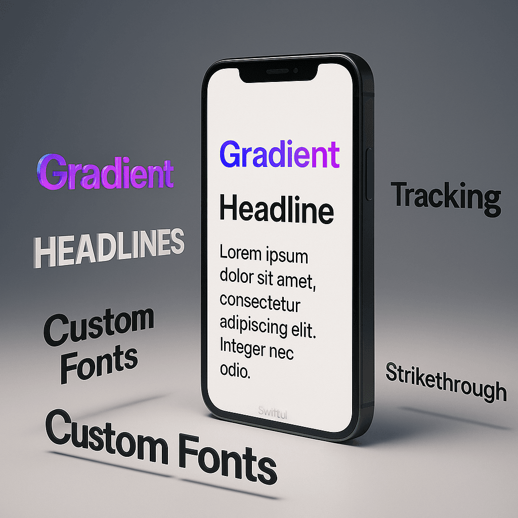

📏 Dynamic Type & Text Styles
Most SwiftUI apps I see either hardcode font sizes or use .font(.system(size: 16)) everywhere. Both approaches break accessibility and make your app feel amateurish.
Apple ships Dynamic Type with iOS — text that scales based on user preferences. Someone with bad eyesight can bump text up to 3x normal size. Your app should handle that automatically.
And to fix this you can use text styles:
VStack(alignment: .leading, spacing: 8) {
    Text("Article Title")
        .font(.largeTitle)
    Text("Published today")
        .font(.caption)
        .foregroundColor(.secondary)
}
.largeTitle, .title, .headline, .body, .caption these automatically scale with Dynamic Type settings.
But here’s what most people don’t know, you can customize their styles:
Text("Custom Large Title")
    .font(.largeTitle.weight(.black))
Stack modifiers on the text styles. .weight(), .italic(), .monospaced() all work.
iOS 14 added more control:
Text("Precise sizing")
    .font(.system(size: 17, weight: .semibold, design: .rounded))
Three designs: .default (San Francisco), .rounded (SF Rounded), .serif (New York), and .monospaced (SF Mono).
Now the Dynamic Type gotcha — if you use fixed sizes with .font(.system(size: 20)), it won't scale. Want fixed size but still scalable? Use .dynamicTypeSize():
Text("Constrained scaling")
    .font(.body)
    .dynamicTypeSize(...DynamicTypeSize.xxxLarge)
This caps the maximum size even if the user cranks accessibility settings higher. Useful for UI elements that break at huge sizes (like tab bar labels).
You can also read the current Dynamic Type size:
@Environment(\.dynamicTypeSize) var typeSizevar body: some View {
Text("Adapts to size")
.font(typeSize >= .xxxLarge ? .title3 : .body)
}Real-world example — a card that adjusts layout based on text size:
struct ProfileCard: View {
    @Environment(\.dynamicTypeSize) var typeSize
var body: some View {
Group {
if typeSize >= .xxxLarge {
VStack(alignment: .leading, spacing: 12) {
profileContent
}
} else {
HStack(spacing: 12) {
profileContent
}
}
}
.padding()
} var profileContent: some View {
Group {
Image(systemName: "person.circle.fill")
.font(.system(size: 50))
VStack(alignment: .leading) {
Text("Alice Chen")
.font(.headline)
Text("iOS Developer")
.font(.subheadline)
.foregroundColor(.secondary)
}
}
}
}

At normal sizes, horizontal layout. At accessibility sizes, vertical stack so text doesn’t get cramped. This is how Apple’s apps work.
One more thing — .minimumScaleFactor() for when text MUST fit:
Text("Super Long Text Label That Might Not Fit The Screen")
            .font(.headline)
            .minimumScaleFactor(0.7)
            .lineLimit(1)
Text will shrink down to 70% of its size to fit the space. Use sparingly — usually it means your text is too long.
✍️ Custom Fonts Done Right
Adding custom fonts to SwiftUI still feels clunky but here’s the least painful way.
First, drag your font files (.ttf or .otf) into Xcode. Make sure “Copy items if needed” is checked and they’re added to your target.
Then update Info.plist with the “Fonts provided by application” key:
<key>UIAppFonts</key>
<array>
    <string>Poppins-Bold.ttf</string>
    <string>Poppins-Regular.ttf</string>
    <string>Poppins-Light.ttf</string>
</array>NOTE: Projects created in latest versions of Xcode don’t have Info.plist file. Instead go in your Project Settings, find the Info tab, and there you can add your Fonts as shown in the screenshot below. Just add “Fonts provided by application”, and add the names of the font you have added in your target.

Now you can use them:
Text("Custom Font")
    .font(.custom("Poppins-Bold", size: 24))
The font name is usually the filename without the extension, but not always. If it doesn’t work, use the font name shown in your mac’s Font Book app, or print all available fonts:
UIFont.familyNames.forEach { family in
    print(family)
    UIFont.fontNames(forFamilyName: family).forEach { font in
        print("  \(font)")
    }
}
Run that in a debug build and look for your font’s actual PostScript name.
Better approach: extend Font to avoid magic strings everywhere:
extension Font {
    static func poppins(_ size: CGFloat, weight: Font.Weight = .regular) -> Font {
        let fontName: String
        switch weight {
        case .bold, .heavy, .black:
            fontName = "Poppins-Bold"
        case .light, .thin, .ultraLight:
            fontName = "Poppins-Light"
        default:
            fontName = "Poppins-Regular"
        }
        return .custom(fontName, size: size)
    }
}
// usage
Text("Cleaner")
.font(.poppins(20, weight: .bold))Custom fonts with Dynamic Type is trickier. You need .custom(_:size:relativeTo:):
Text("Scales with accessibility")
    .font(.custom("Poppins-Bold", size: 24, relativeTo: .title))
The relativeTo parameter ties your custom font to a text style, so it scales proportionally.
Or make it even cleaner:
extension Font {
    static var poppinsTitle: Font {
        .custom("Poppins-Bold", size: 28, relativeTo: .title)
    }
static var poppinsBody: Font {
.custom("Poppins-Regular", size: 17, relativeTo: .body)
}
}// usage
Text("Branded text that scales")
.font(.poppinsTitle)Now your custom fonts behave like system fonts.
One warning: not all custom fonts have complete character sets. Test with emoji, non-Latin characters, and symbols. Your font might not have them and you’ll get ugly fallback glyphs.
Also test at large accessibility sizes. Some decorative fonts become unreadable when scaled up. You might need to switch to system fonts at extreme sizes:
@Environment(\.dynamicTypeSize) var typeSizevar titleFont: Font {
typeSize >= .xxxLarge ? .title : .poppinsTitle
}📐 Line Spacing, Kerning & Tracking
Default line spacing in SwiftUI is… fine. But “fine” doesn’t look great.
Line spacing (leading in typography terms):
Text("This text has custom line spacing that makes it more readable when you have multiple lines of content.")
    .lineSpacing(8)
Adds 8 points between lines. Good range: 4–10 points depending on font size. Too much looks disconnected, too little looks cramped.
Here’s the thing — bigger text needs proportionally more line spacing:
Text("Large Title\nWith Multiple Lines")
    .font(.largeTitle)
    .lineSpacing(12) // more space for larger text
Kerning adjusts space between individual letters:
Text("TRACKING")
    .kerning(2)
Positive values spread letters apart, negative squishes them together. Useful for all-caps text where default spacing looks tight:
Text("SECTION HEADER")
    .font(.caption)
    .kerning(1.5)
    .foregroundColor(.secondary)
But there’s also .tracking() which... does almost the same thing? The difference is subtle:
Text("Kerning adjusts space")
.kerning(2)Text("Tracking adjusts space")
.tracking(2)Kerning affects character spacing but respects ligatures. Tracking treats each character independently. For most uses? They look identical. I usually use .tracking() for consistency with design tools like Figma which use tracking.
Real example — a quote block:
VStack(alignment: .leading, spacing: 12) {
    Text("\"Design is not just what it looks like and feels like. Design is how it works.\"")
        .font(.title3)
        .italic()
.lineSpacing(6) Text("— Steve Jobs")
.font(.caption)
.tracking(1)
.foregroundColor(.secondary)
}
.padding()
.background(Color(.systemGray6))
.cornerRadius(8)
The quote has extra line spacing for readability, the attribution has tracking to make it feel distinct.
Multi-line text alignment matters too:
Text("Centered text\nwith multiple lines\nthat reads weird")
    .multilineTextAlignment(.center)
Options: .leading (default), .center, .trailing. Most body text should be leading-aligned. Only center short headings or single lines.
Line limits:
Text("Long text that might overflow and we want to truncate it gracefully")
    .lineLimit(2)
Shows maximum 2 lines, adds “…” if truncated. You can combine with .truncationMode():
Text("Truncated text example here")
    .lineLimit(1)
    .truncationMode(.middle) // "Truncated...example here"
Options: .tail (default "text..."), .middle ("text...here"), .head ("...text here").
🎨 Text Effects (Gradients, Shadows, Strokes)
Plain colored text is boring. SwiftUI lets you do way more.
Gradient text (iOS 15+):
Text("Gradient Text")
    .font(.largeTitle)
    .fontWeight(.bold)
    .foregroundStyle(
        LinearGradient(
            colors: [.pink, .purple, .blue],
            startPoint: .leading,
            endPoint: .trailing
        )
    )
Works with any gradient type — linear, radial, angular. Looks great for headings and hero text. Don’t overuse it though, too many gradients makes your UI look like a 2000s MySpace page.
Text shadows:
Text("Shadowed Text")
    .font(.title)
    .foregroundColor(.white)
    .shadow(color: .black.opacity(0.3), radius: 2, x: 0, y: 2)
Same shadow rules from the colors article apply — keep opacity low, layer multiple shadows for depth:
Text("Better Shadow")
    .foregroundColor(.white)
    .shadow(color: .black.opacity(0.2), radius: 1, x: 0, y: 1)
    .shadow(color: .black.opacity(0.1), radius: 4, x: 0, y: 2)
Stroke/outline text is hacky but doable:
ZStack {
    Text("OUTLINED")
        .font(.system(size: 60, weight: .black))
.foregroundColor(.white) Text("OUTLINED")
.font(.system(size: 60, weight: .black))
.foregroundColor(.clear)
.shadow(color: .blue, radius: 0, x: -2, y: 0)
.shadow(color: .blue, radius: 0, x: 2, y: 0)
.shadow(color: .blue, radius: 0, x: 0, y: -2)
.shadow(color: .blue, radius: 0, x: 0, y: 2)
}Two text views stacked — one filled white, one with shadows on all sides creating the outline. Radius 0 makes them sharp. It’s not perfect but it works.
Blend modes for creative effects:
ZStack {
    LinearGradient(colors: [.purple, .blue],
                  startPoint: .top,
endPoint: .bottom) Text("BLEND MODE")
.font(.system(size: 60, weight: .black))
.blendMode(.difference)
}
.frame(height: 200).difference inverts colors, creating that glitchy effect. Other fun modes: .screen, .multiply, .colorBurn.
SF Symbols inline with text:
Text("Love \(Image(systemName: "heart.fill")) SwiftUI")
    .font(.title2)
    .foregroundStyle(
        LinearGradient(colors: [.pink, .red],
                      startPoint: .leading,
                      endPoint: .trailing)
    )
The heart icon inherits the gradient from the text. String interpolation with Image() makes it part of the text flow.
Realistic example — a feature callout:
VStack(spacing: 16) {
    Text("Premium")
        .font(.system(size: 48, weight: .black))
        .foregroundStyle(
            LinearGradient(
                colors: [.yellow, .orange],
                startPoint: .topLeading,
                endPoint: .bottomTrailing
            )
        )
.shadow(color: .orange.opacity(0.3), radius: 10, x: 0, y: 5) Text("Unlock all features")
.font(.headline)
.foregroundColor(.secondary)
.tracking(1)
}
Gradient title with matching shadow, tracking on the subtitle for contrast.
🔤 Text Case, Underlines & Strikethroughs
Text formatting that developers forget exists.
Text case transformations:
Text("automatic capitalization")
.textCase(.uppercase) // "AUTOMATIC CAPITALIZATION"Text("LOWERCASE THIS")
.textCase(.lowercase) // "lowercase this"Useful for section headers or styling without rewriting strings. But careful with localization — some languages don’t have uppercase variants.
Underlines:
Text("Underlined text")
.underline()Text("Custom underline")
.underline(true, color: .red)Second parameter is color. Default uses the text color.
Strikethroughs:
Text("$99.99")
.strikethrough()Text("Discounted price")
.strikethrough(true, color: .red)
Perfect for showing discounts or completed tasks.
Bold specific words (iOS 15+):
Text("This is **bold** and this is *italic*")Markdown in Text views. Works with **bold**, *italic*, [links](https://example.com). Way cleaner than concatenating AttributedStrings.
You can also use AttributedString directly for more control:
var styledText: AttributedString {
    var result = AttributedString("Mixed styles")
    result.font = .title2
if let range = result.range(of: "Mixed") {
result[range].foregroundColor = .blue
result[range].font = .title2.bold()
} return result
}Text(styledText)More code but gives you per-word styling without markdown.
Combining everything:
Text("NEW")
    .font(.caption)
    .fontWeight(.bold)
    .textCase(.uppercase)
    .tracking(2)
    .foregroundColor(.white)
    .padding(.horizontal, 8)
    .padding(.vertical, 4)
    .background(
        Capsule()
            .fill(Color.red)
    )
That badge design pattern — uppercase, tracked, bold, with background. Looks way more intentional than plain text.
Real use case — a todo list item:
HStack {
    Image(systemName: task.isComplete ? "checkmark.circle.fill" : "circle")
.foregroundColor(task.isComplete ? .green : .gray) Text(task.title)
.strikethrough(task.isComplete, color: .gray)
.foregroundColor(task.isComplete ? .secondary : .primary) Spacer()
}
Completed tasks get strikethrough and gray color. Simple but effective.
Another pattern — emphasized text in paragraphs:
VStack(alignment: .leading, spacing: 8) {
    Text("Important Notice")
        .font(.headline)
        .textCase(.uppercase)
.tracking(1) Text("This feature requires iOS 15+")
.font(.body)
.lineSpacing(4)
}The header uses uppercase + tracking to stand out from body text.
✅ Wrap-up
Typography is half of UI design and most SwiftUI apps ignore it. Use text styles for accessibility. Add line spacing for readability. Track section headers. Layer shadows for depth. These details take 5 extra minutes but make your app look like you cared.
🎉 Enjoyed this article? Your support means the world to me!
💬 Drop a comment below! I love hearing about your experiences and answering questions
🎬 Subscribe on Youtube and become early subscribers of my channel: https://www.youtube.com/@swift-pal
💼 Let’s connect on LinkedIn for more professional insights: https://www.linkedin.com/in/karan-pal
Happy coding! 🚀
New articles, straight to your inbox.
No spam, no filler — just new writing on iOS, the web, and AI when it ships. Unsubscribe anytime.
Keep reading
Your CPU Has More Cores Than Your Job Can Use
Some work splits cleanly across hundreds of cores. Other work is a chain of steps where every new step has to wait for the last one to finish.
ReadYour Password Isn’t as Random as You Think
Crack-time calculators measure the size of a theoretical password space—not how people actually choose passwords or how attackers search them.
Read