iOS Widget Guide: Everything Beginners Need to Know About WidgetKit in 2025
Understanding widget families, timelines, configuration, and Apple’s latest interactive widget features
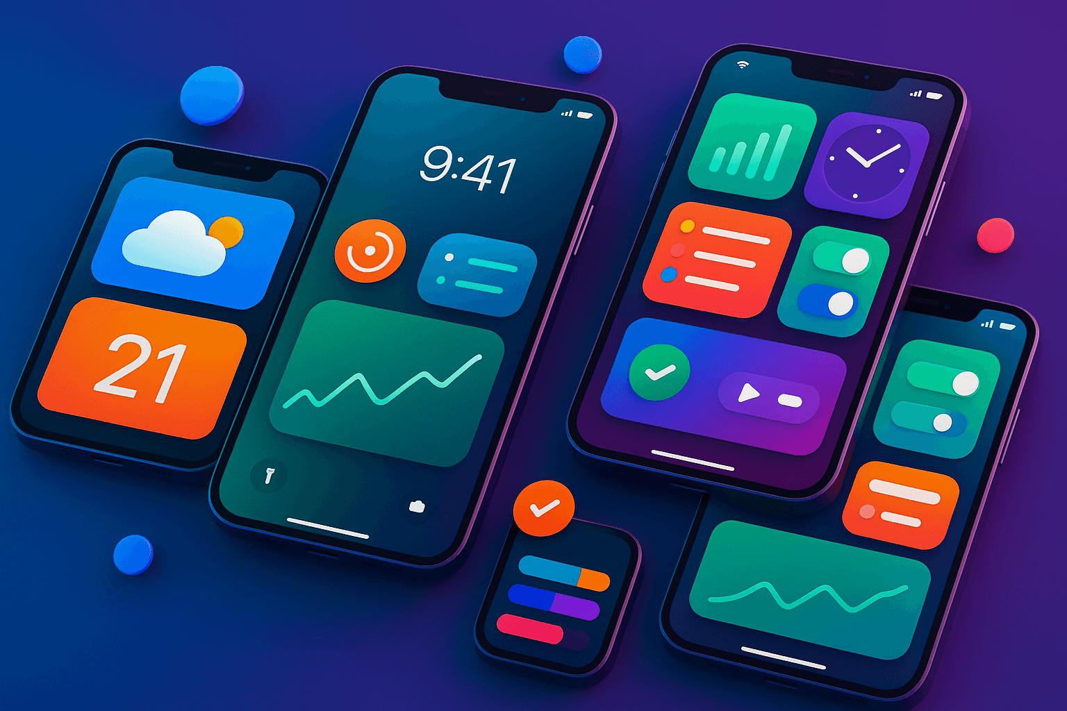

🚀 Introduction
If you’re here, you’ve probably seen those sleek little squares on iPhone home screens and wondered “how the hell do I build one of those?” Well, you’re in the right place, but let’s be clear about what we’re doing here.
This isn’t a coding tutorial. Think of this as your pre-flight briefing before you actually touch Xcode. We’re going to walk through all the concepts, terminology, and gotchas that’ll save you hours of confusion later. The actual hands-on coding? That’s coming soon in a comprehensive video tutorial on the Swift Pal YouTube channel: https://youtube.com/@swift-pal
**Swift Pal** _👨💻 Welcome to Swift Pal - Your iOS Dev Companion! Whether you're just starting your journey with Swift and SwiftUI…_youtube.comhttps://youtube.com/@swift-pal
Now, here’s why 2025 is different from every other widget guide you’ve probably skimmed through. Apple just killed off legacy widgets entirely in iOS 18. Gone. Poof. If you haven’t migrated to WidgetKit, your widget literally disappears from users’ phones. But that’s not all — iOS 18 also brought interactive widgets that actually work (finally!), and iOS 26 is around the corner with cross-platform support that’s honestly pretty wild.
So whether you’re completely new to widgets or you’ve been putting off that legacy migration, this guide covers everything that’s relevant in 2025. No outdated examples, no deprecated APIs, just the current state of iOS widgets as they actually exist today.
Actually, let me rephrase that… this guide assumes you know Swift and SwiftUI basics, but zero widget experience. If you’re still learning Swift fundamentals, bookmark this and come back later. Ready? Let’s decode this widget mess.
🧭 Widget Terminology Decoded
Okay, so here’s where things get messy. Apple has this wonderful habit of using the word “widget” for like… three different things. And if you’ve been doing iOS development for a while, you might have some baggage from the old days that’ll just confuse you.
Let’s start with the big one: Legacy widgets are dead. I’m talking about those old Today View Extensions that lived in the notification center. If you built widgets before iOS 14, forget everything you know. Seriously. Those used UIKit, had completely different lifecycles, and as of iOS 18, they don’t exist anymore. Apple gave developers years to migrate, and now they’ve pulled the plug.
Modern widgets use WidgetKit — that’s Apple’s current framework built entirely on SwiftUI. These are the widgets you see on home screens, lock screens, and soon on your Mac, CarPlay, and even Vision Pro. Same framework, different places.
But wait, there’s more confusion! People constantly mix up widgets with Live Activities. Look, I get it — they both show dynamic content outside your app. But Live Activities are those persistent notifications that show ongoing events (like your Uber ride or sports scores). Widgets are those little squares you pin to your home screen. Different APIs, different use cases.
And then there’s App Clips which… okay, those aren’t widgets at all, but somehow everyone groups them together. App Clips are mini-apps that load instantly via QR codes or NFC. Completely different beast.
Now, here’s something that trips up beginners: your widget extension is not your main app. When you add widget support to your iOS app, Xcode creates a separate target — a widget extension. This is its own little bundle with its own lifecycle. Your widget can’t directly access your main app’s data unless you set up App Groups for sharing. This separation is crucial to understand because it affects how you architect your widget’s data flow.
One more thing that confused the hell out of me initially — Home Screen widgets vs Lock Screen widgets. They use the same WidgetKit framework, but Lock Screen widgets (introduced in iOS 16) have different size families and design constraints. You can’t just slap a home screen widget on the lock screen and call it a day.
So when someone says “widget” in 2025, they better be talking about WidgetKit-based widgets. Everything else is either deprecated or misnamed.
📏 Widget Families Explained
Alright, let’s talk sizes. Apple gives you specific widget “families” to work with, and honestly, this system makes way more sense once you see it in action.
The Big Three (Home Screen):
- systemSmall: Those tiny squares, roughly 2x2 app icons
- systemMedium: Rectangular, about 4x2 app icons wide
- systemLarge: The big boys, 4x4 app icons
Most beginners think “I’ll just make one widget and it’ll automatically resize.” Nope. You need to design separate layouts for each family because the information hierarchy changes completely. A small widget might show just a number, medium adds context, and large might include charts or multiple data points.
Here’s what gets interesting — systemExtraLarge exists but only on iPad. Don’t even bother with it unless you’re specifically targeting iPad users. And trust me, designing for that much real estate is its own challenge.
Lock Screen Widgets (iOS 16+): Now we get into the newer stuff. Lock Screen widgets have completely different families:
- accessoryInline: Text that appears above the time
- accessoryCircular: Small circular widgets next to the time
- accessoryRectangular: Rectangular widgets below the time
These Lock Screen families are way more constrained than Home Screen widgets. You’re dealing with limited colors (they adapt to wallpapers), smaller sizes, and different user expectations. People glance at Lock Screen widgets, they don’t study them.
The iOS 26 Cross-Platform Reality: Here’s where things get really interesting. With iOS 26, your WidgetBundle can target multiple platforms with the same code. But each platform has its own quirks:
- macOS: Widgets live in Notification Center, different sizing expectations
- CarPlay: Dashboard integration, safety-first design requirements
- visionOS: Spatial widgets floating in 3D space (wild, right?)
The key insight? Don’t try to support every family and platform from day one. Pick one or two families that make sense for your app’s core use case. A weather app probably wants all three home screen sizes. A simple task tracker might only need small and medium.
Actually, let me be honest here — most successful widgets I’ve seen focus on small and medium first. Large widgets are harder to design well, and users don’t always have the home screen real estate for them. Start simple, then expand.
One more gotcha: when you’re testing widgets, they behave differently in the simulator vs real devices. Always test on actual hardware, especially for Lock Screen widgets where wallpaper interactions matter.
⏰ Timeline System Deep Dive
Okay, so here’s where widgets get… weird. Unlike regular apps that update when users open them, widgets need to predict the future. Seriously.
Think of it like this: your widget is basically a fortune teller that has to guess what information will be relevant at 9 AM, 2 PM, and 6 PM today. That’s the timeline system in a nutshell.
The Core Players: Your widget has three main components working together. The Provider is like your data manager — it fetches information and decides when updates should happen. An Entry represents your widget at a specific moment in time (think of it as a snapshot). And the Timeline is your schedule of all these snapshots.
Here’s what actually happens: iOS asks your Provider, “Hey, what should this widget look like for the next few hours?” Your Provider responds with a timeline containing multiple entries — maybe one for now, another for lunch time, and one for evening. iOS then swaps between these entries automatically.
Refresh Policies (this is where it gets tricky):
- .atEnd: When your timeline runs out, iOS asks for a new one
- .after(date): Refresh at a specific time you choose
- .never: Only update when the user opens your main app
Most beginners go crazy with .after(date) thinking they can update every minute. Don’t. iOS limits you to roughly 40–70 timeline refreshes per day, and that budget varies based on how much users interact with your app. Heavy app users get more widget updates. Makes sense, right?
The Background Refresh Reality Check: Your widget doesn’t run continuously in the background burning battery. Instead, iOS gives your Provider about 30 seconds to generate a timeline, then kills the process. Everything has to be fast and efficient.
This means if you need fresh data from an API, you better cache it in App Groups or Core Data shared containers. Your timeline Provider can’t sit around waiting for network requests to complete.
Look, I’ll be honest — this timeline concept feels backwards if you’re coming from traditional app development. You’re not responding to user actions in real-time. You’re pre-calculating what might be useful later and hoping iOS actually shows it to users.
And sometimes iOS just… doesn’t update your widget when you expect it to. The system is aggressive about preserving battery life, so don’t design widgets that require precise timing. Design for “roughly around this time” instead of “exactly at 3:47 PM.”
The sooner you accept that widgets are more like smart billboards than mini-apps, the easier this timeline system becomes.
⚙️ Configuration Types
So you’ve got your timeline figured out, but now comes the big question: should users be able to customize your widget, or keep it simple and static?
Static Widgets: These are the “set it and forget it” approach. Your widget shows the same type of information for everyone — maybe your app’s main feature or most important data. Think of Apple’s Clock widget or a simple step counter. No user choices, no setup complexity.
Static widgets use StaticConfiguration in your WidgetKit code, and honestly? Start here. I've seen too many developers jump straight into configurable widgets and get overwhelmed by the complexity.
Configurable Widgets: These let users choose what the widget displays. Maybe they can pick which calendar to show, select a specific playlist, or choose between different data views. Way more powerful, but also way more ways for things to go wrong.
Configurable widgets use IntentConfiguration and require you to build an Intent Definition file. It's basically a form that iOS presents when users add or edit your widget. The user's choices get passed to your Provider so you can customize the timeline accordingly.
App Groups — The Data Sharing Bridge: Here’s something that’ll bite you: your widget extension can’t directly access your main app’s data. They’re separate processes with separate sandboxes. Enter App Groups.
App Groups let you create a shared container where both your app and widget can read/write data. Think of it as a shared folder that both processes can access. You’ll use this for caching API responses, storing user preferences, or sharing Core Data databases.
Setting up App Groups requires configuring capabilities in both your main app target and widget extension target. Same group identifier for both. Miss this step and your widget will have no data to display.
When to Make Widgets Configurable: Ask yourself: does your app have multiple “views” of the same data that users might want quick access to? A weather app might let users choose which city to display. A music app could let users pick a specific playlist.
But don’t go configuration-crazy. If you find yourself building a settings screen with 15 different options, you’re probably overcomplicating things. Users want glanceable information, not another app to configure.
Actually, let me share something I learned the hard way — test your configuration flow on actual users. What seems obvious to you as the developer often confuses the hell out of regular people. Keep the Intent Definition simple and use clear, descriptive labels.
One more reality check: configurable widgets are harder to market because you can’t just show one screenshot. You need to explain the customization options, which dilutes your App Store message. Sometimes static widgets that do one thing really well perform better than configurable widgets that do everything okay.
🆕 Interactive Features (iOS 18+)
Okay, this is where things get actually exciting. For years, widgets were basically fancy screenshots. Tap them, open the app. That was it. iOS 18 finally changed the game.
AppIntent Integration — the real deal: You can now put actual Button, Toggle, and Link controls inside your widgets. When users tap them, your AppIntent code runs directly without launching your main app. Finally!
But here’s the thing — and this is important — AppIntent actions are lightweight only. You can mark a task as complete, toggle a smart home device, or trigger a quick action. But you can’t make network requests, perform heavy calculations, or update complex UI states inside the AppIntent itself.
Think of AppIntents as “remote controls” for your app. They should trigger simple state changes that your app can handle in the background or process the next time it launches.
What Actually Works:
- Toggle settings (like Do Not Disturb mode)
- Mark items complete in lists
- Start/stop timers
- Quick data entry (like mood tracking)
- Simple navigation triggers
What Doesn’t Work (and will frustrate you):
- API calls inside the AppIntent
- Complex animations or UI updates
- File operations or heavy data processing
- Anything that takes more than a few seconds
System Tinting with **.widgetAccentable**: Here's something new that caught me off guard. iOS 18 lets users apply custom tint colors to their home screen, and your widgets need to adapt gracefully.
Mark views with .widgetAccentable and iOS will automatically apply the user's chosen accent color. Don't mark every element — just key UI components that should inherit the system tinting. Your text and background should usually stay readable regardless of the user's color choice.
The tricky part? Your widget needs to look good with any color the user throws at it. Test with extreme colors — bright yellow, deep purple, whatever. Users will pick the weirdest combinations.
Button Design Reality Check: Just because you can add buttons doesn’t mean you should add a bunch of buttons. Widgets are still glanceable interfaces. One or two clear actions work better than a tiny control panel.
And here’s something Apple doesn’t emphasize enough — these interactive elements need to be accessible. Make sure your buttons have proper labels for VoiceOver and are large enough for people with motor difficulties.
Look, interactive widgets feel like magic when they work well. But they also add complexity to your timeline management. When a user toggles something in your widget, you might need to update other timeline entries to reflect that state change. Plan for this complexity upfront.
🌍 Cross-Platform Reality (iOS 26 Preview)
Alright, let’s talk about the future — and it’s honestly pretty wild. iOS 26 introduces something Apple’s calling “universal WidgetBundles,” and if it works as advertised, it’s going to change how we think about widget development.
Write Once, Run Everywhere: Your WidgetBundle can now target iPhone, iPad, macOS, CarPlay, and even visionOS with the same codebase. But before you get too excited, “same codebase” doesn’t mean “zero platform-specific work.”
Each platform has its own quirks. macOS widgets live in Notification Center with different interaction patterns. CarPlay widgets need to follow strict safety guidelines — no tiny buttons or complex interactions while driving. And visionOS? Well, your widgets are floating in 3D space, which is… a lot to think about.
Environment Detection is Key: You’ll use SwiftUI’s environment system to detect where your widget is running and adapt accordingly. Check widgetRenderingMode to see if you're on a lock screen vs home screen. Use levelOfDetail to understand if users are viewing your widget up close or from a distance (especially relevant for visionOS).
The smart approach? Design your core widget logic once, then create platform-specific view modifiers for the differences. Don’t try to cram everything into one massive conditional statement.
CarPlay Integration — Actually Pretty Slick: Here’s what surprised me: CarPlay widgets are essentially your existing iPhone widgets, but displayed in the CarPlay dashboard. No separate CarPlay app development needed. Your home screen widget automatically becomes available in CarPlay with some system-level adaptations for driving safety.
iOS handles the heavy lifting — larger touch targets, simplified interactions, voice control integration. But you should still test your widget in CarPlay simulator to make sure the information hierarchy makes sense while driving.
visionOS Spatial Widgets: Okay, this is where things get weird in the best way possible. Widgets in visionOS can exist as floating panels in 3D space. Users can position them around their environment, resize them, and view them from different angles.
The technical implementation uses the same WidgetKit APIs, but the design considerations are completely different. Information needs to be readable from various distances and angles. Colors and contrast become even more critical when your widget might be floating in front of a bright window.
Reality Check on Platform Support: Don’t try to support every platform on day one. Pick the ones that make sense for your app’s core use case. A meditation app probably doesn’t need CarPlay widgets. A navigation app definitely does.
And honestly? Most of this iOS 26 stuff is still in developer preview. The APIs might change, performance characteristics are unknown, and we don’t know how users will actually interact with cross-platform widgets in practice.
My advice: get really good at iPhone/iPad widgets first. The cross-platform expansion will be much easier once you understand the fundamentals.
🎯 Next Steps
So here’s where you are right now: you understand what widgets actually are, how the timeline system works, and why iOS 18 changed everything. But you probably can’t wait to start building something real.
When You’re Ready to Code: Before you jump into Xcode, make sure you’re solid on SwiftUI fundamentals. I’m talking about @State, @ObservableObject, and basic view composition. Widgets are built entirely in SwiftUI, and if you're still figuring out the basics, widget development will feel overwhelming.
Also, pick a simple first project. Don’t build a configurable, interactive, cross-platform widget for your first attempt. Build a static widget that shows one piece of information well. Maybe current weather, today’s calendar events, or a simple counter. Get the timeline system working, then add complexity.
Common Beginner Mistakes to Avoid: Stop trying to make your widget look exactly like your main app. Widgets have different design constraints — limited space, glanceable interactions, system tinting. Embrace the widget paradigm instead of fighting it.
Don’t obsess over real-time updates. Remember that timeline refresh budget? Design your widget to be useful even if it’s an hour out of date. Cache data aggressively and design for “good enough” rather than “perfectly current.”
And please, test on actual devices early and often. The simulator lies about widget performance, timeline behavior, and how your widget looks with different wallpapers and system settings.
What’s Coming on Swift Pal: The hands-on coding tutorial is coming soon to the Swift Pal YouTube channel (https://youtube.com/@swift-pal). We’ll build a complete widget from scratch — timeline provider, multiple families, App Groups for data sharing, and interactive features. Everything you need to ship your first widget.
The video will walk through the actual Xcode setup, show you how to debug timeline issues, and cover the gotchas that aren’t well-documented elsewhere. Subscribe so you don’t miss it.
Look, widgets seem simple from the outside, but there’s a lot of nuance in making them feel polished and reliable. The concepts we covered here will save you hours of confusion when you start coding. Now go build something cool.
Actually, let me leave you with this: the best widgets solve a specific problem really well. They don’t try to be mini-versions of your main app. Figure out what your users glance at most often, then build a widget that surfaces exactly that information. Everything else is just feature creep.
🎉 Enjoyed this article? Your support means the world to me!
💬 Drop a comment below! I love hearing about your experiences and answering questions
🎬 Subscribe on Youtube and become early subscribers of my channel: https://www.youtube.com/@swift-pal
💼 Let’s connect on LinkedIn for more professional insights: https://www.linkedin.com/in/karan-pal
Happy coding! 🚀
New articles, straight to your inbox.
No spam, no filler — just new writing on iOS, the web, and AI when it ships. Unsubscribe anytime.
Keep reading
Your CPU Has More Cores Than Your Job Can Use
Some work splits cleanly across hundreds of cores. Other work is a chain of steps where every new step has to wait for the last one to finish.
ReadYour Password Isn’t as Random as You Think
Crack-time calculators measure the size of a theoretical password space—not how people actually choose passwords or how attackers search them.
Read