How to Customize SwiftUI TabBar: Colors, Icons, Badges and Animations
A beginner-friendly guide to creating beautiful, interactive TabBars that users will love

👋🏽 Introduction
SwiftUI’s TabView might look plain out of the box… but under the hood? It’s a total chameleon. With a little customization, you can turn that default gray strip into a slick, branded, and interactive experience that your users will actually enjoy tapping on.
We’re talking:
- 🎨 Custom colors that match your app’s vibe
- ✨ Smooth animations that feel like butter
- 🔔 Attention-grabbing badges
- 🧭 Icons that make sense and look sharp
In this guide, we’ll level up your TabBar from “meh” to magnificent. Whether you’re brand new to SwiftUI or knee-deep in TabView tweaks already, I’ll walk you through it all — no fluff, no lectures, just clean, copy-paste-friendly code that works.
Here’s what’s inside:
- 🎯 Basic styling (colors, fonts, backgrounds)
- 🌀 Advanced flair (animations, badges, custom shapes)
- 🤝 Interactive touches (transitions, haptics, FABs)
- 🛠️ Real-world patterns you’ll actually reuse
- 😵💫 Gotchas and fixes (so you don’t rage-quit halfway)
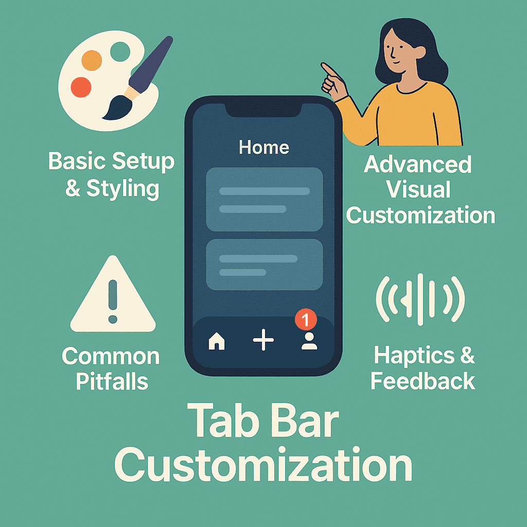
By the end, you’ll have a TabBar that looks pro, feels smooth, and just works. So let’s leave boring behind and build something that stands out. Ready? Let’s dive in 🚀🎨 Basic TabBar Setup & Styling
🧱 Let’s Start with the Foundation
Before we get wild with animations, badges, and bouncing icons, let’s lay down a solid base. You know — walk before you animate a spring-loaded custom shape into view 🚶♂️
At the heart of it all is TabView, and getting it right upfront makes every customization easier later. So let’s start clean:
struct ContentView: View {
    var body: some View {
        TabView {
            HomeView()
                .tabItem {
                    Image(systemName: "house")
                    Text("Home")
                }

            SearchView()
                .tabItem {
                    Image(systemName: "magnifyingglass")
                    Text("Search")
                }

            ProfileView()
                .tabItem {
                    Image(systemName: "person")
                    Text("Profile")
                }
        }
    }
}
Clean and simple? Sure. But let’s be honest — that default gray TabBar isn’t winning any design awards 😅
Customizing Colors and Background
Time to give it a glow-up. SwiftUI makes it surprisingly easy to change the TabBar’s background, tint, and overall vibe. You’ve got a few options — pick whatever fits your app’s personality.
struct ContentView: View {
    init() {
        // Customize TabBar appearance
        UITabBar.appearance().backgroundColor = UIColor.systemBackground
        UITabBar.appearance().unselectedItemTintColor = UIColor.systemGray
    }

    var body: some View {
        TabView {
            // Your tabs here
        }
        .accentColor(.blue) // Changes selected tab color
        .background(Color.white)
    }
}
💡 Pro tip: Use the init() method inside your View to configure TabBar appearance when the view is created — it’s the perfect spot for one-time global tweaks.
Font and Text Styling
Want your tab labels to stand out a bit more? Custom fonts to the rescue — here’s how to tweak them:
init() {
    // Custom font for tab items
    UITabBarItem.appearance().setTitleTextAttributes([
        .font: UIFont.systemFont(ofSize: 12, weight: .medium)
    ], for: .normal)

    UITabBarItem.appearance().setTitleTextAttributes([
        .font: UIFont.systemFont(ofSize: 12, weight: .bold)
    ], for: .selected)
}
Icon Customization Basics
Icons can make or break your TabBar. Here’s how to get them just right:
TabView {
    HomeView()
        .tabItem {
            Image(systemName: "house.fill") // Use .fill for selected state
            Text("Home")
        }
        .tag(0)
}
.onAppear {
    // Ensure icons show properly
    UITabBar.appearance().unselectedItemTintColor = UIColor.gray
}
⚡ Quick Wins for Better Icons
- Use SF Symbols to keep everything consistent and native-looking
- Pick
**.fill**variants for selected states (they add subtle visual weight) - Keep icons intuitive — a house means Home, not Settings, please 😅
✨ Advanced Visual Customization
Now that you’ve nailed the basics, let’s turn up the heat 🔥 This is where your TabBar goes from “nice” to “wait… how did they do that?”
Custom Tab Shapes and Animations
Want to break free from boring rectangles? SwiftUI makes it surprisingly fun to craft custom tab shapes that give your app real personality:
struct CustomTabView: View {
    @State private var selectedTab = 0

    var body: some View {
        ZStack(alignment: .bottom) {
            TabView(selection: $selectedTab) {
                HomeView().tag(0)
                SearchView().tag(1)
                ProfileView().tag(2)
            }

            // Custom tab bar overlay
            HStack {
                ForEach(0..<3) { index in
                    Button(action: {
                        withAnimation(.spring(response: 0.4, dampingFraction: 0.6, blendDuration: 0)) {
                            selectedTab = index
                        }
                    }) {
                        VStack(spacing: 4) {
                            Image(systemName: tabIcon(for: index))
                                .font(.system(size: 24, weight: .medium))
                                .foregroundColor(selectedTab == index ? .blue : .gray)
                                .scaleEffect(selectedTab == index ? 1.3 : 1.0)

                            if selectedTab == index {
                                Circle()
                                    .fill(Color.blue)
                                    .frame(width: 6, height: 6)
                            }
                        }
                    }
                    .frame(maxWidth: .infinity)
                }
            }
            .padding()
            .background(Color.white.shadow(radius: 2))
        }
    }

    func tabIcon(for index: Int) -> String {
        let icons = ["house.fill", "magnifyingglass", "person.fill"]
        return icons[index]
    }
}
See how that .spring() animation adds that extra bounce? That little bit of movement feels intentional — and users notice it (even if they don’t realize it).
Want to go deeper into animation magic? Check out: Advanced Animations in SwiftUI: matchedGeometryEffect, TimelineView, PhaseAnimator & Beyond 🎭
**Advanced Animations in SwiftUI: matchedGeometryEffect, TimelineView, PhaseAnimator & Beyond (2025…** _In this deep dive, we’re exploring SwiftUI’s most advanced animation tools — from layout-matching transitions and…_medium.comhttps://medium.com/swift-pal/advanced-animations-in-swiftui-matchedgeometryeffect-timelineview-phaseanimator-beyond-2025-da8876b7b0b9
Badge Implementation
🔔 Badges are perfect for drawing attention — whether it’s unread messages, cart items, or app alerts.
Let’s slap a badge on this thing the right way:
struct BadgedTabItem: View {
    let iconName: String
    let title: String
    let badgeCount: Int
    let isSelected: Bool

    var body: some View {
        VStack {
            ZStack {
                Image(systemName: iconName)
                    .font(.system(size: 24))
                    .foregroundColor(isSelected ? .blue : .gray)

                if badgeCount > 0 {
                    Text("\(badgeCount)")
                        .font(.caption2)
                        .foregroundColor(.white)
                        .padding(4)
                        .background(Color.red)
                        .clipShape(Circle())
                        .offset(x: 12, y: -12)
                        .scaleEffect(badgeCount > 99 ? 0.8 : 1.0)
                }
            }

            Text(title)
                .font(.caption)
                .foregroundColor(isSelected ? .blue : .gray)
        }
    }
}
💡 Pro tip: Use .scaleEffect() on your badges when dealing with higher numbers — it keeps things tidy and avoids awkward layout breaks!
Custom Selection Indicators
🎨 Ditch that default blue tint — your TabBar deserves better. Let’s create something that actually matches your app’s vibe (and sticks in users’ minds):
struct LineSelectionIndicator: View {
    let isSelected: Bool

    var body: some View {
        if isSelected {
            RoundedRectangle(cornerRadius: 2)
                .fill(
                    LinearGradient(
                        colors: [.blue, .purple],
                        startPoint: .leading,
                        endPoint: .trailing
                    )
                )
                .frame(width: 60, height: 4)
                .transition(.asymmetric(
                    insertion: .scale.combined(with: .opacity),
                    removal: .opacity
                ))
        }
    }
}
Floating Action Button Integration
➕ Want to add a standout center button (like a floating action button)? Here’s the magic that makes it pop:
struct FloatingTabView: View {
    @State private var selectedTab = 0

    var body: some View {
        ZStack {
            TabView(selection: $selectedTab) {
                // Your regular tabs
            }
            .tabViewStyle(.page(indexDisplayMode: .never))

            VStack {
                Spacer()
                HStack {
                    // Left tabs
                    TabButton(icon: "house", isSelected: selectedTab == 0) {
                        selectedTab = 0
                    }

                    Spacer()

                    // Floating center button
                    Button(action: { /* Special action */ }) {
                        Image(systemName: "plus")
                            .font(.title2)
                            .foregroundColor(.white)
                            .frame(width: 60, height: 60)
                            .background(
                                Circle()
                                    .fill(LinearGradient(
                                        colors: [.pink, .orange],
                                        startPoint: .topLeading,
                                        endPoint: .bottomTrailing
                                    ))
                            )
                            .shadow(radius: 8)
                    }
                    .offset(y: -20)

                    Spacer()

                    // Right tabs
                    TabButton(icon: "person", isSelected: selectedTab == 1) {
                        selectedTab = 1
                    }
                }
                .padding(.horizontal, 20)
                .padding(.bottom, 20)
            }
        }
    }
}
The floating button gives off that “tap me, I do something important” vibe — perfect for spotlighting primary actions. Pretty slick, right? 😎
Up next: interactive enhancements — we’re talking haptic feedback, smooth transitions, and the kind of subtle polish that makes your TabBar feel alive 🔄✨
🔄 Interactive Enhancements
Time to breathe life into your TabBar! This is where we add those delightful micro-interactions that make users go, “Ooh… that’s smooth!” 🎯
Think haptics, transitions, and subtle motion — the kind of details that turn good apps into great ones.
Custom Tab Transitions
Let’s add some visual flair when switching tabs — because instant snaps are sooo 2020 😅
Here’s how to create smooth, custom transitions that make your TabBar feel way more polished:
struct TransitionTabView: View {
    @State private var selectedTab = 0
    @State private var previousTab = 0
    @State private var isMovingForward = true // Track direction explicitly
    @Namespace private var animation

    var body: some View {
        GeometryReader { geometry in
            VStack(spacing: 0) {
                // Content area with direction-aware transitions
                ZStack {
                    if selectedTab == 0 {
                        HomeView()
                            .frame(width: geometry.size.width, height: geometry.size.height - 100)
                            .transition(isMovingForward ? forwardTransition : backwardTransition)
                    }
                    if selectedTab == 1 {
                        SearchView()
                            .frame(width: geometry.size.width, height: geometry.size.height - 100)
                            .transition(isMovingForward ? forwardTransition : backwardTransition)
                    }
                    if selectedTab == 2 {
                        ProfileView()
                            .frame(width: geometry.size.width, height: geometry.size.height - 100)
                            .transition(isMovingForward ? forwardTransition : backwardTransition)
                    }
                }
                .animation(.easeInOut(duration: 0.3), value: selectedTab)

                customTabBar
                    .frame(height: 100)
            }
        }
        .ignoresSafeArea(.all)
    }

    // Separate transitions for each direction
    var forwardTransition: AnyTransition {
        .asymmetric(
            insertion: .move(edge: .trailing).combined(with: .opacity),
            removal: .move(edge: .leading).combined(with: .opacity)
        )
    }

    var backwardTransition: AnyTransition {
        .asymmetric(
            insertion: .move(edge: .leading).combined(with: .opacity),
            removal: .move(edge: .trailing).combined(with: .opacity)
        )
    }

    var customTabBar: some View {
        HStack {
            ForEach(0..<3) { index in
                Button(action: {
                    // Calculate direction BEFORE changing selectedTab
                    isMovingForward = index > selectedTab
                    previousTab = selectedTab

                    withAnimation(.spring(response: 0.3, dampingFraction: 0.7)) {
                        selectedTab = index
                    }
                }) {
                    VStack(spacing: 6) {
                        Image(systemName: tabIcon(for: index))
                            .font(.system(size: 24))
                            .foregroundColor(selectedTab == index ? .white : .gray)

                        Text(tabTitle(for: index))
                            .font(.caption)
                            .foregroundColor(selectedTab == index ? .white : .gray)
                    }
                    .padding(.horizontal, 20)
                    .padding(.vertical, 12)
                    .background {
                        if selectedTab == index {
                            Capsule()
                                .fill(.blue)
                                .matchedGeometryEffect(id: "selectedTab", in: animation)
                        }
                    }
                }
            }
        }
        .padding(.horizontal)
        .padding(.bottom, 20)
    }

    func tabIcon(for index: Int) -> String {
        ["house.fill", "magnifyingglass", "person.fill"][index]
    }

    func tabTitle(for index: Int) -> String {
        ["Home", "Search", "Profile"][index]
    }
}
Notice the .transition()? That’s what gives you that smooth sliding capsule effect between tabs — slick and satisfying! For more animation techniques like this, check out SwiftUI Animations for Beginners: Learn with Simple Examples.
**SwiftUI Animations for Beginners: Learn with Simple Examples (2025 Edition)** _Animations in SwiftUI feel like magic 🪄 — until your view just snaps instead of fades. In this beginner-friendly…_medium.comhttps://medium.com/swift-pal/swiftui-animations-for-beginners-learn-with-simple-examples-2025-edition-76eb224eb633
Haptic Feedback Integration
Nothing says “premium app” like that subtle buzz at just the right moment.
Here’s how to add it:
struct HapticTabView: View {
    @State private var selectedTab = 0

    var body: some View {
        TabView(selection: $selectedTab) {
            HomeView().tag(0)
            SearchView().tag(1)
            ProfileView().tag(2)
        }
        .onChange(of: selectedTab) { oldValue, newValue in
            // Light haptic feedback on tab change
            let impactFeedback = UIImpactFeedbackGenerator(style: .light)
            impactFeedback.impactOccurred()
        }
    }
}

// Or for custom tab bars:
Button(action: {
    // Medium haptic for special actions
    let impactFeedback = UIImpactFeedbackGenerator(style: .medium)
    impactFeedback.impactOccurred()

    selectedTab = index
}) {
    // Your tab content
}
📳 Haptic Guidelines
.light→ for regular tab switches.medium→ for important actions (like sending a message).heavy→ reserve for critical actions only (like deleting something)
⚠️ Don’t overdo it — haptics should enhance the experience, not turn your phone into a massage device 😅
Dynamic Tab Visibility
Sometimes your UI needs to adapt — like showing or hiding tabs based on login state, roles, or user flow.
Here’s a clean implementation:
struct DynamicTabView: View {
    @State private var selectedTab = 0
    @State private var isLoggedIn = false

    var availableTabs: [TabItem] {
        var tabs = [
            TabItem(id: 0, icon: "house.fill", title: "Home"),
            TabItem(id: 1, icon: "magnifyingglass", title: "Search")
        ]

        if isLoggedIn {
            tabs.append(TabItem(id: 2, icon: "person.fill", title: "Profile"))
            tabs.append(TabItem(id: 3, icon: "heart.fill", title: "Favorites"))
        }

        return tabs
    }

    var body: some View {
        VStack {
            // Content area
            ZStack {
                ForEach(availableTabs, id: \.id) { tab in
                    if selectedTab == tab.id {
                        viewForTab(tab.id)
                            .transition(.opacity.combined(with: .scale))
                    }
                }
            }
            .animation(.easeInOut, value: selectedTab)

            Spacer()

            // Dynamic tab bar
            HStack {
                ForEach(availableTabs, id: \.id) { tab in
                    Button(action: { selectedTab = tab.id }) {
                        VStack {
                            Image(systemName: tab.icon)
                                .font(.system(size: 24))
                            Text(tab.title)
                                .font(.caption)
                        }
                        .foregroundColor(selectedTab == tab.id ? .blue : .gray)
                    }
                    .frame(maxWidth: .infinity)
                }
            }
            .padding()
            .background(Color(.systemGray6))
            .animation(.spring(), value: availableTabs.count)
        }
        .onAppear {
            // Simulate login state change
            DispatchQueue.main.asyncAfter(deadline: .now() + 2) {
                isLoggedIn.toggle()
            }
        }
    }

    @ViewBuilder
    func viewForTab(_ id: Int) -> some View {
        switch id {
        case 0: HomeView()
        case 1: SearchView()
        case 2: ProfileView()
        case 3: FavoritesView()
        default: EmptyView()
        }
    }
}

struct TabItem {
    let id: Int
    let icon: String
    let title: String
}
✅ Perfect for situations like:
- Login/logout flows
- Feature flags (turn tabs on/off remotely)
- User permission levels (e.g. admin vs regular user)
- Contextual navigation based on user state
Smooth Tab Bar Hide/Show
Want that sleek, auto-hiding TabBar effect when scrolling content? It’s a subtle touch, but it makes your UI feel way more dynamic. Here’s a smooth implementation:
struct AutoHideTabView: View {
    @State private var isTabBarVisible = true
    @State private var lastScrollOffset: CGFloat = 0

    var body: some View {
        ZStack(alignment: .bottom) {
            ScrollView {
                LazyVStack {
                    ForEach(0..<50) { index in
                        Text("Item \(index)")
                            .padding()
                            .frame(maxWidth: .infinity)
                            .background(Color.blue.opacity(0.1))
                    }
                }
                .background(
                    GeometryReader { proxy in
                        Color.clear
                            .onAppear {
                                lastScrollOffset = proxy.frame(in: .global).minY
                            }
                            .onChange(of: proxy.frame(in: .global).minY) { _, newValue in
                                let delta = newValue - lastScrollOffset

                                withAnimation(.easeInOut(duration: 0.3)) {
                                    if delta > 0 {
                                        // Scrolling up - show tab bar
                                        isTabBarVisible = true
                                    } else if delta < -20 {
                                        // Scrolling down - hide tab bar
                                        isTabBarVisible = false
                                    }
                                }

                                lastScrollOffset = newValue
                            }
                    }
                )
            }

            // Custom tab bar overlay
            if isTabBarVisible {
                HStack {
                    ForEach(0..<3) { index in
                        Button(action: {}) {
                            Image(systemName: ["house", "magnifyingglass", "person"][index])
                                .font(.system(size: 24))
                        }
                        .frame(maxWidth: .infinity)
                    }
                }
                .padding()
                .background(.regularMaterial)
                .transition(.move(edge: .bottom).combined(with: .opacity))
            }
        }
    }
}
These interactive enhancements are what make your TabBar feel responsive, polished, and downright alive.
Users may not be able to put it into words — but they’ll feel the difference. And that’s what sets great apps apart 🎭
⚠️ Common Pitfalls & Solutions
Even seasoned devs run into TabBar headaches — trust me, I’ve been there 😅
Here are some of the most common pitfalls (and how to avoid them), so you can skip the wall-banging phase and get straight to the good stuff.
Performance Considerations
Problem: Your TabBar animations feel janky — especially on older devices.
// ❌ Heavy animations that cause performance issues
struct HeavyTabView: View {
    @State private var selectedTab = 0

    var body: some View {
        TabView(selection: $selectedTab) {
            ForEach(0..<5) { index in
                ComplexView()
                    .tag(index)
                    .tabItem {
                        Image(systemName: "star")
                            .scaleEffect(selectedTab == index ? 2.0 : 1.0) // Too heavy!
                            .animation(.spring(response: 0.1), value: selectedTab) // Too fast!
                    }
            }
        }
    }
}Solution: Optimize your animations by dialing back the complexity — use lighter effects:
// ✅ Performance-optimized approach
struct OptimizedTabView: View {
    @State private var selectedTab = 0

    var body: some View {
        TabView(selection: $selectedTab) {
            ForEach(0..<5) { index in
                LazyView (
                    ComplexView() // Lazy loading prevents all views from loading at once
                )
                .tag(index)
                .tabItem {
                    Image(systemName: "star")
                        .scaleEffect(selectedTab == index ? 1.2 : 1.0) // Reasonable scale
                        .animation(.easeInOut(duration: 0.2), value: selectedTab) // Smoother timing
                }
            }
        }
    }
}

// Lazy wrapper to prevent unnecessary view creation
struct LazyView<Content: View>: View {
    let build: () -> Content
    init(_ build: @autoclosure @escaping () -> Content) {
        self.build = build
    }
    var body: Content {
        build()
    }
}
UITabBar.appearance() Not Working
Problem: Your UITabBar.appearance() customizations aren’t showing up — and you’re wondering if SwiftUI is just ignoring you 😤.
// ❌ Common timing issue
struct AppearanceTabView: View {
    var body: some View {
        TabView {
            HomeView()
                .tabItem {
                    Image(systemName: "house")
                    Text("Home")
                }
        }
        .onAppear {
            // Too late - TabView already rendered!
            UITabBar.appearance().backgroundColor = UIColor.red
        }
    }
}Solution: Set your UITabBar.appearance() tweaks inside init() or before the TabView appears — timing matters! Still not working? Add .id(UUID()) to your TabView to force a refresh and make those styles stick.
// ✅ Proper appearance setup
struct AppearanceTabView: View {
    init() {
        // Set appearance BEFORE view creation
        UITabBar.appearance().backgroundColor = UIColor.systemBackground
        UITabBar.appearance().unselectedItemTintColor = UIColor.systemGray
        UITabBar.appearance().barTintColor = UIColor.systemBackground
    }

    var body: some View {
        TabView {
            HomeView()
                .tabItem {
                    Image(systemName: "house")
                    Text("Home")
                }
        }
        .accentColor(.blue) // SwiftUI way to set selected color
    }
}

// Alternative: Force appearance update
struct ForceRefreshTabView: View {
    @State private var refreshID = UUID()

    var body: some View {
        TabView {
            HomeView()
                .tabItem {
                    Image(systemName: "house")
                    Text("Home")
                }
        }
        .id(refreshID) // Forces recreation when refreshID changes
        .onAppear {
            UITabBar.appearance().backgroundColor = UIColor.red
            refreshID = UUID() // Trigger refresh
        }
    }
}
Memory Leaks with Custom TabBars
Problem: Your custom TabBar is leaking memory — maybe timers, bindings, or state objects aren’t cleaning up properly.
// ❌ Potential memory leak
class TabBarViewModel: ObservableObject {
    @Published var selectedTab = 0
    private var timer: Timer?

    init() {
        // Timer keeps strong reference to self, in general case it's a networking session.
        timer = Timer.scheduledTimer(withTimeInterval: 1.0, repeats: true) { _ in
            self.updateBadgeCount() // Strong reference cycle!
        }
    }

    func updateBadgeCount() {
        // Some logic here
    }
}Solution: Use [weak self] in closures to avoid retain cycles, and make sure to clean up anything like Timer or publishers in onDisappear. Also, use @StateObject only when you truly need ownership — otherwise stick with @ObservedObject. Clean code = clean memory ✅
// ✅ Memory-safe implementation
class TabBarViewModel: ObservableObject {
    @Published var selectedTab = 0
    private var timer: Timer?

    init() {
        timer = Timer.scheduledTimer(withTimeInterval: 1.0, repeats: true) { [weak self] _ in
            self?.updateBadgeCount() // Weak reference prevents cycle
        }
    }

    deinit {
        timer?.invalidate() // Always clean up resources
        timer = nil
    }

    func updateBadgeCount() {
        // Some logic here
    }
}

struct SafeTabView: View {
    @StateObject private var viewModel = TabBarViewModel()

    var body: some View {
        TabView(selection: $viewModel.selectedTab) {
            // Your tabs here
        }
        .onDisappear {
            // Additional cleanup if needed
        }
    }
}
Badge Count Formatting Issues
Problem: Badge numbers look awful once they hit double or triple digits — they overflow, misalign, or just look… off. 😬
// ❌ Ugly badge implementation
struct BadTabBadge: View {
    let count: Int

    var body: some View {
        Text("\(count)") // "1247" looks awful!
            .background(Color.red)
            .clipShape(Circle())
    }
}Solution: Format large numbers smartly — use "99+" or cap it at a visual limit. Pair that with .scaleEffect() to shrink badges slightly for higher counts. Keeps things readable and stylish 🔢✨
// ✅ Smart badge formatting
struct SmartBadge: View {
    let count: Int

    var body: some View {
        Text(formattedCount)
            .font(.caption2)
            .foregroundColor(.white)
            .padding(.horizontal, count > 9 ? 6 : 8)
            .padding(.vertical, 4)
            .background(Color.red)
            .clipShape(Capsule())
            .scaleEffect(count > 99 ? 0.9 : 1.0) // Slightly smaller for big numbers
    }

    private var formattedCount: String {
        switch count {
        case 0:
            return ""
        case 1...9:
            return "\(count)"
        case 10...99:
            return "\(count)"
        case 100...999:
            return "99+"
        default:
            return "99+"
        }
    }
}
Dark Mode Inconsistencies
Problem: Your TabBar looks crisp in light mode… but in dark mode? It’s a murky mess. Text disappears, backgrounds clash, and it feels unpolished 🌚💥
// ❌ Hard-coded colors that break in dark mode
struct BrokenDarkModeTab: View {
    var body: some View {
        TabView {
            HomeView()
                .tabItem {
                    Image(systemName: "house")
                    Text("Home")
                }
        }
        .background(Color.white) // Oops! White in dark mode
        .foregroundColor(.black) // Black text on dark background
    }
}Solution: Use adaptive system colors like .background, .label, or .secondarySystemBackground to keep things readable in both light and dark mode. And yep — actually test both modes before shipping! 🌞🌚
// ✅ Dark mode friendly implementation
struct AdaptiveTabView: View {
    var body: some View {
        TabView {
            HomeView()
                .tabItem {
                    Image(systemName: "house")
                    Text("Home")
                }
        }
        .background(Color(.systemBackground)) // Adapts automatically
        .foregroundColor(Color(.label)) // Adapts automatically
    }
}

// Custom adaptive colors
extension Color {
    static let adaptiveBackground = Color(.systemBackground)
    static let adaptiveText = Color(.label)
    static let adaptiveSecondary = Color(.secondaryLabel)
}
💡 Pro tip: Always test your TabBar in both light and dark modes. What looks perfect in sunlight might turn into a mystery UI at midnight 🌙
These pitfalls catch almost everyone at some point — even the seasoned devs. The real win? Knowing they exist and having the fix ready when they show up.
Your future self will thank you for this moment of foresight 😉
**SwiftUI Styling Guide: Fonts, Themes, Dark Mode & Why Order Matters** _🎨 Give your SwiftUI app a complete style upgrade! Learn how to add custom fonts, build adaptive themes, support dark…_medium.comhttps://medium.com/swift-pal/swiftui-styling-guide-fonts-themes-dark-mode-why-order-matters-7fbf5389d384
🎯 Wrapping Up
And there you have it! We’ve officially upgraded your TabBar from a bland gray strip to a clean, snappy experience your users will actually want to tap on 🎉
From smooth animations to subtle haptics — it’s those little details that make your app feel thoughtful, polished, and pro.
🧠 Key Takeaways
🎨 Start with the basics Master your colors, fonts, and backgrounds before chasing fancy animations. A well-styled simple TabBar will always beat a flashy one that doesn’t work right.
✨ Animations make the difference Those buttery spring effects, sliding transitions, and animated capsules? That’s the secret sauce that sets your app apart from a sea of default TabBars.
🔄 Interactions create delight Haptics, smooth transitions, and tabs that respond to context — they’re not just extras. They’re what make users go, “Okay, this app feels premium.”
⚠️ Avoid the classic pitfalls Dark mode fails, layout bugs, janky performance — these sneak up fast. Plan for them early and save yourself hours of head-scratching later.
🏗️ Build for real-world use Custom tabs should work with login flows, scroll behavior, feature flags, and more. Think experience, not just appearance.
🚀 Your Next Steps
Now comes the fun part — experimenting! 🎨 Take these code snippets and make them yours. Try out wild color combos, mess with animation timing, or mash up multiple techniques into something totally unique.
Break stuff. Tweak stuff. Rebuild it. That’s where the real learning lives. Every funky layout glitch or misbehaving transition teaches you something new about how SwiftUI ticks. And when you finally get that buttery-smooth tab switch to work? Pure 👌.
Just remember: slick TabBars don’t happen by accident. They’re built with patience, curiosity, and a little bit of that “I will make this look good even if it kills me” energy 😅
Your users might never say, “Wow, this TabBar is amazing!” — but they’ll feel it. And in a sea of lookalike apps, feeling different is what matters most.
🎉 Enjoyed this article? Your support means the world to me!
💬 Drop a comment below! I love hearing about your experiences and answering questions
🎬 Subscribe on Youtube and become early subscribers of my channel: https://www.youtube.com/@swift-pal
💼 Let’s connect on LinkedIn for more professional insights: https://www.linkedin.com/in/karan-pal
Happy coding! 🚀
New articles, straight to your inbox.
No spam, no filler — just new writing on iOS, the web, and AI when it ships. Unsubscribe anytime.
Keep reading
Your CPU Has More Cores Than Your Job Can Use
Some work splits cleanly across hundreds of cores. Other work is a chain of steps where every new step has to wait for the last one to finish.
ReadYour Password Isn’t as Random as You Think
Crack-time calculators measure the size of a theoretical password space—not how people actually choose passwords or how attackers search them.
Read