Build Custom Transitions in SwiftUI: Guide to Navigation Zoom, Detents & Custom Animations in Views
Stop settling for boring default animations — create the smooth, professional transitions your users expect
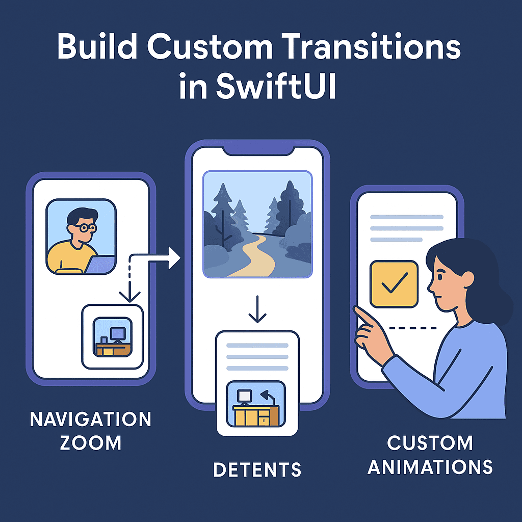

In this guide, we’ll build five specific transitions and animations that you’ll actually want to use in production apps: a photo gallery zoom (because every app needs media handling), a card-to-detail expansion (perfect for e-commerce or content apps), a modal presentation that doesn’t feel like it came out of nowhere, a scale and slide animation and a 3D flip animation that gives your app a premium feel.
📺 Coming soon to Swift Pal: _https://youtube.com/@swift-pal_ — I’ll walk through each of these implementations step-by-step in the video.
You can download the source code available 👉🏻 here
No theory-heavy explanations or contrived examples. Just practical transitions that solve real problems your users face every day.
📸 Photo Gallery Navigation: The Right Way
Okay, let’s be honest about something. Most photo gallery tutorials show you some complicated matchedGeometryEffect hack that never quite works right in production. The image bounces weird, the timing feels off, or it breaks when you rotate the device.
Here’s the thing — if you’re building a photo gallery in 2025, you should probably just use proper navigation. Users expect to be able to swipe back, use the navigation bar, and have everything work predictably. Fighting against SwiftUI’s navigation system usually ends up feeling janky.
The Modern iOS 18+ Approach
If you’re targeting iOS 18+, Apple finally gave us the .navigationTransition(.zoom) that actually works:
import SwiftUI

struct PhotoGallery: View {
    @Namespace private var photoTransition

    let photos = [
        Photo(id: 1, imageName: "https://picsum.photos/id/1/400", title: "Coder"),
        Photo(id: 2, imageName: "https://picsum.photos/id/2/400", title: "Coffee Coder"),
        Photo(id: 3, imageName: "https://picsum.photos/id/3/400", title: "Mobile Engineer"),
        Photo(id: 10, imageName: "https://picsum.photos/id/10/400", title: "Forest Path"),
        Photo(id: 20, imageName: "https://picsum.photos/id/20/400", title: "Pretty Desk"),
        Photo(id: 30, imageName: "https://picsum.photos/id/30/400", title: "Coffee Mug")
    ]

    var body: some View {
        NavigationStack {
            ScrollView {
                LazyVGrid(columns: Array(repeating: GridItem(.flexible()), count: 3), spacing: 8) {
                    ForEach(photos) { photo in
                        NavigationLink(value: photo) {
                            AsyncImage(url: URL(string: photo.imageName)) { image in
                                image
                                    .resizable()
                                    .aspectRatio(contentMode: .fill)
                                    .frame(width: 100, height: 100)
                                    .clipped()
                                    .cornerRadius(8)
                            } placeholder: {
                                Rectangle()
                                    .fill(Color.gray.opacity(0.3))
                                    .frame(width: 100, height: 100)
                                    .cornerRadius(8)
                            }
                        }
                        .matchedTransitionSource(id: photo.id, in: photoTransition)
                    }
                }
                .padding()
            }
            .navigationTitle("Photos")
            .navigationDestination(for: Photo.self) { photo in
                PhotoDetailView(photo: photo)
                    .navigationTransition(.zoom(sourceID: photo.id, in: photoTransition))
                    .navigationBarTitleDisplayMode(.inline)
            }
        }
    }
}

struct PhotoDetailView: View {
    let photo: Photo

    var body: some View {
        ScrollView {
            VStack(spacing: 20) {
                AsyncImage(url: URL(string: photo.imageName)) { image in
                    image
                        .resizable()
                        .aspectRatio(contentMode: .fit)
                } placeholder: {
                    ProgressView()
                        .frame(height: 300)
                }

                Text(photo.title)
                    .font(.largeTitle)
                    .fontWeight(.bold)

                Text("Captured during a perfect moment when light and landscape came together. This image represents the beauty of natural photography.")
                    .font(.body)
                    .foregroundColor(.secondary)
                    .multilineTextAlignment(.center)
                    .padding(.horizontal)
            }
        }
        .navigationTitle(photo.title)
    }
}

struct Photo: Identifiable, Hashable {
    let id: Int
    let imageName: String
    let title: String
}
Breaking Down the Magic
Let me walk through the key parts because this is way simpler than it looks:
The Namespace Setup:
@Namespace private var photoTransitionInstead of handling tap gestures manually, we’re using proper NavigationLink with a value. The .navigationTransition(.zoom...) tells SwiftUI to use a zoom animation when navigating to/from this specific photo.
The NavigationLink Setup with matchedTransitionSource:
.matchedTransitionSource(id: photo.id, in: photoTransition)This tells SwiftUI the source view it needs to open the destination from.
The Destination Setup:
.navigationDestination(for: Photo.self) { photo in
    PhotoDetailView(photo: photo)
        .navigationTransition(.zoom(sourceID: photo.id, in: photoTransition))
}
This is where SwiftUI connects the dots. When someone taps a NavigationLink with a Photo value, show the PhotoDetailView. The matching sourceID (the photo's id) and photoTransition namespace tell SwiftUI exactly which elements to animate between.
Why This Works Better:
- Proper navigation stack — users can swipe back, use the navigation bar, everything works as expected
- Automatic state management — SwiftUI handles all the showing/hiding logic
- Consistent animation timing — no weird bounces or timing conflicts
- Accessibility support — screen readers and other assistive technologies work properly
- Deep linking ready — you can programmatically navigate to specific photos
When Zoom Transitions Actually Help
Use zoom transitions when:
- You’re showing the same content at different scales (photos, documents, maps)
- The relationship between views is obvious (grid item → detail view)
- Users need visual continuity to understand where they are
Don’t use them when:
- Views show completely different content types
- You’re just trying to make navigation “fancy”
- The source and destination don’t have a clear visual relationship
The best navigation transitions are the ones users don’t even notice — they just make the app feel more natural and responsive.
📱 Card-to-Detail Expansions: Making Lists Feel Alive
Here’s where things get interesting. You know that satisfying feeling when you tap a card in an app and it smoothly expands into a detail view? Like in the App Store when you tap an app preview, or in Apple News when you select an article?
That’s not just eye candy — it’s solving a real UX problem. When users tap a card, they want to feel like they’re diving deeper into that specific item, not jumping to some disconnected screen. The expansion creates visual continuity that keeps users oriented.
Building a Product Card Expansion
Let’s build something you’d actually use — a product catalog where cards expand into detail views. Think e-commerce, portfolio apps, or any content browser.
First, let’s set up our data model:
struct Product: Identifiable, Hashable {
    let id: Int
    let name: String
    let price: String
    let image: String
    let category: String
}
Simple but practical. The Identifiable protocol is required for SwiftUI's ForEach, and Hashable is needed for the navigation system to properly match and transition between views.
Setting up the main catalog view:
import SwiftUI

struct ProductCatalogView: View {
    @Namespace private var cardTransition

    let products = [
        Product(id: 1, name: "Wireless Headphones", price: "$299", image: "https://picsum.photos/id/96/300", category: "Audio"),
        Product(id: 2, name: "Smart Watch", price: "$399", image: "https://picsum.photos/id/119/300", category: "Wearables"),
        Product(id: 3, name: "Laptop Stand", price: "$89", image: "https://picsum.photos/id/48/300", category: "Accessories"),
        Product(id: 4, name: "Bluetooth Speaker", price: "$149", image: "https://picsum.photos/id/155/300", category: "Audio")
    ]

    var body: some View {
        NavigationStack {
            ScrollView {
                LazyVStack(spacing: 16) {
                    ForEach(products) { product in
                        NavigationLink(value: product) {
                            ProductCardView(product: product)
                                .contentShape(Rectangle())
                                .matchedTransitionSource(id: product.id, in: cardTransition)
                        }
                        .buttonStyle(PlainButtonStyle())
                    }
                }
                .padding()
            }
            .navigationTitle("Products")
            .navigationDestination(for: Product.self) { product in
                ProductDetailView(product: product)
                    .navigationTransition(.zoom(sourceID: product.id, in: cardTransition))
            }
        }
    }
}
Here’s what’s happening:
- @Namespace creates the shared reference for smooth transitions
- NavigationLink(value: product) uses the modern navigation approach where you pass data instead of specifying destinations directly
- .matchedTransitionSource(id: product.id, in: cardTransition) tells SwiftUI this entire card should be the source of the zoom transition
- .navigationTransition(.zoom(…)) applies the zoom effect when navigating to the detail view
- .buttonStyle(PlainButtonStyle()) removes default button styling so our custom card design shows properly
Building the product card:
import SwiftUI

struct ProductCardView: View {
    let product: Product

    var body: some View {
        VStack(alignment: .leading, spacing: 12) {
            // Product Image
            AsyncImage(url: URL(string: product.image)) { image in
                image
                    .resizable()
                    .aspectRatio(contentMode: .fill)
                    .frame(height: 200)
                    .clipped()
            } placeholder: {
                Rectangle()
                    .fill(Color.gray.opacity(0.3))
                    .frame(height: 200)
            }

            VStack(alignment: .leading, spacing: 8) {
                // Category Badge
                HStack {
                    Text(product.category)
                        .font(.caption)
                        .foregroundColor(.secondary)
                        .padding(.horizontal, 8)
                        .padding(.vertical, 4)
                        .background(Color.blue.opacity(0.1))
                        .cornerRadius(8)

                    Spacer()
                }

                // Product Name
                Text(product.name)
                    .font(.title2)
                    .fontWeight(.semibold)
                    .lineLimit(2)

                // Price
                Text(product.price)
                    .font(.title3)
                    .fontWeight(.bold)
                    .foregroundColor(.primary)
            }
            .padding(.horizontal, 16)
            .padding(.bottom, 16)
        }
        .background(Color(.systemBackground))
        .cornerRadius(16)
        .overlay(
            RoundedRectangle(cornerRadius: 16)
                .stroke(Color.black.opacity(0.05), lineWidth: 0.5)
        )
    }
}
This creates a clean, professional card with:
- Consistent image sizing using
.frame(height: 200)and.aspectRatio(contentMode: .fill) - Category badge for quick visual categorization
- Product information laid out in a scannable hierarchy
- Card styling with rounded corners
The key here is that the entire card (not just the image) will be the source of the zoom transition because we applied .matchedTransitionSource to the whole card view.
The detail view structure:
import SwiftUI

struct ProductDetailView: View {
    let product: Product

    var body: some View {
        ScrollView {
            VStack(alignment: .leading, spacing: 24) {
                // Hero Image - same as card but bigger
                AsyncImage(url: URL(string: product.image)) { image in
                    image
                        .resizable()
                        .aspectRatio(contentMode: .fill)
                        .frame(height: 300)
                        .clipped()
                } placeholder: {
                    Rectangle()
                        .fill(Color.gray.opacity(0.3))
                        .frame(height: 300)
                }

                VStack(alignment: .leading, spacing: 16) {
                    // Enhanced Category Badge
                    HStack {
                        Text(product.category)
                            .font(.subheadline)
                            .foregroundColor(.white)
                            .padding(.horizontal, 12)
                            .padding(.vertical, 6)
                            .background(Color.blue)
                            .cornerRadius(12)

                        Spacer()
                    }

                    // Product Name - larger in detail
                    Text(product.name)
                        .font(.largeTitle)
                        .fontWeight(.bold)

                    // Price - emphasized with color
                    Text(product.price)
                        .font(.title)
                        .fontWeight(.semibold)
                        .foregroundColor(.green)

                    // Product Description
                    Text("Premium quality product designed with attention to detail. Perfect for everyday use with modern aesthetics and reliable performance.")
                        .font(.body)
                        .foregroundColor(.secondary)
                        .lineSpacing(4)

                    // Features Section
                    VStack(alignment: .leading, spacing: 12) {
                        Text("Features")
                            .font(.headline)
                            .fontWeight(.semibold)

                        FeatureRow(icon: "checkmark.circle.fill", text: "High-quality materials")
                        FeatureRow(icon: "checkmark.circle.fill", text: "1-year warranty included")
                        FeatureRow(icon: "checkmark.circle.fill", text: "Free shipping worldwide")
                    }

                    Spacer(minLength: 100)
                }
                .padding(.horizontal, 20)
            }
        }
        .navigationTitle(product.name)
        .navigationBarTitleDisplayMode(.inline)
        .overlay(alignment: .bottom) {
            // Add to Cart Button
            Button(action: {}) {
                Text("Add to Cart - \(product.price)")
                    .font(.headline)
                    .foregroundColor(.white)
                    .frame(maxWidth: .infinity)
                    .padding()
                    .background(Color.blue)
                    .cornerRadius(12)
            }
            .padding(.horizontal, 20)
            .padding(.bottom, 20)
            .background(
                Color(.systemBackground)
                    .shadow(color: .black.opacity(0.1), radius: 10, x: 0, y: -5)
            )
        }
    }
}

struct FeatureRow: View {
    let icon: String
    let text: String

    var body: some View {
        HStack(spacing: 12) {
            Image(systemName: icon)
                .foregroundColor(.green)
                .frame(width: 20)

            Text(text)
                .font(.body)
        }
    }
}
The detail view expands on the card’s information:
- Same image but larger, creating visual continuity
- Enhanced styling of the same elements (category, name, price)
- Additional content like description and features
- Action button overlay for purchasing
What Makes This Implementation Work
Clean Architecture: Each view has a single responsibility — the card shows essential info, the detail provides comprehensive information.
Visual Continuity: Using the same image and consistent styling helps users understand they’re looking at the same product in more detail.
Proper Navigation: Using NavigationLink with values and .navigationDestination gives users expected navigation behaviors (swipe back, navigation bar).
Smooth Transitions: The .matchedTransitionSource on the entire card creates a satisfying zoom effect that feels natural.
When Card Expansions Make Sense
This pattern works great for:
- E-commerce product catalogs (like we built)
- Portfolio or gallery apps (design work, photography)
- News or article feeds (expanding to full articles)
- Social media content (posts expanding to detail views)
Avoid it for:
- Navigation between unrelated sections (Settings → About page)
- Forms or data entry (where the relationship isn’t visual)
- Simple list items (where a basic push animation is clearer)
The expansion should feel like you’re zooming into more detail about the same thing, not jumping to a completely different context.
🎭 Modal Presentations: Beyond Basic Sheets
Default SwiftUI sheets work fine, but sometimes they feel… abrupt. You tap a button and suddenly there’s a view covering everything with no context about where it came from or how it relates to what you were doing.
Modal transitions solve this by creating smooth, contextual presentations that feel connected to the user’s action. Think about how Apple’s Control Center slides up from the bottom, or how the Camera app’s settings panel slides in from the side.
When Modals Make Sense
Before we dive into code, let’s talk about when you’d actually want this. Modal transitions work best for:
- Settings or options panels that relate to specific content
- Quick actions that don’t warrant full navigation (like sharing, editing)
- Form presentations where you want to maintain context
- Progressive disclosure where users need to see both the source and destination
Don’t use them for:
- Primary navigation between main app sections
- Complex multi-step flows (use proper navigation instead)
- Full-screen content that should take over completely
Building a Slide-Up Settings Panel
Let’s create something practical — a settings panel that slides up from a button. This pattern is everywhere in modern apps:
First, let’s set up our main view with a trigger:
import SwiftUI

struct CustomModalView: View {
    @State private var showingSettings = false

    var body: some View {
        NavigationStack {
            VStack(spacing: 20) {
                Text("Main Content")
                    .font(.largeTitle)
                    .fontWeight(.bold)

                Text("This is your main app content. The settings panel will slide up from the bottom when you tap the button.")
                    .multilineTextAlignment(.center)
                    .foregroundColor(.secondary)
                    .padding(.horizontal)

                Spacer()

                Button(action: {
                    showingSettings = true
                }) {
                    HStack {
                        Image(systemName: "gear")
                        Text("Settings")
                    }
                    .font(.headline)
                    .foregroundColor(.white)
                    .padding()
                    .background(Color.blue)
                    .cornerRadius(12)
                }
            }
            .padding()
            .navigationTitle("Custom Modal")
        }
        .sheet(isPresented: $showingSettings) {
            SettingsModalView(isPresented: $showingSettings)
                .presentationDetents([.medium, .large])
                .presentationDragIndicator(.visible)
        }
    }
}
Here we’re using .presentationDetents([.medium, .large]) to create a half-sheet that can expand to full screen, and .presentationDragIndicator(.visible) to show the drag handle.
Now the custom settings modal:
struct SettingsModalView: View {
    @Binding var isPresented: Bool
    @State private var notificationsEnabled = true
    @State private var darkModeEnabled = false
    @State private var selectedLanguage = "English"

    let languages = ["English", "Spanish", "French", "German"]

    var body: some View {
        NavigationStack {
            VStack(spacing: 0) {
                // Header
                VStack(spacing: 8) {
                    Text("Settings")
                        .font(.title2)
                        .fontWeight(.semibold)

                    Text("Customize your app experience")
                        .font(.subheadline)
                        .foregroundColor(.secondary)
                }
                .padding(.top, 20)
                .padding(.bottom, 30)

                // Settings Content
                ScrollView {
                    VStack(spacing: 24) {
                        SettingsSection(title: "Preferences") {
                            SettingsRow(
                                icon: "bell.fill",
                                title: "Notifications",
                                subtitle: "Get alerts for new content"
                            ) {
                                Toggle("", isOn: $notificationsEnabled)
                                    .labelsHidden()
                            }

                            SettingsRow(
                                icon: "moon.fill",
                                title: "Dark Mode",
                                subtitle: "Use dark appearance"
                            ) {
                                Toggle("", isOn: $darkModeEnabled)
                                    .labelsHidden()
                            }
                        }

                        SettingsSection(title: "Language") {
                            SettingsRow(
                                icon: "globe",
                                title: "App Language",
                                subtitle: selectedLanguage
                            ) {
                                Menu(selectedLanguage) {
                                    ForEach(languages, id: \.self) { language in
                                        Button(language) {
                                            selectedLanguage = language
                                        }
                                    }
                                }
                                .foregroundColor(.blue)
                            }
                        }
                    }
                    .padding(.horizontal, 20)
                }

                Spacer()
            }
            .toolbar {
                ToolbarItem(placement: .navigationBarTrailing) {
                    Button("Done") {
                        isPresented = false
                    }
                }
            }
        }
    }
}
This creates a clean, organized settings panel with proper sections and controls.
Supporting components for clean organization:
struct SettingsSection<Content: View>: View {
    let title: String
    let content: Content

    init(title: String, @ViewBuilder content: () -> Content) {
        self.title = title
        self.content = content()
    }

    var body: some View {
        VStack(alignment: .leading, spacing: 12) {
            Text(title)
                .font(.headline)
                .foregroundColor(.primary)
                .padding(.horizontal, 4)

            VStack(spacing: 0) {
                content
            }
            .background(Color(.secondarySystemGroupedBackground))
            .cornerRadius(12)
        }
    }
}

struct SettingsRow<Content: View>: View {
    let icon: String
    let title: String
    let subtitle: String
    let content: Content

    init(icon: String, title: String, subtitle: String, @ViewBuilder content: () -> Content) {
        self.icon = icon
        self.title = title
        self.subtitle = subtitle
        self.content = content()
    }

    var body: some View {
        HStack(spacing: 16) {
            Image(systemName: icon)
                .font(.title3)
                .foregroundColor(.blue)
                .frame(width: 24, height: 24)

            VStack(alignment: .leading, spacing: 2) {
                Text(title)
                    .font(.body)
                    .fontWeight(.medium)

                Text(subtitle)
                    .font(.caption)
                    .foregroundColor(.secondary)
            }

            Spacer()

            content
        }
        .padding(.horizontal, 16)
        .padding(.vertical, 12)
    }
}
What Makes These Modals Feel Better
Contextual Presentation: Using .presentationDetents lets users see both the modal and the content behind it, maintaining context.
Interactive Dismissal: Users can drag to dismiss or tap outside, giving them control over the interaction.
Clear Hierarchy: The modal content is organized and easy to scan, with clear sections and actions.
The key is making the modal feel like a natural extension of the current context, not a jarring interruption.
🔧 Building Custom Transitions From Scratch
Alright, enough with the built-in stuff. Let’s get our hands dirty and build transitions that actually require some coding skills. Because honestly? Most of the time you need something Apple didn’t think to include, or you’re supporting iOS versions that don’t have the fancy new modifiers.
Here’s where we’ll build transitions that work anywhere, look unique, and give you full control over the animation timing and behavior.
Custom Slide-and-Scale Transition
Let’s start with something practical — a transition where new content slides in from the right while scaling up, and the old content slides out to the left while scaling down. Perfect for onboarding flows, step-by-step forms, or any sequential content.
First, let’s set up our transition container:
import SwiftUI

enum ActionType {
    case next
    case previous
}

struct CustomTransitionView: View {
    @State private var currentStep = 1
    @State private var actionType: ActionType = .next

    var body: some View {
        NavigationStack {
            VStack(spacing: 30) {
                Text("Custom Transition Demo")
                    .font(.largeTitle)
                    .fontWeight(.bold)

                // This is where the magic happens
                ZStack {
                    ForEach(1...3, id: \.self) { step in
                        if step == currentStep {
                            if actionType == .next {
                                StepContentView(step: step)
                                    .transition(.asymmetric(
                                        insertion: .slideInFromRight,
                                        removal: .slideInFromRight
                                    ))
                            } else {
                                StepContentView(step: step)
                                    .transition(.asymmetric(
                                        insertion: .slideInFromLeft,
                                        removal: .slideInFromLeft
                                    ))
                            }
                        }
                    }
                }
                .frame(height: 300)
                .background(Color(.systemGroupedBackground))
                .cornerRadius(16)

                HStack(spacing: 20) {
                    Button("Previous") {
                        if currentStep > 1 {
                            actionType = .previous
                            withAnimation(.spring(response: 0.6, dampingFraction: 0.8)) {
                                currentStep -= 1
                            }
                        }
                    }
                    .disabled(currentStep == 1)

                    Button("Next") {
                        if currentStep < 3 {
                            actionType = .next
                            withAnimation(.spring(response: 0.6, dampingFraction: 0.8)) {
                                currentStep += 1
                            }
                        }
                    }
                    .disabled(currentStep == 3)
                }
                .buttonStyle(.borderedProminent)
            }
            .padding()
        }
    }
}
Now here’s where we actually build the custom transitions:
Creating our custom AnyTransition extensions:
extension AnyTransition {
    static var slideInFromRight: AnyTransition {
        AnyTransition.asymmetric(
            insertion: .move(edge: .trailing).combined(with: .scale(scale: 0.8).combined(with: .opacity)),
            removal: .move(edge: .leading).combined(with: .scale(scale: 1.2).combined(with: .opacity))
        )
    }

    static var slideInFromLeft: AnyTransition {
        AnyTransition.asymmetric(
            insertion: .move(edge: .leading).combined(with: .scale(scale: 0.8).combined(with: .opacity)),
            removal: .move(edge: .trailing).combined(with: .scale(scale: 1.2).combined(with: .opacity))
        )
    }
}
Let me break down what’s happening:
**.move(edge: .trailing)**slides the new content in from the right**.scale(scale: 0.8)**makes it start smaller and grow to full size**.opacity**fades it in as it slides**.combined(with:)**chains these effects together**.asymmetric**lets us define different animations for insertion vs removal
The content view for our steps:
struct StepContentView: View {
    let step: Int

    var body: some View {
        VStack(spacing: 20) {
            Image(systemName: stepIcon)
                .font(.system(size: 60))
                .foregroundColor(.blue)

            Text(stepTitle)
                .font(.title2)
                .fontWeight(.semibold)
                .multilineTextAlignment(.center)

            Text(stepDescription)
                .font(.body)
                .foregroundColor(.secondary)
                .multilineTextAlignment(.center)
                .padding(.horizontal)
        }
        .padding()
    }

    private var stepIcon: String {
        switch step {
        case 1: return "person.fill"
        case 2: return "heart.fill"
        case 3: return "star.fill"
        default: return "questionmark"
        }
    }

    private var stepTitle: String {
        switch step {
        case 1: return "Welcome!"
        case 2: return "Personalize"
        case 3: return "You're Ready!"
        default: return "Unknown"
        }
    }

    private var stepDescription: String {
        switch step {
        case 1: return "Let's get you started with our amazing app experience."
        case 2: return "Tell us what you're interested in so we can customize your feed."
        case 3: return "Everything is set up! You're ready to explore."
        default: return ""
        }
    }
}
Advanced Custom Transition: Flip Card Effect
Now let’s build something more complex — a flip card transition that’s perfect for flashcards, product reveals, or any before/after content:
struct FlipCardView: View {
    @State private var isFlipped = false

    var body: some View {
        VStack(spacing: 30) {
            Text("Flip Card Transition")
                .font(.title)
                .fontWeight(.semibold)

            ZStack {
                if !isFlipped {
                    CardFrontView()
                        .rotation3DEffect(.degrees(0), axis: (x: 0, y: 1, z: 0))
                        .transition(.flipFromLeft)
                } else {
                    CardBackView()
                        .rotation3DEffect(.degrees(0), axis: (x: 0, y: 1, z: 0))
                        .transition(.flipFromRight)
                }
            }
            .onTapGesture {
                withAnimation(.easeInOut(duration: 0.6)) {
                    isFlipped.toggle()
                }
            }

            Text("Tap the card to flip it")
                .font(.caption)
                .foregroundColor(.secondary)
        }
        .padding()
    }
}

struct CardFrontView: View {
    var body: some View {
        VStack(spacing: 16) {
            Image(systemName: "questionmark.circle.fill")
                .font(.system(size: 50))
                .foregroundColor(.blue)

            Text("Question")
                .font(.title2)
                .fontWeight(.semibold)

            Text("What's the capital of France?")
                .font(.body)
                .multilineTextAlignment(.center)
        }
        .frame(width: 250, height: 200)
        .background(Color.blue.opacity(0.1))
        .cornerRadius(16)
        .overlay(
            RoundedRectangle(cornerRadius: 16)
                .stroke(Color.blue, lineWidth: 2)
        )
    }
}

struct CardBackView: View {
    var body: some View {
        VStack(spacing: 16) {
            Image(systemName: "checkmark.circle.fill")
                .font(.system(size: 50))
                .foregroundColor(.green)

            Text("Answer")
                .font(.title2)
                .fontWeight(.semibold)

            Text("Paris")
                .font(.title)
                .fontWeight(.bold)
                .foregroundColor(.green)
        }
        .frame(width: 250, height: 200)
        .background(Color.green.opacity(0.1))
        .cornerRadius(16)
        .overlay(
            RoundedRectangle(cornerRadius: 16)
                .stroke(Color.green, lineWidth: 2)
        )
    }
}
The custom flip transitions:
extension AnyTransition {
    static var flipFromLeft: AnyTransition {
        AnyTransition.modifier(
            active: FlipModifier(angle: -180),
            identity: FlipModifier(angle: 0)
        ).combined(with: .opacity)
    }

    static var flipFromRight: AnyTransition {
        AnyTransition.modifier(
            active: FlipModifier(angle: 180),
            identity: FlipModifier(angle: 0)
        ).combined(with: .opacity)
    }
}

struct FlipModifier: ViewModifier {
    let angle: Double

    func body(content: Content) -> some View {
        content
            .rotation3DEffect(
                .degrees(angle),
                axis: (x: 0, y: 1, z: 0),
                perspective: 0.5
            )
            .opacity(angle == 0 ? 1 : 0)
    }
}
This creates a true 3D flip effect with perspective.
When to Build Custom vs Use Built-In
Build custom when:
- You need to support older iOS versions
- You want unique effects Apple doesn’t provide
- You need precise control over timing and easing
- You’re creating branded interactions specific to your app
Use built-in when:
- You’re targeting recent iOS versions only
- Standard transitions fit your use case
- You want guaranteed accessibility support
- Development speed is more important than uniqueness
The custom approach gives you complete control but requires more testing and maintenance. Choose based on your specific needs and constraints.
⚡ Performance & Best Practices
Alright, let’s talk about the stuff that actually matters in production. Custom transitions look great in demos, but they can quickly become performance nightmares if you’re not careful. Here’s what you need to know to ship smooth animations that don’t drain batteries or frustrate users.
When NOT to Use Custom Transitions
Skip custom transitions if:
- You’re animating large images or complex views — Custom transitions with heavy content will stutter on older devices
- The transition doesn’t add meaningful context — Don’t animate just because you can; users prefer fast, predictable navigation over flashy effects
- You’re supporting accessibility features — Users with reduced motion preferences should get instant transitions, not custom animations
- The views have complex layouts — SwiftUI’s layout system can conflict with custom animations, causing jank
Red flags that your transition needs simplification:
// This will perform poorly
VStack {
    ForEach(0..<100) { _ in
        ComplexCardView()
            .transition(.slide.combined(with: .scale.combined(with: .rotation)))
    }
}

// Better approach
VStack {
    ForEach(0..<100) { _ in
        ComplexCardView()
            .transition(.opacity) // Simple, fast
    }
}
Too Many Simultaneous Effects
// BAD: Too many simultaneous effects create complexity
.transition(
    .slide
    .combined(with: .scale)
    .combined(with: .rotation)
    .combined(with: .opacity)
)

// BETTER: Pick 1-2 effects that serve a purpose
.transition(.slide.combined(with: .opacity))
Always respect user preferences:
struct AccessibleTransition: View {
    @Environment(\.accessibilityReduceMotion) var reduceMotion
    @State private var showContent = false

    var body: some View {
        VStack {
            if showContent {
                ContentView()
                    .transition(reduceMotion ? .identity : .slide)
            }
        }
        .animation(
            reduceMotion ? .none : .spring(),
            value: showContent
        )
        .onChange(of: showContent) { _, newValue in
            if newValue {
                AccessibilityNotification.Announcement("New content loaded").post()
            }
        }
    }
}
Testing Custom Transitions
1\. Test on Older Devices Your iPhone 16 Pro will handle anything. Test on iPhone SE (3rd gen) or iPad (9th gen) to catch performance issues.
2\. Test with Different Content Sizes
// Test your transitions with varying content
ForEach(1...5, id: \.self) { lines in
    Text(String(repeating: "Sample text. ", count: lines * 10))
        .transition(.slide)
}
3\. Test Reduced Motion In iOS Simulator: Device > Accessibility Inspector > Settings > Reduce Motion
Timing Best Practices
Use appropriate durations based on interaction type:
// Quick feedback (button press, toggle)
.animation(.easeOut(duration: 0.15), value: isPressed)

// Content appearance/disappearance
.animation(.easeInOut(duration: 0.3), value: showingContent)

// Navigation between views
.animation(.spring(response: 0.5, dampingFraction: 0.8), value: currentPage)

// Major layout changes
.animation(.spring(response: 0.6, dampingFraction: 0.8), value: expandedState)
Spring parameters that feel natural:
// Gentle, professional
.spring(response: 0.6, dampingFraction: 0.9)

// Standard iOS-like feel
.spring(response: 0.5, dampingFraction: 0.8)

// Bouncy, playful (use sparingly)
.spring(response: 0.4, dampingFraction: 0.6)
Real-World Implementation Strategy
1\. Create Consistent Animation Language
extension Animation {
    static let appStandard = Animation.spring(response: 0.5, dampingFraction: 0.8)
    static let appQuick = Animation.easeOut(duration: 0.15)
    static let appGentle = Animation.easeInOut(duration: 0.3)
}

// Use throughout your app
.animation(.appStandard, value: someState)
2\. Start Simple, Add Complexity Only When Needed
// Phase 1: Basic functionality
.transition(.opacity)

// Phase 2: Add movement if it helps orientation
.transition(.slide.combined(with: .opacity))

// Phase 3: Add scale only if it provides meaningful feedback
.transition(.scale.combined(with: .opacity))
3\. Context-Appropriate Transitions
- Between main sections: Simple push/slide transitions
- Expanding detail views: Scale or zoom transitions
- Modal presentations: Slide from bottom or scale with backdrop
- Deleting items: Scale down to nothing with opacity fade
- Adding items: Scale up from small with opacity fade
- Loading states: Gentle opacity or skeleton placeholders
Common Mistakes to Avoid
// DON'T: Animate everything separately
VStack {
    Text("Title").transition(.slide)
    Text("Subtitle").transition(.scale)
    Button("Action").transition(.rotation)
}

// DO: Animate as a cohesive unit
VStack {
    Text("Title")
    Text("Subtitle")
    Button("Action")
}
.transition(.slide.combined(with: .opacity))
The best transitions are the ones users don’t consciously notice — they just make the app feel more responsive and polished. Focus on solving navigation problems, not showing off animation skills.
🎬 Wrapping Up
We’ve covered the practical side of SwiftUI navigation transitions — from the new iOS 18 zoom effects to building your own custom animations from scratch. The key takeaway? Use transitions to solve UX problems, not just to look fancy.
The photo gallery zoom helps users maintain context when browsing media. Card expansions create visual continuity in content apps. Custom slide transitions guide users through sequential flows. Each serves a purpose beyond just looking cool.
Remember:
- Start with built-in transitions when they fit your needs
- Build custom only when you need something specific that improves UX
- Always test on older devices and with accessibility features enabled
- Respect user preferences like reduced motion
- Keep most animations under 0.3 seconds, navigation under 0.6 seconds
📺 Want to see these transitions in action?
I’m building out more SwiftUI content over at Swift Pal — subscribe for live coding sessions where we build these effects step-by-step and troubleshoot the inevitable issues that come up in real projects.
The best way to master transitions is to build them yourself. Start with one pattern that fits your app, get it working smoothly, then expand from there. Your users will notice the difference, even if they can’t articulate why your app just “feels better” to use.
🎉 Enjoyed this article? Your support means the world to me!
💬 Drop a comment below! I love hearing about your experiences and answering questions
🎬 Subscribe on Youtube and become early subscribers of my channel: https://www.youtube.com/@swift-pal
💼 Let’s connect on LinkedIn for more professional insights: https://www.linkedin.com/in/karan-pal
Happy coding! 🚀
New articles, straight to your inbox.
No spam, no filler — just new writing on iOS, the web, and AI when it ships. Unsubscribe anytime.
Keep reading
Your CPU Has More Cores Than Your Job Can Use
Some work splits cleanly across hundreds of cores. Other work is a chain of steps where every new step has to wait for the last one to finish.
ReadYour Password Isn’t as Random as You Think
Crack-time calculators measure the size of a theoretical password space—not how people actually choose passwords or how attackers search them.
Read